posted
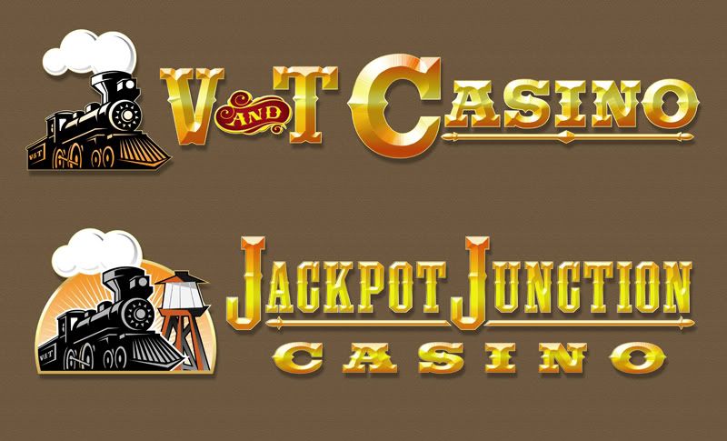
Here are a couple of casino sign concepts I've been working on. The guy's trying to decide on a name. V&T is not a medical procedure or disease... it stands for Virginia & Truckee Railroad. The signs would be led lighted channel letters w/ polished gold aluminum returns. The biggest letters are over 6' tall and would be direct digital prints on plex faces. The client likes beveled letters and before they're printed would have to be converted to gradient filled vectors.
posted
Nice Train! On the V&T one the weight of the C bothers me. How does it look when it is the same size as the V&T. If you want more emphasis on it could you do that with a jewel or a striped bottom or something? If you rotated the and to the left a little it might nestle in a bit better between the V&T, but I'm not sure it is the best solution for the ampersand as it dominates right now. An ampersand would fit into the negative space nicely. They both capture the Casino feel nicely IMO.
-------------------- Did you ever stop to think, and forget to start again? -Winnie the Pooh & A.A. Milne
Kelly Thorson Kel-T-Grafix 801 Main St. Holdfast, SK S0G 2H0 ktg@sasktel.net Posts: 5496 | From: Penzance, Saskatchewan | Registered: May 2002
| IP: Logged |
posted
Thanks for the critique Kelly... I work with 2 other designers and besides the occasional grunt I never get a second opinion! You've got a good eye. These letters are unusual as they have plastic faces per the customer's request. He's trying to go green with static led illumination. As a rule big casino letters are reverse pan channel with bulb fills and/or exposed neon with a lot of animation. I'll probably thin down the "C" if it goes any further. The customer is leaning towards Jackpot Junction as a name.
posted
I love looking at your stuff Brent - ya have a lot of talent...and this one shows it.
Couple small things:
1.) Regarding the V & T....... what would it look like if the V and the T were closer together and the "&" sign element slightly overlapped the V and T at a slightly offset angle??
2.) The whit section on the water tower somehow looks flat/detached...something visually bugging me about that but can't quite put my finger on it...
Images and text work great together!!
-------------------- Todd Gill Outside The Lines Potterville, MI Posts: 7792 | From: Potterville, MI | Registered: Dec 2001
| IP: Logged |
posted
I don't know if this has value for you but in easel painting it is customary to prioritize what you want the viewer to see 1st, 2nd, and 3rd. This helps me in making layout decisions regarding size, value, texture, and color etc. I like your effects but the shapes are competing they are premature to the basic visual communication for me. Just my 3 cents. Also, connecting the elements in some way would help for me.
[ January 20, 2010, 09:23 PM: Message edited by: Bruce Brickman ]
posted
Thanks for the input guys! The suggestions really help. It's hard for me to keep perspective sometimes when I'm trying to digest the customer's wants after they're communicated through a commission hungry salesman. The sign also has to be read from a distance in a very narrow space. As sure as Jon's mailbox will be stolen this thing will be revised several times! I'll keep the suggestions in mind.
posted
Looks good Brent, I like the simple silhouette going on in the Jackpot lettering. I agree with bruce, They need to connect so they look like one design.I would make the sun (shape behind the train) a little bigger so the J overlaps it. The color in the lettering is good, just a little too much bevel. I would make the underline a solid color (black or burnt orange) to carry the flat colors over to the wording. might want to try making the tower bigger as well so it hangs over the J. Over all I think you will have a happy customer with or without changes!
posted
I thought about making the tower bigger on the next pass although a problem with connecting elements on a sign this large is that it increases the cost dramatically. The overall width is about 37'. Individual channel letters will keep the cost within the client's budget.
Funny thing, we had another designer draw a seperate concept and he drew open channel letters w/ an exposed neon fill. The salesman told me before we started that the customer wanted led lighted letters with no neon, liked beveled letters, trains, blah, blah.. Yesterday he came by to pick up the drawings. I asked the salesman "how did he like the concepts?" He replied "well, he's a real big fan of exposed neon".
posted
Great designs. I, like Todd, don't like the water tower. Most of them I've seen have straight sides and were usually made of redwood. Yours reminds me more of the top of a lighthouse. Try going with straight sides and color them a wood tone.
-------------------- Dave Sherby "Sandman" SherWood Sign & Graphic Design Crystal Falls, MI 49920 906-875-6201 sherwoodsign@sbcglobal.net Posts: 5396 | From: Crystal Falls, MI USA | Registered: Apr 1999
| IP: Logged |
posted
Corel 14 & Photoshop CS4. I'm revising it tommorrow. I'll post the picture. The customer wants exposed neon in the letters now and some kind of animation. I may alter the water tower per the suggestions and animate the smoke from the train with exposed white neon rings that would appear to travel out from the smokestack. They decided upon Jackpot Junction for the name.
posted
Looking at your first design- to me the big C begs to have the train coming through the centre of it.
( & I agree with other comments esp. overlapping the V & T )
-------------------- "Stewey" on chat
"...there are no limits when you aim for perfection..." Jonathan Livingston Seagull Posts: 7014 | From: Highgrove via Toowoomba, Queensland, Australia | Registered: Dec 2002
| IP: Logged |
posted
the smoke animation sounds cool, would love to see that. the water tower change would be good. I like the bolder letter style of the v & t logo, but 37' is only 37'
if you see my mailbox on ebay let me know
-------------------- Jon Peterman 200 Summit Loop Grants Pass, OR -------------------- a.k.a. dc-62 success is in Jesus Christ Posts: 434 | From: grants pass or. usa | Registered: Nov 1998
| IP: Logged |
posted
I agree that the Jackpot Junction design feels better and am siding with Dave on some crafty modifications to make the water tower more believable. A retracted water spout would help as well.(Hey,I'm a train freak,ok?) This will probably be detailed later, but the "O" in "Casino" wants to exit the picture and needs a little nudge closer to the group. Wow! it's cool to see some of your work from the new shop your at now, Brent.
-------------------- David C. Petri Flying Peach Custom Paint Green Bay, WI 54302 cell 920-246-7821 Posts: 79 | From: Green Bay, WI | Registered: Jun 2006
| IP: Logged |


![[Smile]](smile.gif)

![[Rolling On The Floor]](graemlins/rolf.gif) I'll keep the suggestions in mind.
I'll keep the suggestions in mind.


 Printer-friendly view of this topic