Letterville Bull Board Letterville | Bull Board


Front Page
A Letterhead History
About Us
Become A Resident
Edit Your Database Info
Find A Letterhead

Letterville Merchants
Resident Downloads
Letterville BookShop
Future Live Meets
Past Meets
Step-By-Steps
Past Panel Swaps
Past SOTM
Letterhead Profiles
Business Cards
Become A Merchant

Click on the button
below to chat with other
Letterville users.

http://www.letterville.com/ubb/chaticon.gif

Steve & Barb Shortreed
144 Hill St., E.
Fergus, ON, Canada
N1M 1G9

Phone: 519-787-2892
Fax: 519-787-2673
Email: barb@letterville.com

Copyright ©1995-2008
The Letterhead Website


The Letterville BullBoard Post New Topic  Post A Reply
my profile login | search | faq | calendar | im | forum home

  next oldest topic   next newest topic
» The Letterville BullBoard » The Portfolio Table » Some fun lettering projects

 - UBBFriend: Email this page to someone!    
Author Topic: Some fun lettering projects
Charles Borges de Oliveir
Visitor
Member # 3770

Icon 6 posted      Profile for Charles Borges de Oliveir   Author's Homepage   Email Charles Borges de Oliveir   Send New Private Message       Edit/Delete Post   Reply With Quote 
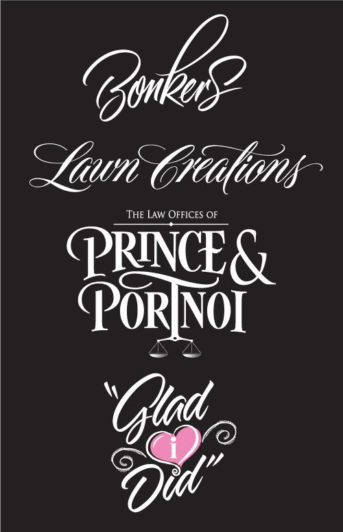
I thought I would share these with whoever likes lettering as much as I do. The word Bonkers was bagged because the company said they were a serious company despite their name and the script was to crazy for them. Oh well it was fun lettering.

Lawn Creations and Prince and Portnoi were done for Dan Antonelli. The Prince logo came off looking kinda like a romance novel. That logo was rejected.

The last one was for a lady who is writing a book on her experiences of taking care of a elderly lady. She loved it. 2 out of 4 isnt too bad I guess.

 -

Thanks for looking [Smile]

--------------------
Charles Borges de Oliveira
Borges Lettering & Design
Snohomish WA

Posts: 352 | From: Snohomish WA | Registered: Mar 2003  |  IP: Logged | Report this post to a Moderator
Glenn Taylor
Visitor
Member # 162

Icon 1 posted      Profile for Glenn Taylor   Author's Homepage   Email Glenn Taylor   Send New Private Message       Edit/Delete Post   Reply With Quote 
Excellent!! [Applause]

--------------------
BlueDog Graphics
Wilson, NC

www.BlueDogUSA.com

Warning: A well designed sign may cause fatigue due to increased business.

Posts: 10690 | From: Wilson, NC, USA | Registered: Nov 1998  |  IP: Logged | Report this post to a Moderator
Shane Durnford
Resident


Member # 8125

Icon 1 posted      Profile for Shane Durnford   Author's Homepage   Email Shane Durnford       Edit/Delete Post   Reply With Quote 
Beautiful lettering Charles
Nice and loose with great form. Inspiring

[ March 06, 2008, 12:37 PM: Message edited by: Shane Durnford ]

--------------------
Shane Durnford
Shane Durnford Design
142 Mill Street, Creemore, ON, L0M 1G0

Posts: 302 | From: Creemore, ON | Registered: Sep 2007  |  IP: Logged | Report this post to a Moderator
Joseph Diaz
Resident


Member # 5913

Icon 1 posted      Profile for Joseph Diaz   Author's Homepage   Email Joseph Diaz   Send New Private Message       Edit/Delete Post   Reply With Quote 
Love em. Man, if some of those are the rejects, I would love to see the ones that made the final cut.

--------------------
Joe Diaz
Diaz Sign Art
628 W. Lincoln Ave.
Pontiac, IL 61764
www.diazsignart.com

Posts: 538 | From: Pontiac, IL | Registered: Aug 2005  |  IP: Logged | Report this post to a Moderator
Dave Correll
Visitor
Member # 100

Icon 1 posted      Profile for Dave Correll   Author's Homepage   Email Dave Correll   Send New Private Message       Edit/Delete Post   Reply With Quote 
How can you have a serious business with a name Bonkers???

Great as always Charles

--------------------
Dave Correll

Posts: 283 | From: Faribault, MN | Registered: Jan 1999  |  IP: Logged | Report this post to a Moderator
Todd Gill
Resident


Member # 2569

Icon 1 posted      Profile for Todd Gill   Email Todd Gill   Send New Private Message       Edit/Delete Post   Reply With Quote 
Stunning work!! Very, very nice Charles!! [Applause]

--------------------
Todd Gill
Outside The Lines
Potterville, MI

Posts: 7792 | From: Potterville, MI | Registered: Dec 2001  |  IP: Logged | Report this post to a Moderator
Deb Fowler
Resident


Member # 1039

Icon 1 posted      Profile for Deb Fowler   Email Deb Fowler   Send New Private Message       Edit/Delete Post   Reply With Quote 
Very slick and beautiful. Wow. What type of brushes and size did you use for those?

--------------------
Deb Fowler

"It's kind of fun to do the impossible - Walt Disney (1901-1966)

Posts: 5373 | From: Loves Park, Illinois | Registered: Aug 1999  |  IP: Logged | Report this post to a Moderator
Jillbeans
Resident


Member # 1912

Icon 1 posted      Profile for Jillbeans   Author's Homepage   Email Jillbeans   Send New Private Message       Edit/Delete Post   Reply With Quote 
Excellent.
I particularly love the bottom one, but all are top-notch.
I'm wondering the same as Joe.
Love....Jill

Posts: 8834 | From: Butler, PA, USA | Registered: Jan 2001  |  IP: Logged | Report this post to a Moderator
Bobbie Rochow
Resident


Member # 3341

Icon 1 posted      Profile for Bobbie Rochow   Email Bobbie Rochow   Send New Private Message       Edit/Delete Post   Reply With Quote 
Those are so beautiful Charles! As if they have flowed right off a brush, each their own personality!

--------------------
The Word in Signs
Bobbie Rochow
Jamestown, PA 16134

724-927-6471

thewordinsigns@alltel.net

Posts: 3485 | From: Jamestown, PA 16134 | Registered: Oct 2002  |  IP: Logged | Report this post to a Moderator
Charles Borges de Oliveir
Visitor
Member # 3770

Icon 1 posted      Profile for Charles Borges de Oliveir   Author's Homepage   Email Charles Borges de Oliveir   Send New Private Message       Edit/Delete Post   Reply With Quote 
Thanks Guys!

Shane- You are the Mike Stevens of dimensionally Carved Signs!! I love you work.

Joe- That was the last one I did. You can see the finished logo at http://princeandportnoi.com/

I am not sure who did it. I think it was Dan Antonelli or someone from his staff.

All of the logos were done using different mediums.

The top script was done with a Winsor and Newton series 7 size 6 pointed brush (natural Kolinsky Sable) with Pelican Fountain Pen Ink slightly thinned (Its pretty thin to start with). Lawn Creations and The Prince logo were done with a #2 Pencil. Its kinda weird but I drew the Lawn Creations logo rather large too. The finish size was about 28" long!

On the Glad I did logo I used a Tombow Pen Brush Marker. You have to abusive the tip to get a fatter stroke.

Thanks again for looking!

--------------------
Charles Borges de Oliveira
Borges Lettering & Design
Snohomish WA

Posts: 352 | From: Snohomish WA | Registered: Mar 2003  |  IP: Logged | Report this post to a Moderator
   

Quick Reply
Message:

HTML is not enabled.
UBB Code™ is enabled.

Instant Graemlins


Post New Topic  Post A Reply Close Topic   Feature Topic   Move Topic   Delete Topic next oldest topic   next newest topic
 - Printer-friendly view of this topic
Hop To:


Contact Us | Letterville. A Community Of Letterheads & Pinheads!

Powered by Infopop Corporation
UBB.classic™ 6.7.2

Search For Sign Supplies
Category:


Letterhead Suppliers Around the World