posted
Just pokin around with a new business card idea. I still have to add my "what I do's" probably at the top. Thats why its a little off centered. I wanted to go with a dark/industrial look.
-------------------- Ryan Ursta Ursta Graphics 116 B North Mercer Avenue Sharpsville Pa. 16150 Call: 7249622206 "We make YOU look good"
Known as "Ugraph" on mirc Posts: 558 | From: Sharpsville Pa. USA | Registered: Sep 2000
| IP: Logged |
Bottom left looks a little crowded where "graphics" and your name are. I'd probably move everything in the center more towards the top and forget the "what I do's" completely.
The purple outlines on the white text should be a bit darker, they compete with the white a little.
-------------------- "If I share all my wisdom I won't have any left for myself."
Mike Pipes stickerpimp.com Lake Havasu, AZ mike@stickerpimp.com Posts: 8746 | From: Lake Havasu, AZ USA | Registered: Jun 2000
| IP: Logged |
card is nice and not too busy but if ya put anymore on it you will ruin it
-------------------- Harris Kohen K-Man Pinstriping and Graphix Trenton, NJ "Showing the world that even I can strategically place the pigment where its got to go." Posts: 1739 | From: Trenton, NJ, USA | Registered: Jun 2001
| IP: Logged |
posted
I would put the name, e-mail and what you do at the back of the card, then you get a nice clean look. I think I might take the transparency out of the checkered flag and have it all white and black. I assume you mostly do race cars and car decals? Because I would not think of signs when I see this card. Nice work.


![[Wink]](wink.gif) probably at the top. Thats why its a little off centered. I wanted to go with a dark/industrial look.
probably at the top. Thats why its a little off centered. I wanted to go with a dark/industrial look. 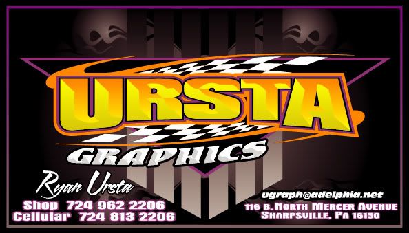


 Printer-friendly view of this topic