posted
My initial opinion is that the designs are not bad, certainly I've seen designs put out that cost a lot more that were not near as nice, we can bash all we want but what a deal this company has... maybe it's a third world company and 1 dollar to them is like 100 to us?
-------------------- "Keep Positive"
SIGNS1st. Neil Butler Paradise, NF Posts: 6277 | From: St. John's NF Canada | Registered: Mar 1999
| IP: Logged |
posted
I wasn't posting because I thought they were bad. Heck, for a couple of hundred bucks they would be fine. The fast follow up and listening to the customer alone is worth that.
-------------------- Wright Signs Wyandotte, Michigan Posts: 2785 | From: Wyandotte, MI USA | Registered: Jan 1999
| IP: Logged |
posted
I thought some of the logos were OK- certainly better than most I have seen and tons better than what many business people have had designed by their nephew. The sad part is how much money these folks leave on the table and how they pull down an entire industry in the process.
The other side of the equation is how the 'elite' design firms charge many hundreds of thousands of dollars (or more) for a logo than may or may not be much better. These folks then justify their designs with pompous talk using big words and complex terms that mean little. That in my mind is just as obscene.
The reality (as always) is somewhere in the middle. But life goes on.
-grampa dan
-------------------- Dan Sawatzky Imagination Corporation Yarrow, British Columbia dan@imaginationcorporation.com http://www.imaginationcorporation.com
Being a grampa is one of the the most wonderful things in the world!!! Posts: 8738 | From: Yarrow, B.C. Canada | Registered: Nov 1998
| IP: Logged |
quote:Originally posted by Dan Sawatzky: I thought some of the logos were OK- certainly better than most I have seen and tons better than what many business people have had designed by their nephew. The sad part is how much money these folks leave on the table and how they pull down an entire industry in the process.
The other side of the equation is how the 'elite' design firms charge many hundreds of thousands of dollars (or more) for a logo than may or may not be much better. These folks then justify their designs with pompous talk using big words and complex terms that mean little. That in my mind is just as obscene.
The reality (as always) is somewhere in the middle. But life goes on.
-grampa dan
There'nothing at all obscene about any of it. Pompous talk or not, branding fees are primarily based on application and usage. And the ability, or lack thereof, to get the same service and deliverable elsewhere will also factor in the pricing.
Once you can deliver something that no one else can produce, you can charge whatever you want for it. I really don't see anything at all obscene about that.
"Some are born to move the world, to live their fantasies. But most of us just dream about the things we'd like to be." - Rush Posts: 1192 | From: Washington, NJ | Registered: Feb 1999
| IP: Logged |
"The other side of the equation is how the 'elite' design firms charge many hundreds of thousands of dollars (or more) for a logo that may or may not be much better. These folks then justify their designs with pompous talk using big words and complex terms that mean little. That in my mind is just as obscene."
No doubt about it, Dan. I totally agree with this portion of what you say..... I have been seeing this kind of arrogance for over forty years, now, and it does not seem to end. It's getting worse and, yes, I also think it is obscene.
P.S. -- I like Paula Scher.......We both hate Helvetica
posted
6 minutes into that video and i cut it off, I have the attention span of fly if I'm not interested
-------------------- You ever notice how easily accessible people are when they are requiring your services but once they get invoice you can't reach them anymore
quote:Originally posted by Dan Sawatzky: I thought some of the logos were OK- certainly better than most I have seen and tons better than what many business people have had designed by their nephew. The sad part is how much money these folks leave on the table and how they pull down an entire industry in the process.
The other side of the equation is how the 'elite' design firms charge many hundreds of thousands of dollars (or more) for a logo than may or may not be much better. These folks then justify their designs with pompous talk using big words and complex terms that mean little. That in my mind is just as obscene.
The reality (as always) is somewhere in the middle. But life goes on.
-grampa dan
There'nothing at all obscene about any of it. Pompous talk or not, branding fees are primarily based on application and usage. And the ability, or lack thereof, to get the same service and deliverable elsewhere will also factor in the pricing.
Once you can deliver something that no one else can produce, you can charge whatever you want for it. I really don't see anything at all obscene about that.
When you produce some of the stuff you produce, Dan, I agree. The problem lies when you charge $100k+ for little more than helvetica. Look at the Windows 8 logo.
-------------------- Dan Beach Cylinder 9 Designs 1650 Glassboro Rd Sewell, NJ 08080 Posts: 625 | From: South Jersey | Registered: Sep 2008
| IP: Logged |
posted
There's a lot more to Logo design for most companies than a little plumbing firm, there's stationary, Vehicles, TV, Web, and countless other applications... as well as revision after revision... so yes I can see thousands being spent in some cases... but hundreds of thousands??? I don't know......
-------------------- "Keep Positive"
SIGNS1st. Neil Butler Paradise, NF Posts: 6277 | From: St. John's NF Canada | Registered: Mar 1999
| IP: Logged |
posted
We charge $2K for logo design in our shop. On some it is easy money - others can be a lot of work and I earn it well. The occasional client who asks for endless revisions also deserves to be charged more but that is more of a management issue.
Selling logos at an hourly rate is not a practice I would pursue or condone. I am selling creativity and satisfaction which can be any price I feel I can get within boundaries and reason.
For a larger company that requires spec sheets for endless variations like fleets of trucks, cars, planes and sign applications, web, and various media application specs, on buildings and way finding systems the customer should and would be charged significantly more obviously. I have no problem with that.
My argument is that just because one charges more for a logo does not make the design more brilliant or better than the guy that charges less. The amount one charges isn't necessarily a reflection on creativeness or cleverness of the design but often more a reflection on the purveyor's ability sell snake oil.
I stand by my statement that selling logos for $42 is absolutely ridiculous. Just as much so as hundreds of thousands of dollars (or more) for a logo from an 'elite' firm.
I liken it somewhat to payment for our work. Most (not self owned or owner operated) companies have many employees. The poor folks at the bottom do the heavy lifting and for the most part are paid minimum wage (or perhaps a little better) while the CEO at the top (and his management team) makes an obscene amount and often gets massive bonuses on top of that plus all kinds of stock options and the like. How can anyone be worth the kind of money these guys get? Millions of dollars, sometimes tens of millions of dollars (or more) per year. My argument is the poor guy at the bottom is getting shafted while the top dude makes obscene money. It simply isn't right. The best in the business and leaders in every industry deserve to be paid more than the hourly worker but often it is out of hand.
-grampa dan
-------------------- Dan Sawatzky Imagination Corporation Yarrow, British Columbia dan@imaginationcorporation.com http://www.imaginationcorporation.com
Being a grampa is one of the the most wonderful things in the world!!! Posts: 8738 | From: Yarrow, B.C. Canada | Registered: Nov 1998
| IP: Logged |
posted
Look at the websites advertising "hand-painted" copies of Old Masters for $50 each, your choice of size, proportion, etc. I'd bet the $42 logos are being done in China, in factories like the ones that produce Levi's -- computer savvy young Chinese working for $2 a day or whatever they get. If the factory only makes a couple bucks per logo and they're selling millions of these things, it's good business -- if that's your idea of business. Mine is not.
-------------------- dennis kiernan independent artist san francisco, calif, usa Posts: 907 | From: san francisco, ca usa | Registered: Feb 2010
| IP: Logged |
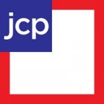
"To help create the future for the new JCP company, ceo Ron Johnson and the rest of the new management team have dug into the JC Penney archives. This is a good idea. Dig into the roots of most brands, and youll find out what made them successful in the first place.
"For the new JCP, which lost its Americas Favorite Store status eons ago, that means going back to what James Cash Penneythe founder of JC Penney, said and thought about his company. One of Cash Penneys founding ideas was to give every customer a square deal, a notion youll find reflected in JCPs new logo design."
Here's what they came up with:
-------------------- dennis kiernan independent artist san francisco, calif, usa Posts: 907 | From: san francisco, ca usa | Registered: Feb 2010
| IP: Logged |
posted
I dont understand the trend to drop names and go with initials only. I thought the idea behind a company name and a logo was to create an identity, instantly recognizable by all. What kind of identity is conveyed by lower case initials in a simple gothic face?
-------------------- dennis kiernan independent artist san francisco, calif, usa Posts: 907 | From: san francisco, ca usa | Registered: Feb 2010
| IP: Logged |
posted
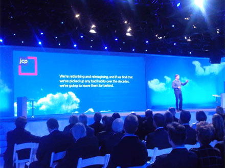
It's hard to believe that JCP logo isn't a joke.
The words on the screen tell the story:
"We're rethinking and reimagining, and if we find that we've picked up any bad habits over the decades, we're going to leave them far behind."
They are leaving aesthetics far behind in the process. It's sad how some large companies are embracing the simple, boring approach to branding, just to make a break with tradition.
My mind wanders. And that's not a good thing, 'cause it's too small to be out there alone. Posts: 3129 | From: Tooele, UT | Registered: Mar 2005
| IP: Logged |
posted
$42 logos are in the realm of everybody on here. Logos costing hundreds of thousands of dollars, like JCP just aren't. Face it, these big corporations aren't going to call any of us with the possible exception of Dan Antonelli, who, by the way, I'm siding with in this debate. I don't even know what a "branding fee" is.
-------------------- George Perkins Millington,TN. goatwell@bigriver.net
"I started out with nothing and still have most of it left"
posted
Just last month, our local university decided to update their "brand". For years they'd been known as The University of Western Ontario and most recently had used a historic bit of architecture which was part of their campus as their logo. After some extensive research, the firm updating the brand discovered that most students, faculty, and public-at-large ususally referred to the university, simply as "Western". So, a new logo was designed, and introduced at a press conference where it was revealed that the updating of their brand had cost a mere $ 200,000.00.
Now for an institution of higher learning, supposedly populated by intelligent people, this press conference turned out to be a bit of a joke. For the past 40-some years, most people had made it their practice to refer to this university as simply "Western". Now this marketing firm holds a full-scale press conference to declare that they've now recognized the obvious, and in doing so have possibly created the impression that just maybe the administration of said university were actually slow learners.
For 200 grand, I suspect that this money may have been better spent elsewhere.
-------------------- Ken Henry Henry & Henry Signs London, Ontario Canada (519) 439-1881 e-mail: kjmlhenry@rogers.com
Why do I get all those on-line offers to sell me Viagara, when the only thing hardening is my arteries ? Posts: 2684 | From: London,Ontario, Canada | Registered: Feb 1999
| IP: Logged |
posted
I gave up designing logos. Seems I can never quickly achieve what the customer wants, and if you can't do it fast, you lose yer profit margin.
Plus a lot of people are bringing in their own layouts anymore that are pretty darned good, so I just try to run with what they give me.
As for $2k logos, Dan is uniquely positioned to achieve that. I think that is good for him. Me? I'm in no position to ask that. I am usually only lettering two or three trucks for somebody, and that doesn't jusify my time or their expense for a killer logo. It justifies a decent layout.
and doesn't that jcp logo like the flag of some third world country?
-------------------- Michael Gene Adkins The Fontry 1576 S Hwy 59 Watts OK 74964 Posts: 845 | From: Watts, OK USA | Registered: Jun 1999
| IP: Logged |
posted
Having worked at a design firm where they did 6 figure logo design, it's not about snake oil or ego... it's about focus groups, process, departmental art directing and corporate committee's. Like a large sign project, it's 10% fun (the design part), 90% getting it done (engineering, permitting, ordering, fabricating, and installing) There is more going on than just typing out Helvetica and presenting it with design fluff. By the time we see the end product, it's been watered down.
Focus groups, process, departmental art directing and corporate committee's, will suck money, creativity and clever design out of any job no matter how good the original concepts were.
I believe on most of these projects, designers do not come up with those excuses for bad design, it's the corporation who whittles down the design and make up the excuses for poor design decisions. They have investors to answer too.
[ March 05, 2012, 11:53 AM: Message edited by: Rick Chavez ]
-------------------- Rick Chavez Hemet, CA Posts: 1538 | From: Hemet,CA U.S.A. | Registered: Jun 2001
| IP: Logged |
posted
I agree 100% with what Rick says about the creativity being sucked out of a design by the over-process. Part of me wants us to get big enough to get payed really well for what we do, but small enough to avoid those types of clients. The clients that make a habit out of ignoring creative intuition and experience because they figure they can back their generic ideas by spending an obscene amount of money cramming it down consumers' throats to a point where they except the logo, not because it is good, but because you can't hide from it.
Can you imagine how successful some of these brands would be if they spent the same amount of coin promoting it and it actually had some personality? So yeah there is more going on then just typing out Helvetica and putting a box around it. But the majority of the general population will never understand that. To them it's boring. It doesn't give them any feeling. It doesn't even explain what the company is about or who they are. They will only except it because it's just there.
-------------------- Joe Diaz Diaz Sign Art 628 W. Lincoln Ave. Pontiac, IL 61764 www.diazsignart.com Posts: 538 | From: Pontiac, IL | Registered: Aug 2005
| IP: Logged |
quote:Can you imagine how successful some of these brands would be if they spent the same amount of coin promoting it and it actually had some personality?
When you said that, the Coca-Cola script was the first thing that came to mind.
posted
Logos should help the consumer to easily recognize the brand. They should be memorable, stylistically fit the business and if you have the ability-clever. Trends come around, and pretty soon everyone has a logo with a swoosh... One company produces a design for a product that is called "clean and simple" and the result is that they all now look like this:
Whether it's logos or products...I like a little flavor to make it memorable. I call this new style (J.C. Penney's new logo, Windows new logo) "Pleasing Sterility" It's designed not to offend, distract, suggest one mindset or personality...or be remembered. They are napkins at a feast: Needed, plain, easily disposed.
-------------------- Doug Haffner Haffner Signs www.haffnersigns.com 309-338-9570 211 W. Williams Wyoming, Il 61491 Posts: 211 | From: Wyoming, Illinois | Registered: May 2010
| IP: Logged |
posted
The interesting thing, Doug, is how much the JCP logo does offend me. LOL. It isn't balanced. The colors clash (red touching blue). It doesn't scale (how big will the JCP be when the logo is 1/2" high?). The type is cramped on the sides. There is no emotion or style to it either. Square about sums it up, if square stands for lame.
I am a big fan of simple logos if aesthetics can play a part. If the simplicity stems solely from the desire to divorce from every established tradition, I can't say I am going enjoy the result. In the case of JCP, their new logo does tell a story - loudly. It says, "We don't know what we are doing. We have lost our identity. We are willing to try anything".
My mind wanders. And that's not a good thing, 'cause it's too small to be out there alone. Posts: 3129 | From: Tooele, UT | Registered: Mar 2005
| IP: Logged |
they'd have been better off to abandon the red and just go with the white letters on blue. that would have been far less annoying.
boring, yes, but as it is now, they gotta worry about how that stupid red border with it's open interior (or is it white?) lands on the background colors of wherever they slap it down. It's going to be a design nuisance if I ever saw one. When they start advertising back to school stuff, that crazy border is going to disappear into a montage of red delicious apples.
-------------------- Michael Gene Adkins The Fontry 1576 S Hwy 59 Watts OK 74964 Posts: 845 | From: Watts, OK USA | Registered: Jun 1999
| IP: Logged |
posted
I doubt if many of the old classic logos. like His Master's Voice, Coca-Cola, The Chessy cat, etc., were produced by commitees. I think most were born the way the Frisco logo was -- the owner of the railroad spotted a coonskin nailed to the wall of one of his stations, got an idea, sketched it himself, and gave it o somebody to do some finished art.
-------------------- dennis kiernan independent artist san francisco, calif, usa Posts: 907 | From: san francisco, ca usa | Registered: Feb 2010
| IP: Logged |


![[Smile]](smile.gif)


 Printer-friendly view of this topic