Letterville Bull Board Letterville | Bull Board


Front Page
A Letterhead History
About Us
Become A Resident
Edit Your Database Info
Find A Letterhead

Letterville Merchants
Resident Downloads
Letterville BookShop
Future Live Meets
Past Meets
Step-By-Steps
Past Panel Swaps
Past SOTM
Letterhead Profiles
Business Cards
Become A Merchant

Click on the button
below to chat with other
Letterville users.

http://www.letterville.com/ubb/chaticon.gif

Steve & Barb Shortreed
144 Hill St., E.
Fergus, ON, Canada
N1M 1G9

Phone: 519-787-2892
Fax: 519-787-2673
Email: barb@letterville.com

Copyright ©1995-2008
The Letterhead Website


The Letterville BullBoard Post New Topic  New Poll  Post A Reply
my profile login | search | faq | calendar | im | forum home

  next oldest topic   next newest topic
» The Letterville BullBoard » Letterhead/Pinstriper Talk » New Cards critique

 - UBBFriend: Email this page to someone!    
Author Topic: New Cards critique
Wayne Webb
Resident


Member # 1124

Icon 1 posted      Profile for Wayne Webb   Author's Homepage   Email Wayne Webb   Send New Private Message       Edit/Delete Post   Reply With Quote 
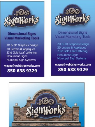
After setting this one on the back burner for awhile, I'm at it again. Any suggestions would be appreciated. bear in mind that the image is uploaded at 72 dpi but all the small copy on the right one is still vector images so it will be alot sharper on the finished cards. The bottom one will be the back. Thanks for looking.

 -

--------------------
Wayne Webb
Webb Signworks
Chipley, FL
850.638.9329
wayne@webbsignworks.com

Posts: 7403 | From: Chipley,Florida,United States | Registered: Oct 1999  |  IP: Logged | Report this post to a Moderator
Glenn Taylor
Visitor
Member # 162

Icon 1 posted      Profile for Glenn Taylor   Author's Homepage   Email Glenn Taylor   Send New Private Message       Edit/Delete Post   Reply With Quote 
I'd do the following...

1) Center all of the copy.
2) Keep the "2D & 3...." in white
3) Make the email address either in a pale blue or beige that matches the color used in "SignWorks".

--------------------
BlueDog Graphics
Wilson, NC

www.BlueDogUSA.com

Warning: A well designed sign may cause fatigue due to increased business.

Posts: 10690 | From: Wilson, NC, USA | Registered: Nov 1998  |  IP: Logged | Report this post to a Moderator
Wayne Webb
Resident


Member # 1124

Icon 1 posted      Profile for Wayne Webb   Author's Homepage   Email Wayne Webb   Send New Private Message       Edit/Delete Post   Reply With Quote 
Thanks Glenn, How's this?
 -

--------------------
Wayne Webb
Webb Signworks
Chipley, FL
850.638.9329
wayne@webbsignworks.com

Posts: 7403 | From: Chipley,Florida,United States | Registered: Oct 1999  |  IP: Logged | Report this post to a Moderator
Sonny Franks
Resident


Member # 588

Icon 1 posted      Profile for Sonny Franks   Email Sonny Franks   Send New Private Message       Edit/Delete Post   Reply With Quote 
Too much copy - put the "2D, 3D etc." info on the back and maybe I'm being picky, but if you go with a vertical front, you should keep it vertical on back as well. That'll be 2 cents, please......

--------------------
www.signcreations.net
Sonny Franks
Lilburn, GA
770-923-9933

Posts: 4115 | From: Lilburn, GA USA | Registered: Feb 1999  |  IP: Logged | Report this post to a Moderator
Glenn Taylor
Visitor
Member # 162

Icon 1 posted      Profile for Glenn Taylor   Author's Homepage   Email Glenn Taylor   Send New Private Message       Edit/Delete Post   Reply With Quote 
I like that better.

Looking at it now, I'd move the "Dimensional Signs / Visual Marketing Tools" so that it associates visually with the logo. Then I'd move the secondary copy up a bit, centering it between the "Visual Marketing Tools" and the email address. What you have now is something of a monotonous spacing where its too much the same from one thought to the next.

 -

--------------------
BlueDog Graphics
Wilson, NC

www.BlueDogUSA.com

Warning: A well designed sign may cause fatigue due to increased business.

Posts: 10690 | From: Wilson, NC, USA | Registered: Nov 1998  |  IP: Logged | Report this post to a Moderator
Ricardo Davila
Visitor
Member # 3854

Icon 1 posted      Profile for Ricardo Davila   Author's Homepage   Email Ricardo Davila   Send New Private Message       Edit/Delete Post   Reply With Quote 
What Sonny said.

RD

--------------------
Ricardo Davila
Showroom Window Advertising
P.O. Box 1376
Edmond, Oklahoma 73083

Posts: 1180 | From: Edmond, Oklahoma | Registered: May 2003  |  IP: Logged | Report this post to a Moderator
Wayne Webb
Resident


Member # 1124

Icon 1 posted      Profile for Wayne Webb   Author's Homepage   Email Wayne Webb   Send New Private Message       Edit/Delete Post   Reply With Quote 
Thanks Glenn, Is this spaced too much?
I'll get to your's Sonny.

 -

--------------------
Wayne Webb
Webb Signworks
Chipley, FL
850.638.9329
wayne@webbsignworks.com

Posts: 7403 | From: Chipley,Florida,United States | Registered: Oct 1999  |  IP: Logged | Report this post to a Moderator
Glenn Taylor
Visitor
Member # 162

Icon 1 posted      Profile for Glenn Taylor   Author's Homepage   Email Glenn Taylor   Send New Private Message       Edit/Delete Post   Reply With Quote 
Yeah, a little.

--------------------
BlueDog Graphics
Wilson, NC

www.BlueDogUSA.com

Warning: A well designed sign may cause fatigue due to increased business.

Posts: 10690 | From: Wilson, NC, USA | Registered: Nov 1998  |  IP: Logged | Report this post to a Moderator
Michael Clanton
Resident


Member # 2419

Icon 1 posted      Profile for Michael Clanton   Author's Homepage   Email Michael Clanton   Send New Private Message       Edit/Delete Post   Reply With Quote 
as far as the vertical layout- I really don't like the "base" of the sign on the bottom edge like that- it doesn't look right and when they cut them down, more than likely you will lose part of that graphic-- a simple fix would be to but a bar of green at the bottom and then put the sign base on top of that...

add a 1/8th of an inch "safe" area all around or the trim could give you fits.

--------------------
Michael Clanton
Clanton Graphics/ Blackberry 19 Studio
1933 Blackberry
Conway AR 72034
501-505-6794
clantongraphics@yahoo.com

Posts: 1735 | From: Conway Arkansas | Registered: Oct 2001  |  IP: Logged | Report this post to a Moderator
Todd Gill
Resident


Member # 2569

Icon 1 posted      Profile for Todd Gill   Email Todd Gill   Send New Private Message       Edit/Delete Post   Reply With Quote 
Wayne - I like the last one you did there - with Glenn's suggested tweaks.

Just curious - if you reduced the 'white' copy in the center so it was a hair less dominant - would it still be legible?

Seems a little big in relation to your logo and the website/phone number to me.

--------------------
Todd Gill
Outside The Lines
Potterville, MI

Posts: 7792 | From: Potterville, MI | Registered: Dec 2001  |  IP: Logged | Report this post to a Moderator
Jim Moser
Visitor
Member # 6526

Icon 1 posted      Profile for Jim Moser   Email Jim Moser   Send New Private Message       Edit/Delete Post   Reply With Quote 
I like a two sided card... logo and phone on one side.... laundry list on the other...

--------------------
Life is not about waiting for the storm to pass... It's about learning to dance in the rain !
Jim Moser Design
13342 C Grass Valley Ave.
Grass Valley, Ca. 95945
530-273-7615 jwmoser@att.net

Posts: 488 | From: Grass Valley, Ca. | Registered: May 2006  |  IP: Logged | Report this post to a Moderator
Don Coplen
Resident


Member # 127

Icon 1 posted      Profile for Don Coplen   Author's Homepage         Edit/Delete Post   Reply With Quote 
I'm curious what the reasoning is of putting the rendering of your sign on the back.

I would rather put your list of services on the back, making the front less crowded.

--------------------
...

Posts: 4084 | From: ... | Registered: Nov 1998  |  IP: Logged | Report this post to a Moderator
Wayne Webb
Resident


Member # 1124

Icon 1 posted      Profile for Wayne Webb   Author's Homepage   Email Wayne Webb   Send New Private Message       Edit/Delete Post   Reply With Quote 
Visual Marketing...
A picture is worth a thousand words?

--------------------
Wayne Webb
Webb Signworks
Chipley, FL
850.638.9329
wayne@webbsignworks.com

Posts: 7403 | From: Chipley,Florida,United States | Registered: Oct 1999  |  IP: Logged | Report this post to a Moderator
Don Coplen
Resident


Member # 127

Icon 1 posted      Profile for Don Coplen   Author's Homepage         Edit/Delete Post   Reply With Quote 
I think you got your thousand words from the very nicely done logo on the front. The picture on the back says the very same words again, without adding anything.

The back would be put to better use by moving the list from the front, which also would clean up clutter and simplify the layout.

--------------------
...

Posts: 4084 | From: ... | Registered: Nov 1998  |  IP: Logged | Report this post to a Moderator
Michael Clanton
Resident


Member # 2419

Icon 1 posted      Profile for Michael Clanton   Author's Homepage   Email Michael Clanton   Send New Private Message       Edit/Delete Post   Reply With Quote 
I agree with Don- a big logo on the front, even the "sign" if you want- on the back- the info and other stuff you do, contact, etc.

If you want the visual marketing, make sure that is is not cluttered up - simplify the info, let the design speak for itself...

--------------------
Michael Clanton
Clanton Graphics/ Blackberry 19 Studio
1933 Blackberry
Conway AR 72034
501-505-6794
clantongraphics@yahoo.com

Posts: 1735 | From: Conway Arkansas | Registered: Oct 2001  |  IP: Logged | Report this post to a Moderator
Steve Luck
Resident


Member # 5292

Icon 1 posted      Profile for Steve Luck   Author's Homepage   Email Steve Luck   Send New Private Message       Edit/Delete Post   Reply With Quote 
Hi Wayne,

I'm not a fan of vertical cards. I think it would look better if you went horizontal with just you logo and website address, nothing else.
Put all the rest of your information on the back with your phone number and of course your name.

I love your logo and it is really a show piece for your customers to look at when you hand them your card. they will flip it over to check out the rest out of curiosity. That's just my opinion, but I'm sure either way will still work.

Sign-cerely, Steve

--------------------
Steve Luck
Sign Magic Inc.
2718-b Grovelin
Godfrey, Illinois 62035
(618)466-9120
signmagic@sbcglobal.net

Posts: 870 | From: 2718-b Grovelin Godfrey, Illinois 62035 | Registered: Dec 2004  |  IP: Logged | Report this post to a Moderator
Wayne Webb
Resident


Member # 1124

Icon 1 posted      Profile for Wayne Webb   Author's Homepage   Email Wayne Webb   Send New Private Message       Edit/Delete Post   Reply With Quote 
Thanks guys for all the great advice,
I've been a little preoccupied with other things today. Going in the hospital for some tests tomorrow and hopefully I'll be back on it by Friday.

--------------------
Wayne Webb
Webb Signworks
Chipley, FL
850.638.9329
wayne@webbsignworks.com

Posts: 7403 | From: Chipley,Florida,United States | Registered: Oct 1999  |  IP: Logged | Report this post to a Moderator
Sonny Franks
Resident


Member # 588

Icon 1 posted      Profile for Sonny Franks   Email Sonny Franks   Send New Private Message       Edit/Delete Post   Reply With Quote 
Good luck with your tests Wayne - hope you don't mind if I include you in my prayers .....

--------------------
www.signcreations.net
Sonny Franks
Lilburn, GA
770-923-9933

Posts: 4115 | From: Lilburn, GA USA | Registered: Feb 1999  |  IP: Logged | Report this post to a Moderator
Wayne Webb
Resident


Member # 1124

Icon 1 posted      Profile for Wayne Webb   Author's Homepage   Email Wayne Webb   Send New Private Message       Edit/Delete Post   Reply With Quote 
No, not at all. Thanks, Sonny.

--------------------
Wayne Webb
Webb Signworks
Chipley, FL
850.638.9329
wayne@webbsignworks.com

Posts: 7403 | From: Chipley,Florida,United States | Registered: Oct 1999  |  IP: Logged | Report this post to a Moderator
Wayne Webb
Resident


Member # 1124

Icon 1 posted      Profile for Wayne Webb   Author's Homepage   Email Wayne Webb   Send New Private Message       Edit/Delete Post   Reply With Quote 
The test results were good. [Smile] Thanks for the prayers.

--------------------
Wayne Webb
Webb Signworks
Chipley, FL
850.638.9329
wayne@webbsignworks.com

Posts: 7403 | From: Chipley,Florida,United States | Registered: Oct 1999  |  IP: Logged | Report this post to a Moderator
   

Quick Reply
Message:

HTML is not enabled.
UBB Code™ is enabled.

Instant Graemlins


Post New Topic  New Poll  Post A Reply Close Topic   Feature Topic   Move Topic   Delete Topic next oldest topic   next newest topic
 - Printer-friendly view of this topic
Hop To:


Contact Us | Letterville. A Community Of Letterheads & Pinheads!

Powered by Infopop Corporation
UBB.classic™ 6.7.2

Search For Sign Supplies
Category:


Letterhead Suppliers Around the World