Letterville Bull Board Letterville | Bull Board


Front Page
A Letterhead History
About Us
Become A Resident
Edit Your Database Info
Find A Letterhead

Letterville Merchants
Resident Downloads
Letterville BookShop
Future Live Meets
Past Meets
Step-By-Steps
Past Panel Swaps
Past SOTM
Letterhead Profiles
Business Cards
Become A Merchant

Click on the button
below to chat with other
Letterville users.

http://www.letterville.com/ubb/chaticon.gif

Steve & Barb Shortreed
144 Hill St., E.
Fergus, ON, Canada
N1M 1G9

Phone: 519-787-2892
Fax: 519-787-2673
Email: barb@letterville.com

Copyright ©1995-2008
The Letterhead Website


The Letterville BullBoard Post New Topic  New Poll  Post A Reply
my profile login | search | faq | calendar | im | forum home

  next oldest topic   next newest topic
» The Letterville BullBoard » Letterhead/Pinstriper Talk » Logo Design...need advice!

 - UBBFriend: Email this page to someone!    
Author Topic: Logo Design...need advice!
Pierre Tardif
Resident


Member # 3229

Icon 5 posted      Profile for Pierre Tardif   Author's Homepage   Email Pierre Tardif   Send New Private Message       Edit/Delete Post   Reply With Quote 
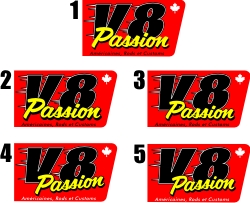
Hey 'heads! I am redesign the logo for my friend's magazine V8 Passion, and got to ask your feeling about it. The top one already been approved, the others are just slightly different. Which one you like the most...?!? Advices are welcome! Thanks!

Life is so good!

 -

[ October 06, 2011, 10:17 AM: Message edited by: Pierre Tardif ]

--------------------
Pierre Tardif
P. Tardif Inc.
1006 boul. PIE-XI sud Val-Belair
QC. Canada G3K 1L2
418-847-4089
pierre@ptardif.com

Posts: 800 | From: Quebec city | Registered: Aug 2002  |  IP: Logged | Report this post to a Moderator
Kelly Thorson
Resident


Member # 2958

Icon 1 posted      Profile for Kelly Thorson   Author's Homepage   Email Kelly Thorson   Send New Private Message       Edit/Delete Post   Reply With Quote 
#4

--------------------
“Did you ever stop to think, and forget to start again?”
-Winnie the Pooh & A.A. Milne

Kelly Thorson
Kel-T-Grafix
801 Main St.
Holdfast, SK
S0G 2H0
ktg@sasktel.net

Posts: 5496 | From: Penzance, Saskatchewan | Registered: May 2002  |  IP: Logged | Report this post to a Moderator
Rusty Bradley
Resident


Member # 6938

Icon 1 posted      Profile for Rusty Bradley   Email Rusty Bradley   Send New Private Message       Edit/Delete Post   Reply With Quote 
I have a slight preference to #4 because of the slant of "Passion"...but I prefer the line of little letters at the bottom to be in black.

--------------------
Rusty Bradley
Bradley Sign Studio
100 Creekview Road
Summertown, Tn. 38483

Posts: 2179 | From: Summertown, Tennessee | Registered: Nov 2006  |  IP: Logged | Report this post to a Moderator
Glenn Taylor
Visitor
Member # 162

Icon 1 posted      Profile for Glenn Taylor   Author's Homepage   Email Glenn Taylor   Send New Private Message       Edit/Delete Post   Reply With Quote 
Pierre, you know how I feel about your work. I love it. Wellllll......not meaning to be a fly in the ointment, but since you asked....

I'm really not liking the script you chose for that particular design. To be honest, the overall layout (all of them) looks like something done at the local Quickie-Stickie. "Passion" looks like something stuck on as an afterthought and you're not sure what to do with it.

To me, a V8 is all about "power". I'm not feeling it with this particular layout.

--------------------
BlueDog Graphics
Wilson, NC

www.BlueDogUSA.com

Warning: A well designed sign may cause fatigue due to increased business.

Posts: 10690 | From: Wilson, NC, USA | Registered: Nov 1998  |  IP: Logged | Report this post to a Moderator
Pete Payne

Member # 344

Icon 1 posted      Profile for Pete Payne   Author's Homepage   Email Pete Payne   Send New Private Message       Edit/Delete Post   Reply With Quote 
I've seen this magazine, mostly 50's and 60's stuff, so on that count the logo fits for me. I would maybe try a non italic v8 and a more italicized and arched passion, i like #5 the best, it works for me the way it is just fine, Pierre

--------------------
Pete Payne
Willowlake Design/Canadian Signcrafters
Bayfield, ON

Canadian Signcrafters

Posts: 619 | From: Bayfield, ON Canada | Registered: Feb 1999  |  IP: Logged | Report this post to a Moderator
Philip Steffen
Visitor
Member # 2235

Icon 1 posted      Profile for Philip Steffen   Email Philip Steffen   Send New Private Message       Edit/Delete Post   Reply With Quote 
I liked #4. Second choice is #3 for me. Don't like the arc-slant of #5.

--------------------
Phil Steffen,
29 Van Rensselaer St
City of Saratoga Springs DPW
Saratoga Springs NY 12866

Posts: 563 | From: beautiful Saratoga Springs NY | Registered: Aug 2001  |  IP: Logged | Report this post to a Moderator
Bill Lynch
Resident


Member # 3815

Icon 1 posted      Profile for Bill Lynch   Email Bill Lynch   Send New Private Message       Edit/Delete Post   Reply With Quote 
I'm with Glenn. It is a really nice clean design, but I think it should have a 60s Hot Rod, RatFink motorhead look.

--------------------
Bill Lynch
Century Sign
Hamden, CT
centurysign@snet.net

Posts: 1125 | From: Hamden, CT | Registered: Apr 2003  |  IP: Logged | Report this post to a Moderator
Wayne Webb
Resident


Member # 1124

Icon 1 posted      Profile for Wayne Webb   Author's Homepage   Email Wayne Webb   Send New Private Message       Edit/Delete Post   Reply With Quote 
4

--------------------
Wayne Webb
Webb Signworks
Chipley, FL
850.638.9329
wayne@webbsignworks.com

Posts: 7403 | From: Chipley,Florida,United States | Registered: Oct 1999  |  IP: Logged | Report this post to a Moderator
Neil D. Butler
Resident


Member # 661

Icon 1 posted      Profile for Neil D. Butler   Email Neil D. Butler   Send New Private Message       Edit/Delete Post   Reply With Quote 
Remember everyone has an opinion...lol I can hardly see them!

--------------------
"Keep Positive"

SIGNS1st.
Neil Butler
Paradise, NF

Posts: 6277 | From: St. John's NF Canada | Registered: Mar 1999  |  IP: Logged | Report this post to a Moderator
Pierre Tardif
Resident


Member # 3229

Icon 1 posted      Profile for Pierre Tardif   Author's Homepage   Email Pierre Tardif   Send New Private Message       Edit/Delete Post   Reply With Quote 
Thanks guys!

Keep in mind I had to work with the colors they've been using for the past 8 years and that the new image is an evolvement from the previous logo and not a complete makeoever. Also the magazine is not just an hot-rods mag, it also feature classic cars and new cars too.

Have a look at what they have now...
http://www.v8passion.com/

Thanks again for your inputs!

--------------------
Pierre Tardif
P. Tardif Inc.
1006 boul. PIE-XI sud Val-Belair
QC. Canada G3K 1L2
418-847-4089
pierre@ptardif.com

Posts: 800 | From: Quebec city | Registered: Aug 2002  |  IP: Logged | Report this post to a Moderator
Pat Welter
Resident


Member # 785

Icon 1 posted      Profile for Pat Welter   Email Pat Welter   Send New Private Message       Edit/Delete Post   Reply With Quote 
I'm with Pete on this one, I like 5 as well.

--------------------
Pat Welter
Masterhand Signs and Designs
Unity, Saskatchewan.Canada

Posts: 1304 | From: Unity, Saskatchewan.Canada | Registered: May 1999  |  IP: Logged | Report this post to a Moderator
Bill Lynch
Resident


Member # 3815

Icon 1 posted      Profile for Bill Lynch   Email Bill Lynch   Send New Private Message       Edit/Delete Post   Reply With Quote 
in that case #5

--------------------
Bill Lynch
Century Sign
Hamden, CT
centurysign@snet.net

Posts: 1125 | From: Hamden, CT | Registered: Apr 2003  |  IP: Logged | Report this post to a Moderator
Glenn Taylor
Visitor
Member # 162

Icon 1 posted      Profile for Glenn Taylor   Author's Homepage   Email Glenn Taylor   Send New Private Message       Edit/Delete Post   Reply With Quote 
Like Bill says....."in that case".

I'll have to go with #5 as well but I really hate that script with that logo.

--------------------
BlueDog Graphics
Wilson, NC

www.BlueDogUSA.com

Warning: A well designed sign may cause fatigue due to increased business.

Posts: 10690 | From: Wilson, NC, USA | Registered: Nov 1998  |  IP: Logged | Report this post to a Moderator
Ian Stewart-Koster
Resident


Member # 3500

Icon 1 posted      Profile for Ian Stewart-Koster   Author's Homepage   Email Ian Stewart-Koster   Send New Private Message       Edit/Delete Post   Reply With Quote 
4 then 5.
(I'm not keen on the ones with Passion on a horizontal baseline)

--------------------
"Stewey" on chat

"...there are no limits when you aim for perfection..." Jonathan Livingston Seagull

Posts: 7014 | From: Highgrove via Toowoomba, Queensland, Australia | Registered: Dec 2002  |  IP: Logged | Report this post to a Moderator
Jane Diaz
Resident


Member # 595

Icon 1 posted      Profile for Jane Diaz   Author's Homepage   Email Jane Diaz   Send New Private Message       Edit/Delete Post   Reply With Quote 
I think the white outline on the V8 is enough and it doesn't the black outline too. It sort of makes it vibrate for me, with the red & black so close. I think that would make the V8 look a lot cleaner & easier to read.

--------------------
Jane Diaz
Diaz Sign Art
628 W. Lincoln Ave. Pontiac, Il. 61764
815-844-7024
www.diazsignart.com

Posts: 4102 | From: Pontiac, IL USA | Registered: Feb 1999  |  IP: Logged | Report this post to a Moderator
Dan Beach
Visitor
Member # 9850

Icon 1 posted      Profile for Dan Beach   Email Dan Beach       Edit/Delete Post   Reply With Quote 
4 or 5

--------------------
Dan Beach
Cylinder 9 Designs
1650 Glassboro Rd
Sewell, NJ 08080

Posts: 625 | From: South Jersey | Registered: Sep 2008  |  IP: Logged | Report this post to a Moderator
Craig Sjoquist
Resident


Member # 4684

Icon 1 posted      Profile for Craig Sjoquist   Author's Homepage   Email Craig Sjoquist   Send New Private Message       Edit/Delete Post   Reply With Quote 
Likes the action of #4

--------------------
Craig Sjoquist
http://www.592sign.net
3220 N.O.B.T
Orlando Fl. 407-592-7446 vikinwolf@gmail.com

Posts: 1588 | From: Orlando Fl. | Registered: May 2004  |  IP: Logged | Report this post to a Moderator
Teddy Carlsen
Visitor
Member # 13012

Icon 1 posted      Profile for Teddy Carlsen   Author's Homepage   Email Teddy Carlsen   Send New Private Message       Edit/Delete Post   Reply With Quote 
3, when i look on the others i read passion V8 becourse the script i hiding to much of the V8.

--------------------
Teddy Carlsen
Logografen
Tilst vestervej 49, 8381 Tilst Denmark.
http://www.logografen.dk

Posts: 38 | From: Denmark | Registered: Sep 2010  |  IP: Logged | Report this post to a Moderator
Preston McCall
Visitor
Member # 351

Icon 1 posted      Profile for Preston McCall   Author's Homepage   Email Preston McCall   Send New Private Message       Edit/Delete Post   Reply With Quote 
How about this angle, Pierre?

http://www.prestonmccall.com/media_page.htm

--------------------
Preston McCall
112 Rim Road
Santa Fe, New Mexico
87501
text: 5056607370

Posts: 1552 | From: Santa Fe, New Mexico | Registered: Nov 1998  |  IP: Logged | Report this post to a Moderator
Janette Balogh
Resident


Member # 192

Icon 1 posted      Profile for Janette Balogh   Author's Homepage   Email Janette Balogh   Send New Private Message       Edit/Delete Post   Reply With Quote 
3 or 5

3 because it's straight
5 because it has a natural feel to the script.

4 to me looks too cut and paste

5 is what I'd go with.

--------------------
"When Love and Skill Work Together ... Expect a Masterpiece"

Janette Balogh
Creative Studio

janette@janettebalogh.com
www.janettebalogh.com

Posts: 5092 | From: Florida | Registered: Nov 1998  |  IP: Logged | Report this post to a Moderator
Pierre Tardif
Resident


Member # 3229

Icon 1 posted      Profile for Pierre Tardif   Author's Homepage   Email Pierre Tardif   Send New Private Message       Edit/Delete Post   Reply With Quote 
Thanks for your input guys! Will let you knowwhen the next magazine come out!!

--------------------
Pierre Tardif
P. Tardif Inc.
1006 boul. PIE-XI sud Val-Belair
QC. Canada G3K 1L2
418-847-4089
pierre@ptardif.com

Posts: 800 | From: Quebec city | Registered: Aug 2002  |  IP: Logged | Report this post to a Moderator
   

Quick Reply
Message:

HTML is not enabled.
UBB Code™ is enabled.

Instant Graemlins


Post New Topic  New Poll  Post A Reply Close Topic   Feature Topic   Move Topic   Delete Topic next oldest topic   next newest topic
 - Printer-friendly view of this topic
Hop To:


Contact Us | Letterville. A Community Of Letterheads & Pinheads!

Powered by Infopop Corporation
UBB.classic™ 6.7.2

Search For Sign Supplies
Category:


Letterhead Suppliers Around the World