posted
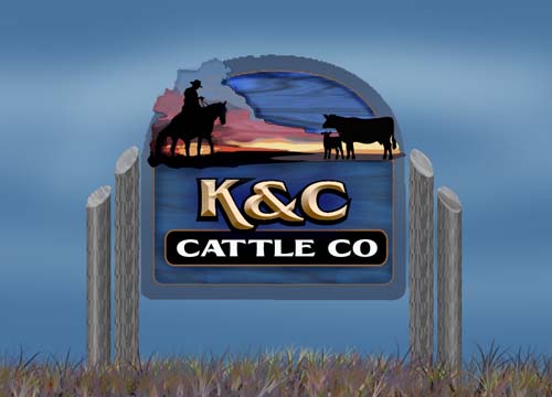
Here is a cedar farm sign I'm working on. The cowboy and cow sunset will be a hand painted panel added. Dibond perhaps? The K&C will be carved of HDU and the textured background will be sandblasted. I haven't shown the client yet, so any comments or suggestions are appreciated.
-------------------- Did you ever stop to think, and forget to start again? -Winnie the Pooh & A.A. Milne
Kelly Thorson Kel-T-Grafix 801 Main St. Holdfast, SK S0G 2H0 ktg@sasktel.net Posts: 5496 | From: Penzance, Saskatchewan | Registered: May 2002
| IP: Logged |
posted
That will be a nice looking sign! Will the cowboy and cows be a raised layer from the sunset??
Can't wait to see pics of the real thing.
-grampa dan
-------------------- Dan Sawatzky Imagination Corporation Yarrow, British Columbia dan@imaginationcorporation.com http://www.imaginationcorporation.com
Being a grampa is one of the the most wonderful things in the world!!! Posts: 8739 | From: Yarrow, B.C. Canada | Registered: Nov 1998
| IP: Logged |
posted
Thanks Bruce, I might use auto air and air brush it and then clear it with an automotive clear. I have another sign I'm working on that I want to do in auto air and clear, so I could do the two of them together. Otherwise I'll likely use Aura paints, I've been using them for my murals and I'm starting to get the hang of blending with them. I'm hoping the colourfastness of them is as good as it is touted to be. Dan I think I may do the cowboys in another layer, more for ease of uninterrupted blending across the sky than for appearance. They would be mounted directly on the layer behind though, otherwise they might cast unwanted shadows.
-------------------- Did you ever stop to think, and forget to start again? -Winnie the Pooh & A.A. Milne
Kelly Thorson Kel-T-Grafix 801 Main St. Holdfast, SK S0G 2H0 ktg@sasktel.net Posts: 5496 | From: Penzance, Saskatchewan | Registered: May 2002
| IP: Logged |
posted
Love the design Kelly. The only tweak I'd suggest is make the ampersand slightly smaller and maybe put some rope, barbed wire, or rusty brackets on the posts......
-------------------- www.signcreations.net Sonny Franks Lilburn, GA 770-923-9933 Posts: 4116 | From: Lilburn, GA USA | Registered: Feb 1999
| IP: Logged |
posted
That will be one beautiful sign...I think both suggestions Sonny made are something to consider...another thought...though it might not be in the budget...would be to epoxy a real rope...natural looking but nylon...on top of both the narrow brown interior border lines...I think even the cows will take notice of this beautiful sign when it's done.
posted
Very nice Kelly, but I think I'd like to see a bit more margin outside the black silhouettes of the horse & cow; and I think I'd raise the height of the yellow in the sunset to help show off the silhouettes a bit more, rather than just in the legs.
-------------------- "Stewey" on chat
"...there are no limits when you aim for perfection..." Jonathan Livingston Seagull Posts: 7014 | From: Highgrove via Toowoomba, Queensland, Australia | Registered: Dec 2002
| IP: Logged |
-------------------- Catharine C. Kennedy CCK Graphics 1511 Route 28 Chatham Center, NY 12184 cck1620@taconic.net "Look at me, Look at me, Look at me now! I't's fun to have fun, But you have to know how!" Posts: 2173 | From: downtown Chatham Center, NY | Registered: Feb 2004
| IP: Logged |
posted
Really Nice Kelly, sure there's always thing you can do with it, but I think it looks wicked... good observation on the shadow being cast by the silouettes as well.
-------------------- "Keep Positive"
SIGNS1st. Neil Butler Paradise, NF Posts: 6277 | From: St. John's NF Canada | Registered: Mar 1999
| IP: Logged |
posted
Nice concept Kel, I would consider a few minor changes since you asked so nicely...
I think there is not enough contrast between the center blasted area and your border. Either lighter or much darker, similar hue or totally different colour (light gray maybe)
I would avoid using pure white on "cattle co", off white towards a beigy or grayish colour.
The K&C is heavy left because of the long leg on the K. Have you considered keeping the same value on both the 'K' and 'C' and playing with the '&' instead ?
And just for fun, try 'beefing' up the poles (no pun intended) to a larger diametre or by adding a third one.
The overall look is superb with the sunset and the big cloud formation and the fact that the silhouttes are just solid shapes
posted
Absolutely beautiful Kelly, I tend to side with Stewy. Bill
-------------------- Bill Riedel Riedel Sign Co., Inc. 15 Warren Street Little Ferry, N.J. 07643 billsr@riedelsignco.com Posts: 2953 | From: Little Ferry, New Jersey, USA | Registered: Feb 1999
| IP: Logged |
posted
I'd use the lower case K and C (small caps) from that font, make the ampersand smaller. The TTs in cattle are too far apart, I'd adjust that and weld/node edit. Also I'd add a period after Co. but that may be a regional thing. Love....Jill
Posts: 8834 | From: Butler, PA, USA | Registered: Jan 2001
| IP: Logged |
posted
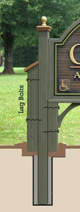
a beautiful sign if it is built as is presently designed with no modification...but Rene's comment made me remember an impression I first had but didn't comment on at the time for whatever reason...I must have been so blown away by the beautiful color scheme that the lobe of my brain where critical thinking processes occur must have shut down ...but I do remember also thinking beefing up the posts might be a good idea...here's how I add a third post to give bulk on the ends and carry some of that mass under the sign...easy to make 3 posts design and of course works the same with the round post...people seem to like this look alot...just one more thing for you to consider...in the end make it like Kelly feels comfortable with...it will be a beauty.
posted
Great design as is but suggested changes are something to consider.
One comment on Rusty's pole suggestion. In my part of the country the frost would push the poles up. I love the thick pole design, but in cold weather areas a couple of modifications are needed. If the outer short poles are going to be in the ground, I cut the end at an angle so heaving ground will slide up the angled portion. The other method I use is to have the short poles above ground by a few inches and then have a thick enough layer of decorative rock high enough to cover the bottoms. This leaves enough empty space below the poles so the ground can heave and not push the poles up.
-------------------- Dave Sherby "Sandman" SherWood Sign & Graphic Design Crystal Falls, MI 49920 906-875-6201 sherwoodsign@sbcglobal.net Posts: 5400 | From: Crystal Falls, MI USA | Registered: Apr 1999
| IP: Logged |
posted
Kelly...here's how that might look...I also stretch a 2" thick board from post to post to give the sign a nice base to sit on...gives it a little more bulk too.
posted
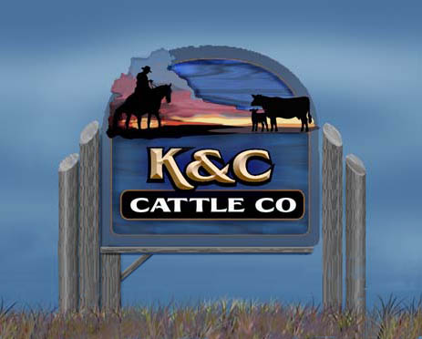
Wow lots of great input. Thanks so much! I've played with most of the suggestions and will have to decide which to implement. Rusty, I'm glad you like it as it was actually inspired by your recent animal sign. You really are spot on with your post ideas, that is something I have always admired on all your signs. I prefer the idea of adding a third post as I am looking for a "fencepost" install. I originally had three posts in the position you have done, but I didn't like it, the addition of the brace and base board make all the difference. I think I will use some "Rusty" brackets.
-------------------- Did you ever stop to think, and forget to start again? -Winnie the Pooh & A.A. Milne
Kelly Thorson Kel-T-Grafix 801 Main St. Holdfast, SK S0G 2H0 ktg@sasktel.net Posts: 5496 | From: Penzance, Saskatchewan | Registered: May 2002
| IP: Logged |
posted
Ooh yes, also the kerning between the A & the first T in cattle...
There are some great suggestions, Kelly!
-------------------- "Stewey" on chat
"...there are no limits when you aim for perfection..." Jonathan Livingston Seagull Posts: 7014 | From: Highgrove via Toowoomba, Queensland, Australia | Registered: Dec 2002
| IP: Logged |
I like the top section/illustration very much - very warm and inviting.
Not very keen on the bottom half/KC Cattle Co layout.... doesn't seem to balance within the sign as a whole, or within the section it resides. Font choices are part of the problem as I see it... it has more of a Seafood restaurant look than a Cattle Company look to me... not being sarcastic... but that's what first came to mind.
What about using a more 'western themed' font?
Also... I think the post design could be more creatively executed. In addition, I agree with Sonny on his suggestions.
Keep at it - you're close to 'being there.' :-)
-------------------- Todd Gill Outside The Lines Potterville, MI Posts: 7792 | From: Potterville, MI | Registered: Dec 2001
| IP: Logged |


![[Applause]](graemlins/applause.gif)
![[Cool]](cool.gif)


![[Smile]](smile.gif) You really are spot on with your post ideas, that is something I have always admired on all your signs. I prefer the idea of adding a third post as I am looking for a "fencepost" install. I originally had three posts in the position you have done, but I didn't like it, the addition of the brace and base board make all the difference. I think I will use some "Rusty" brackets.
You really are spot on with your post ideas, that is something I have always admired on all your signs. I prefer the idea of adding a third post as I am looking for a "fencepost" install. I originally had three posts in the position you have done, but I didn't like it, the addition of the brace and base board make all the difference. I think I will use some "Rusty" brackets. ![[Wink]](wink.gif)


 Printer-friendly view of this topic