posted
Some of you may remember my post from this time last year as I was struggling to get my local Miniature Horse Club to update their 25 year old amateur logo... they put off the vote for an entire year until the next AGM, which is coming up in November.
I have an idea or two that I am going to submit, but I was wondering if any of you doodlers out there would be willing to have a go at it? The more choices the better, as far as I'm concerned. I really want to make some new signage for them - but I HATE the old logo with a passion!
So... if you feel like jumping into the competition and doodling something up, that would be swell! It's just for a non-profit club, so there's no payment for the winner. But you would have bragging rights and my undying gratitude!
It is for the BC Miniature Horse Club. It has to look good in print, black and white as well as colour, and it needs to look good embroidered.
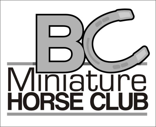
This is the old logo... have a look and hopefully you'll be compelled to help! LOL
This is my idea from last year, I am going to work on another one next week...
It is based on the BC flag...
I don't have access to any other ones. I've seen one of them, it is a nice drawing of a horse's head with a "flowy" mane - and though it's a nice drawing... it's not a logo, you know?
posted
I would love to jump in and submit several ideas but due to my last bashing of NOT CHARGING design time and or fees and in that note being "take as not professional" before I submit and art Im going to need to get some money up front and then we can begin to sort thru this.
I wonder how some of you can jump on my as* for "giving away" art and designs but then you will log on here and just let those designs fly. Im sure this post will once again lead to more hatred and bashing towards me but I would just like to know how you can justify that.
-------------------- You ever notice how easily accessible people are when they are requiring your services but once they get invoice you can't reach them anymore
quote:Originally posted by bruce ward: Im sure this post will once again lead to more hatred and bashing towards me but I would just like to know how you can justify that.
I wouldn't be so sure... unless that is exactly what your intention is for this post Bruce. I saw the thread that now seems to have upset you, but I didn't see "bashing" at all... I saw letterheads, many of whom have once been exactly where you are today, & have since grown to a different level of business... & in the true spirit of the Letterheads, had offered you their best suggestions for improving your business. Nowhere did I see hatred or bashing...
...but for you to come down on the daughter of a sign business owner, who has only posted here a mere 48 times... talk about choosing your battles...
I guess you felt a need to attack someone else to improve your self esteem, but if you don't see the difference between letting your clients walk all over you, & sharing the wisdom of experience in the sign trade, on a website specifically dedicated to just that...
posted
Bec, while I feel you are off to a real good start, I would urge you to try a different direction. What about using a horse shoe? It's probably been done a bazillion times but I think it would work. The image which you have posted has a lot of "noise" to me. I would try to simplify. I am no expert, but I think miniature horses are cute and fun, and I think the logo should be as well. Just a quickie black & white type suggestion. Love....Jill
Posts: 8834 | From: Butler, PA, USA | Registered: Jan 2001
| IP: Logged |
posted
Wow... and I thought horse forums were brutal!
Jill, thanks so much for your input and I LOVE the idea and the execution... unfortunately, Minis do not wear shoes and so it would not really work for us. However... if any other BC breed club needs a logo - I'll send them to you for a slight modification on that one! LOL
I will work on playing with the text though, there are certainly enough words that have to be in there, and you're right - there's so much that can be done with fonts alone!
-------------------- Bec "Phoebe's Mom" Bermudez Sawatzky's Imagination Corporation Yarrow, BC Posts: 103 | From: Yarrow, BC | Registered: Oct 2007
| IP: Logged |
quote:Originally posted by Todd Gill: Very good call on the Pig faced Washington horse Doug.
However... I see a Pit Bull puking some kind of matter out it's mouth.... while standing in a dense patch of it's own road apples.
As far as a suggestion goes? I'd have a picture of Jon Jantz tossing a miniature horse...kind of in the visual vane of midget tossing. LOL
I tried posting earlier to this but I was laughing so hard I couldn't hit the right keys. Todd you crack me up buddy. Doug, they should draft you for Secretary of State; you are the great communicator. BTW, Bec the new logo is awesome. Maybe stick the obligatory maple leaf in there somewhere and a couple of beavers and it should be good to go. Seriously, it's a great logo.
[ October 17, 2008, 11:21 AM: Message edited by: Ricky Jackson ]
-------------------- Ricky Jackson Signs Now 614 Russell Parkway Warner Robins, GA (478) 923-7722 signpimp50@hotmail.com
"If I have seen further it is by standing on the shoulders of giants." Sir Issac Newton Posts: 3528 | From: Warner Robins, GA | Registered: Oct 2004
| IP: Logged |
posted
Bec, looking at Jill's fun idea and your charming horse head, I wonder if you could somehow work it into the C in BC like Jill did with the horse shoe.
-------------------- Did you ever stop to think, and forget to start again? -Winnie the Pooh & A.A. Milne
Kelly Thorson Kel-T-Grafix 801 Main St. Holdfast, SK S0G 2H0 ktg@sasktel.net Posts: 5496 | From: Penzance, Saskatchewan | Registered: May 2002
| IP: Logged |
posted
Oops! I never saw a mini horse up close and personal. For some reason I think I suggested something very similar last year. OK here's another idea, maybe too cliché. Can you tell that I am trying to avoid going up to the garage to make a ballfield sign? This could be used with or without the horse head thingy. Love....Jill
Posts: 8834 | From: Butler, PA, USA | Registered: Jan 2001
| IP: Logged |
posted
Sweet! Way to procrastinate! I'm liking that one!
I am at a horse trade show 12 hours a day this weekend (in a booth for our Mini rescue centre, Pipsqueak Paddocks Miniature Horse Haven ), but next week I'll be able to concentrate on this more!
Thanks for playing! Anyone else?! I'd love to fill a board with wicked logos so that there's no way the old one will be re-voted in!!!
quote:Originally posted by Bec Bermudez: I'd love to fill a board with wicked logos so that there's no way the old one will be re-voted in!!!
It only takes one to win Bec, yours is head and tails above the current one. If yours looses out to it, then there is something else in play and I doubt it makes much difference what is submitted.
-------------------- Did you ever stop to think, and forget to start again? -Winnie the Pooh & A.A. Milne
Kelly Thorson Kel-T-Grafix 801 Main St. Holdfast, SK S0G 2H0 ktg@sasktel.net Posts: 5496 | From: Penzance, Saskatchewan | Registered: May 2002
| IP: Logged |
posted
Without being too picky, the horsehead you have chosen to use appears to be more of an Arabian or some sort of thoroughbred image. I am NOT a horse person, but even I do know that a miniature has "squatted or truncated" features that are more similar to a pony, and that are not quite as "regal" as the one you've chosen.
The idea works fine, but you need to find the proper silhouette to make it work for a miniature.
-------------------- Gene Golden Gettysburg Signs Gettysburg PA 17325 717-334-0200 genegolden@gettysburgsigns.com
"Art is knowing when to stop." Posts: 1578 | From: Gettysburg, PA | Registered: Jun 2003
| IP: Logged |
posted
Bec, I like your logo too, but Gene has a point. Just one observation: in my experience it is not a good idea to give people too many choices, particularly if there is a committee/board involved! They would have to be complete blockheads to choose their old logo over your suggestion, but then again...
posted
I'm glad it was Gene and not me to make the reply in regards to the horse figure and although I have a miniature horse on my property its of an entirely different breed and btw my neighbor has a few miniature horses. It seems like the more I think of horses the more I see in all sizes here in the northwest.
-------------------- HotLines Joey Madden - pinstriping since 1952 'Perfection, its what I look for and what I live for'
posted
Not so Gene. A true mini should look like a big horse only in a pint size form....refinement and femininity for mares and masculne features for a stallion. Jill, I would find a better picture of the horse head. That one looks like it has a swollen jaw. But I still like it. But I love the concept. I also LOVE Bec's.
-------------------- Laura Butler Vision Graphics & Sign 4479 Welch Rd Attica, Mi 48412 Posts: 2855 | From: Attica, Mi, USA | Registered: Nov 2000
| IP: Logged |
posted
I would agree with Gene, but I also think Bec's looks enough like a chess piece to be considered an iconic illustration not required to adhere as much to realism. I think the flag tie-ins are 75% of the appeal to me. Kelly is right too, IMO, regarding a more limited choice being better sometimes.
posted
Gene, Laura is correct. The modern Miniature Horse should be proportioned and refined, just like a "big one". They are bred in "types" and the most popular right now is the "Arab type", and so the profile illustrated is actually correct and a very desirable look. The "pony" look is old-school foundation bloodlines... the Mini has come a long way in a short time! You should be able to take a picture of a Miniature Horse, cut out the background and then not be able to tell that it is a Miniature.
And yes, I understand about things being "comitteed" to death. This, however, is going to be a vote by ballot. I figured, the more choices - the less likely it would be for the factions to unite and keep the old logo! LOL We'll see how creative I can be this week after that huge workshop and now this three-day tradeshow! LOL
Thanks for the replies everyone!
-------------------- Bec "Phoebe's Mom" Bermudez Sawatzky's Imagination Corporation Yarrow, BC Posts: 103 | From: Yarrow, BC | Registered: Oct 2007
| IP: Logged |
posted
My feeling from reading the replies is that most are talking about the horse and not the background, which leads me to thinking that is where their eye is being attracted to because it seems like it is just sitting on top.
That said, here is a suggestion.
This just rough but an idea, soften up the horse line and put BC in front of the horse to take attention off the horse as being the top layer.
I also think a hint of a soft closed eye and eye lid may help in a darker shade of red.
-------------------- Sam Staffan Mackinaw Art & Sign 721 S. Nokomis St. Mackinaw City, MI dstaffan@sbcglobal.net Posts: 1697 | From: Mackinaw City, MI | Registered: Mar 2004
| IP: Logged |
quote:Originally posted by Bec Bermudez: This, however, is going to be a vote by ballot. I figured, the more choices - the less likely it would be for the factions to unite and keep the old logo!
If this is to be decided by vote and there is someone protecting the original logo, I think it is most definitely in your best interest not to "water down" the opposing vote. For example, if 5 out of 12 are voting for the original logo their buddy designed, you don't want the other 7 to split their vote 2 ways or the original one wins even if 7 of the voters hate it. What you need is one strong contender. Are there other members submitting designs as well? I get the definite impression that for some reason the old design has some pull. If the club is attached to it for some reason, perhaps who designed it or whatever symbolism exists within, then your best bet might be to work within the parameters of the existing design (shape of the province, horse (just use the head) and (please tell me that isn't supposed to be dogwood) one blossom and perhapsand improve it as much as possible, it can only go up from here. .
-------------------- Did you ever stop to think, and forget to start again? -Winnie the Pooh & A.A. Milne
Kelly Thorson Kel-T-Grafix 801 Main St. Holdfast, SK S0G 2H0 ktg@sasktel.net Posts: 5496 | From: Penzance, Saskatchewan | Registered: May 2002
| IP: Logged |
posted
LOL Kelly - YES - that is supposed to be Dogwood! I was planning on a re-work of the old one as well, but it's going to be a challenge! Drawing is not my strong-suit... that's why I was hitting you guys up! I have lots of ideas in my head - but lack the ability to get them out properly!
I don't want to split the vote too many ways, but I didn't want only one or two opposing in case they just rubbed people the wrong way and they would decide to stick with the familiar. There is one other member contributing something that I know of... maybe some more will - I don't know. I'm going to set it up so that it is anonymous so that it can't be a popularity contest. The "oposing" faction is only two people who could get maybe two or so more to vote for the old one... so I'm not too concerned as long as there are a handful of alternatives to broaden people's horizons. There will be about 50 people voting.
-------------------- Bec "Phoebe's Mom" Bermudez Sawatzky's Imagination Corporation Yarrow, BC Posts: 103 | From: Yarrow, BC | Registered: Oct 2007
| IP: Logged |
posted
Alrighty... I'm running out of time here.... hahaha.
I am not doing to re-make of the old one as someone else has done one, and though it is MUCH better than the current logo... it's still... well.... nephewy. LOL I am SO SO trying to make something that is NOT!
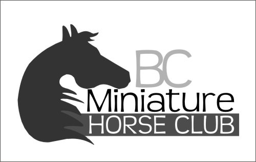
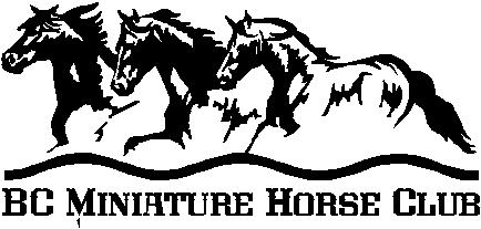
Here is today's effort... what do ya'll think?
-------------------- Bec "Phoebe's Mom" Bermudez Sawatzky's Imagination Corporation Yarrow, BC Posts: 103 | From: Yarrow, BC | Registered: Oct 2007
| IP: Logged |
posted
I like either of your two Bec. The last one would render well as a stitched pattern on a jacket especially in a small size.
-grampa dan (dad)
-------------------- Dan Sawatzky Imagination Corporation Yarrow, British Columbia dan@imaginationcorporation.com http://www.imaginationcorporation.com
Being a grampa is one of the the most wonderful things in the world!!! Posts: 8739 | From: Yarrow, B.C. Canada | Registered: Nov 1998
| IP: Logged |
quote:Originally posted by Bec Bermudez: Alrighty... I'm running out of time here.... hahaha.
I am not doing to re-make of the old one as someone else has done one, and though it is MUCH better than the current logo... it's still... well.... nephewy. LOL I am SO SO trying to make something that is NOT!
Here is today's effort... what do ya'll think?
I like this one alot. Simple and powerful, and looks like it would translate well for alot of different applications.
I think people that like cooler colors may not vote for a bright red horse also.
-------------------- Dan Beach Cylinder 9 Designs 1650 Glassboro Rd Sewell, NJ 08080 Posts: 625 | From: South Jersey | Registered: Sep 2008
| IP: Logged |
posted
I thank you all for your valiant effort... but alas..... the old logo stands. I did manage to wrangle permission to re-draw it and make the horse look like, well... a horse, but the composition must remain the same.
Ah well... what can you do? I tried.
-------------------- Bec "Phoebe's Mom" Bermudez Sawatzky's Imagination Corporation Yarrow, BC Posts: 103 | From: Yarrow, BC | Registered: Oct 2007
| IP: Logged |
posted
I thought dogwoods were trees... Chin up girl, your designs were really nice. There was obviously something else in play that overuled asthetics. That's not uncommon in this business. It is frusterating though isn't it.
-------------------- Did you ever stop to think, and forget to start again? -Winnie the Pooh & A.A. Milne
Kelly Thorson Kel-T-Grafix 801 Main St. Holdfast, SK S0G 2H0 ktg@sasktel.net Posts: 5496 | From: Penzance, Saskatchewan | Registered: May 2002
| IP: Logged |
posted
Tweeking just enough for the design to work but utilizing their elements can swing to your advantage! when they see what can be done to enhance what's already there, they can be most often swayed, because after all, you're still playing by their rules.
posted
About 5 years ago (guess I'm getting old) I found MY solution to Nephew Art!
When I am confronted with the vile stuff, I simply say, "Can I redraw that for you? I have some ideas that may improve the drawing you have."
All the customer has to say is, "No. I like what we have."
From that point on I do not waste one more second of conversation! I do the sign exactly like they want it and I get paid!
An guess what? They are happy!!
-------------------- Tony Vickio The World Famous Vickio Signs 3364 Rt.329 Watkins Glen, NY 14891 t30v@vickiosigns.com 607-535-6241 http://www.vickiosigns.com Posts: 1063 | From: Watkins Glen, New York | Registered: Sep 2001
| IP: Logged |


![[Wink]](wink.gif) But you would have bragging rights and my undying gratitude!
But you would have bragging rights and my undying gratitude! ![[Eek!]](eek.gif)


![[Roll Eyes]](rolleyes.gif)


![[Razz]](tongue.gif)
![[Thanks]](graemlins/thanks.gif)
![[Rolling On The Floor]](graemlins/rolf.gif) Seriously, it's a great logo.
Seriously, it's a great logo.


![[Smile]](smile.gif)


![[I Don t Know]](graemlins/dunno.gif)


 Printer-friendly view of this topic