posted
The customer ordered blue (he says it's green).....that's the first sign. That is the only blue I do.....the wood grain does affect the colors, however.
What would you do?????
joe,
Makin Chips and Havin Fun!
[ August 01, 2008, 12:44 PM: Message edited by: Joe Cieslowski ]
-------------------- Joe Cieslowski Connecticut Woodcarvers Gallery P.O.Box 368 East Canaan CT 06024 jcieslowski@snet.net 860-824-0883 Posts: 2345 | From: East Canaan CT 06024 | Registered: Nov 2001
| IP: Logged |
posted
I would graciously take back the sign. Keep it about a month. Then give it back to him. Make sure there is a green sign nearby when he comes to pick it up. Love....Jill
Posts: 8834 | From: Butler, PA, USA | Registered: Jan 2001
| IP: Logged |
posted
I thought dark blue green when I looked at the first, and yes, it's the wood that probably pushes the color that way. Sise by side no question, it's blue. I know you have already cleared it so I'd do the same thing as Jill suggests
posted
I think you're going to have to fix it, Joe. It doesn't matter if it's your only blue you do. It's definitely an entirely different color. Much as it's a pain, I think also you need to expand your colors, or at least do some tinting to make sure the colors are relatively uniform. Beautiful job...by the way.
posted
I answered "green" when I first saw it. The second one was obviously green (although a very yellow green) so I started to know what you were getting at, but still thought you were pointing out the variety of greens available, to the yellow or blue side. So I wouldn't argue with a customer who said they were expecting something "bluer" if that's a word.
I don't want to hijack your thread, but every time you show one of your stained signs, I think to ask you what kind of would and what kind of stain you use. They're really attractive. So, if you would be so kind...
-------------------- Paul Luszcz Zebra Visuals 27 Water Street Plymouth, MA 02360 508 746-9200 paul@zebravisuals.com Posts: 483 | From: 27 Water Street, Plymouth, MA 02360 | Registered: Jul 2003
| IP: Logged |
I would explain that the warm wood colour and the gold leaf is making the blue appear to be on the warm side (Blue Green). Show them the original colour chip. I'd let them know if they wanted a solid blue colour they will have to sacrifice the wood grain look.
posted
Thanks Everybody......more suggestions are still welcome!!!
Maybe by answering Paul, ya'll will see what happens.
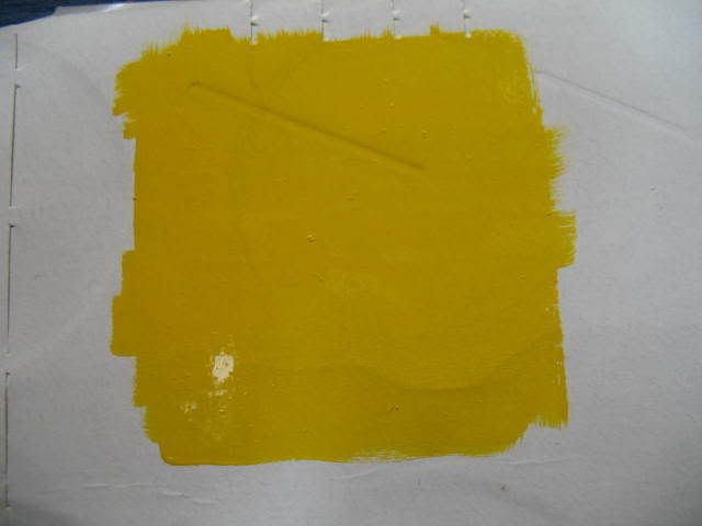
Paul, I use Eastern White pine. I use 1Shot (dark Blue, DarkGreen etc.) thinned with reducer about 50% and "stain" the wood. Here is what happens....each board has a variety of grain densities. The wider bands are spring wood......very absorbent and accept a lot of stain. The summer wood.....the narower bans, are denser and don't absorb as much stain. As a result, the cream or white color of that part of the grain "mixes" with the stain.....resulting in a blue/yellowish mix which shows green.....hence the problem. (Sometimes, even with black, it can look quite brown) If you look carefully at the samples, you can see the dark green or blue areas.
Now, The customer picked this color from samples that I show. Problem is the samples are 3 years old and the wood gets a patina with time.....sorta an amber color so you don't see such a dramatic color shift on the wood.....hense the delima....in time, this will get bluer (if that's a word).
I'm thinking of offering them a painted blue HDU sign.......cause if I do the same thing again,I'd probly I'd get the same results.....
I'm still open for Ideas.
Thanks Abunch Again,
joe,
Makin Chips and Havin Fun!
-------------------- Joe Cieslowski Connecticut Woodcarvers Gallery P.O.Box 368 East Canaan CT 06024 jcieslowski@snet.net 860-824-0883 Posts: 2345 | From: East Canaan CT 06024 | Registered: Nov 2001
| IP: Logged |
posted
Hi Joe. The first sample appeared Teal to my eye, but the 2nd had a more "greenish" cast to it. As a corrective measure, I might try tinting a satin varnish with a small amount of blue/turquoise, and apply that to the teal surfaces with a brush or quill. You want a transparent blue so that the teal combines with the overglaze to arrive at the "correction". To arrive at the optimal level of transparency, it would be a good idea to try a couple of different glaze densitied on a test sample piece of similar wood.
Suggestion: Your explanation of the aging of the wood patina should be printed out and posted right next to the colour samples that you have. Whenever a customer selects their colour from an "aged" sample, get them to read that explanation so that they won't become surprised at another possible "colour variation" in the future.
Edited to change the tint colour, since I misunderstood which final "target colour was desired.
[ August 01, 2008, 03:01 PM: Message edited by: Ken Henry ]
-------------------- Ken Henry Henry & Henry Signs London, Ontario Canada (519) 439-1881 e-mail: kjmlhenry@rogers.com
Why do I get all those on-line offers to sell me Viagara, when the only thing hardening is my arteries ? Posts: 2684 | From: London,Ontario, Canada | Registered: Feb 1999
| IP: Logged |
posted
For me its easy to see why one would dispute the color but if I were in that particular business I would have samples of the painted wood both in new and the Patina as you state. I could just guess that your Patina would mean that the wood has darkened with age, is that correct?
I believe it may be time consuming but yet simple to have these paint formulas on the woods available for your potential customers to view. I know its different in my business as the vehicles are in front of me but not all color looks the same on every vehicle and base.
-------------------- HotLines Joey Madden - pinstriping since 1952 'Perfection, its what I look for and what I live for'
posted
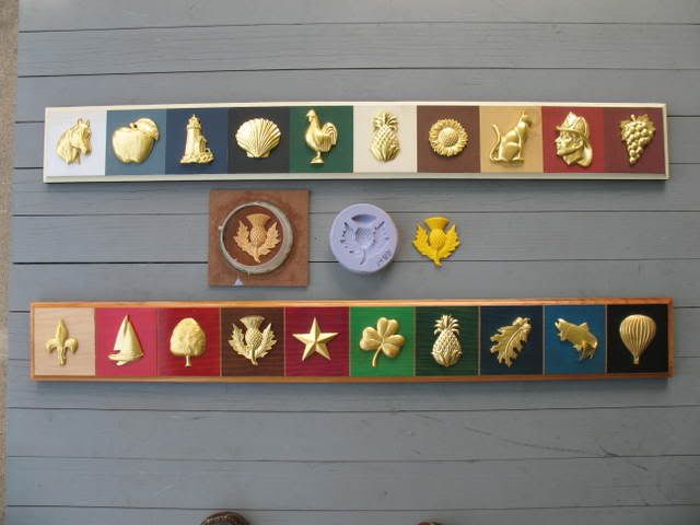
Here is a shot of my booth set up..... color samples are along the bottom center and right panels......they have the ornaments on em.
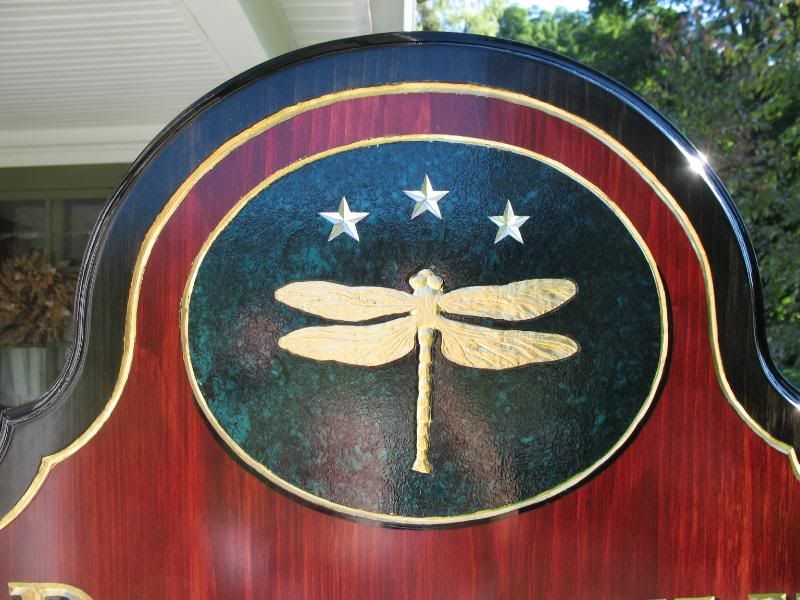
here is a close up.....
the top one has samples of solid stains.....the bottom is the transparent stained ones. The dark blue is behind the oak leaf......notice the amber color on the edges of these boards.....that's the color that will develop over time.
Thanks again,
joe,
Makin Chips and Havin fun!
[ August 01, 2008, 03:32 PM: Message edited by: Joe Cieslowski ]
-------------------- Joe Cieslowski Connecticut Woodcarvers Gallery P.O.Box 368 East Canaan CT 06024 jcieslowski@snet.net 860-824-0883 Posts: 2345 | From: East Canaan CT 06024 | Registered: Nov 2001
| IP: Logged |
posted
Many years ago a quite wild and insane man living in a school bus in the middle of a nearby salvage yard was faced with a dilemma quite like yours in that a decision he was about to make boiled down to the question of money.
Seems he had an V-8 aluminum dual-4 intake that was hanging on the wall of his shed that many people constantly begged him to sell. When he just couldn't get his asking price, he got his shotgun and (to the frightened dismay of the gathering onlookers) permanently removed the intake (and his problem) from the wall.
The moral of this story? Well, do you own a shotgun?
Deals like this make you wish you did.
(and yes, that was a true story--but please, I'm only kidding about shotgunning the sign-!!!)
-------------------- Michael Gene Adkins The Fontry 1576 S Hwy 59 Watts OK 74964 Posts: 845 | From: Watts, OK USA | Registered: Jun 1999
| IP: Logged |
posted
Sounds like you making a stain out of paint. If this is true it will always be tough to match a color from wood to wood. I tell the customer, if they want a certain color, I paint it. If you want stain the color may vary. This is also the problem with woods that are soft and suck up the stain, tough to control. I know Joe loves pine but for my taste it is foam or Mahogany.
-------------------- Rob Larkham Sign Techniques Inc. Chicopee, Ma Posts: 607 | From: Chester, Ma. | Registered: Apr 2002
| IP: Logged |
posted
Tell him to give the optimetrist a look at his colorsight. He might without knowing it beeing some kinda of colorblind and seeing some blues as greenish
Or get a colorsight-testing chart and ask him if see all the numbers;)
Yes it is green, but I know my eyes!
-------------------- Stein Saether GullSkilt AS Trondheim Posts: 1183 | From: Trondheim Norway | Registered: Nov 1998
| IP: Logged |
posted
Very nice set up Joe and I understand the dilemma yet I believe that your client does not comprehend that the color he chose is the same you put there. He must understand that the wood has grain which is both light and dark and this is why it appears this way.
I laughed when I wrote this as it seems so elementary to persons like us.
-------------------- HotLines Joey Madden - pinstriping since 1952 'Perfection, its what I look for and what I live for'
posted
You can't ever tell *exactly* what the final result will be over wood with a clear stain. Surely he can't be so clueless as to not know that. Solid color? That's easy to get the same every time, but not with a tinted clear stain and no two pieces of wood will look exactly alike either. I once installed a set of cabinets; the homeowner complained to the company I worked for that the "doors don't match". They were solid oak with a honey finish. She was expecting all the grain to be exactly the same, LOL. Stupid people's unrealistic expectations can drive you crazy.
-------------------- Ricky Jackson Signs Now 614 Russell Parkway Warner Robins, GA (478) 923-7722 signpimp50@hotmail.com
"If I have seen further it is by standing on the shoulders of giants." Sir Issac Newton Posts: 3528 | From: Warner Robins, GA | Registered: Oct 2004
| IP: Logged |
posted
You could try the overglaze suggestion or just paint the stained area blue, saves redoing the sign. Which by the way I wouldn't do, he got what he ordered.
Take a scrap piece of wood and stain it the blue the client says he wants. Have him sign off on it and restain the sign to match.
IMHO, the problem is communication. If you show him a particular shade of blue without properly explaining the possibility of color shifts, then he has every right to reject the job if the blue he gets doesn't look like the blue he was shown.
Chalk it up to paid tuition to the School of Hard Knocks and move on. Life is too short.
posted
It appears that your customer was expecting a color something more like directly to the right and left side of the 4. I would venture to guess that they'd probably prefer a more uniform look also and wouldn't be opposed to a lesser woodgrain look. Therefore I wonder, how difficult would it be to refinish the stained areas with the paint thinned only about 25 percent while making an effort to shift the color uniformly? If that was practical, and I couldn't convince the customer otherwise as Shane suggested, I think I'd attempt to refinish it. I would also take the suggestion that in the future you have a little more of a disclaimer concerning the finish in order to avoid this issue.
-------------------- Gary Boros SIGNWORKS STUDIOS LLC Monroe, Connecticut, USA Posts: 264 | From: Monroe, Connecticut, USA | Registered: Dec 2007
| IP: Logged |
posted
Try overlaying it with a reducer, 25% blue and say 5 - 10% black. This will deepen the blue. If the job HAS to be redone, then it's worth a shot. Have the client there, and do 1 coat, then two coats, then 3 coats etc until he is happy with the colour.
Either way, it IS teal, and teal is always referred to as blue green - not green blue.
Cheers
-------------------- Gregg Sydney Signworks (02) 9837 1198 Schofields NSW Australia Posts: 368 | From: Schofields | Registered: May 2007
| IP: Logged |
Donna, he wanted the blue but said it was green when he got it (the first sign posted...(Carbray).
Overglaze is a nice idea but it would be more trouble than making a new one.
I'll gonna ask if he's willing to hang it for a year (hoping the patina will improve things) and if he's still not happy I'll do one for him painted in HDU.
I'm obviously gonna have to tighten thigs up a bit with my presentation although I've sold literally hundreds of these over the last 4 years with only one other complaint like this.
Oh, the suggestion about using a thicker "stain"....if it's too thick it just smears and streaks.....I just might try a double staining tho (after the first coat dries). Someone called and suggested using reflex or brillent blue instead of dark blue....I might try that.
This has really been a great help to me.....my sincere Thank You, to you all.
BTW, thanks for the compliments also.
joe,
Makin Chips and Havin Fun!
-------------------- Joe Cieslowski Connecticut Woodcarvers Gallery P.O.Box 368 East Canaan CT 06024 jcieslowski@snet.net 860-824-0883 Posts: 2345 | From: East Canaan CT 06024 | Registered: Nov 2001
| IP: Logged |
posted
Joe, If you used a mask to layout your carving on that piece, a fix may be reasonably simple. Can you cut the design again from sandblast or other heavy mask, slightly powder the back to remove most but not all of the tack and cover any areas that are not blue. Then using an airbrush or fine sprayer build up the blue until it is about half as transparent. That should eliminate a lot of the greenish caste created by the wood grain, but still allow some wood grain to show. It would probably only take you an hour and I'm betting you might just discover possibilities of some new effects in the process. I was originally trying to figure out what you could use to just pour over the surface, sweep off and leave in the grooves but couldn't think of anything.
-------------------- Did you ever stop to think, and forget to start again? -Winnie the Pooh & A.A. Milne
Kelly Thorson Kel-T-Grafix 801 Main St. Holdfast, SK S0G 2H0 ktg@sasktel.net Posts: 5496 | From: Penzance, Saskatchewan | Registered: May 2002
| IP: Logged |
I did use a mask but the layout for the letters didn't come with the mask so I can't really repeat it exactly. (I'm a little low tech here)
The only possibility woud be to use something like a foam brush to apply the glaze by floating it over the surface in hopes of skipping over the carved letters. (I have done this in the past with a recoating of clear). It would be very risky with a glaze....there would be a good chance that some would get on the gold which would be a real mess.
In this case, it probly is more valuable to me as a sample so that folks can see the results when choosing this color combo.
Thanks for keeping my problem in mind. I really appreciate it.
Thanks,
joe,
Makin Chips and Havin Fun!
-------------------- Joe Cieslowski Connecticut Woodcarvers Gallery P.O.Box 368 East Canaan CT 06024 jcieslowski@snet.net 860-824-0883 Posts: 2345 | From: East Canaan CT 06024 | Registered: Nov 2001
| IP: Logged |
posted
Joe, I was just about to suggest that this is a beautiful sample piece.
Hand the guy his deposit back and tell him that you're sorry you couldn't accommodate him.
You can't afford to remake the sign for him, and you don't want to repaint it and give him a sign that is not up to your standards either.
I have come across SO MANY men with color-blindness over the years, and in some cases they didn't even realize it until they were presented with a PMS book in my shop. Most were in the Blue or Green range.
As you go leafing through the samples, they say those telling words, "These all look the same to me!" While you can't be as bold as to accuse them of being color-blind, and some of them REFUSE to admit it to you as if it's a stigma or something, at least you are aware that this may be the problem.
Maybe ask if they have color issues, or give them a test in the future?
-------------------- Gene Golden Gettysburg Signs Gettysburg PA 17325 717-334-0200 genegolden@gettysburgsigns.com
"Art is knowing when to stop." Posts: 1578 | From: Gettysburg, PA | Registered: Jun 2003
| IP: Logged |
I still haven't talked to him but I'm gonna show him the sample he saw at the show and point out the difference with a patina......I'll see if I can talk him into hanging it for a year to get the patina on his panel.....here are the two shots......you can't see the color of the boarder on his cause of the burgundy paint but you can see the difference on the back...
The sample is really bluer.....
Thanks again Everybody!!!!
joe,
Makin Chips and Havin Fun!
[ August 07, 2008, 09:37 AM: Message edited by: Joe Cieslowski ]
-------------------- Joe Cieslowski Connecticut Woodcarvers Gallery P.O.Box 368 East Canaan CT 06024 jcieslowski@snet.net 860-824-0883 Posts: 2345 | From: East Canaan CT 06024 | Registered: Nov 2001
| IP: Logged |
posted
Joe I noticed the bluer color as well from the sample. Is it possible you thinned the paint too much, it definitely looks like more pigment on the sample.
-------------------- Bob Rochon Creative Signworks Millbury, MA 508-865-7330
"Life is Like an Echo, what you put out, comes back to you." Posts: 5149 | From: Millbury, Mass. U.S. | Registered: Nov 1998
| IP: Logged |
posted
I tell my customers that wood has it's own mind : how it wants to move, what colour it will be, it's a natural material and is unpredictable - that's the beauty of it. Other than that it's plastic.
I think it's a good idea to let them live with it awhile, they'll get attached and the whole issue will blow over.
posted
it's all beautiful work Joe...but maybe it's a color perception problem. The only time I ever "kicked a customer outta my office" was over a dispute regarding pretty much this exact same thing. It seems his idea of blue green/dark teal differed from mine. Made me set policy regarding colored artwork and color matching...


![[Frown]](frown.gif)


![[Wink]](wink.gif)


![[Smile]](smile.gif)
![[Thanks]](graemlins/thanks.gif)


![[I Don t Know]](graemlins/dunno.gif)


 Printer-friendly view of this topic