Letterville Bull Board Letterville | Bull Board


Front Page
A Letterhead History
About Us
Become A Resident
Edit Your Database Info
Find A Letterhead

Letterville Merchants
Resident Downloads
Letterville BookShop
Future Live Meets
Past Meets
Step-By-Steps
Past Panel Swaps
Past SOTM
Letterhead Profiles
Business Cards
Become A Merchant

Click on the button
below to chat with other
Letterville users.

http://www.letterville.com/ubb/chaticon.gif

Steve & Barb Shortreed
144 Hill St., E.
Fergus, ON, Canada
N1M 1G9

Phone: 519-787-2892
Fax: 519-787-2673
Email: barb@letterville.com

Copyright ©1995-2008
The Letterhead Website


The Letterville BullBoard Post New Topic  New Poll  Post A Reply
my profile login | search | faq | calendar | im | forum home

  next oldest topic   next newest topic
» The Letterville BullBoard » Letterhead/Pinstriper Talk » A How Big Question

 - UBBFriend: Email this page to someone!    
Author Topic: A How Big Question
Alicia B. Jennings
Resident


Member # 1272

Icon 1 posted      Profile for Alicia B. Jennings   Email Alicia B. Jennings   Send New Private Message       Edit/Delete Post   Reply With Quote 
I 've got a customer, who needs a sign, that could be read from a distance of about 700 feet. It's not 700 feet in a strainght line, but it would be off the main road, sloped hill, in a valley. And it would only have two words, For Sale. I'm wondering if 4'x16' would not be large enough. There will also be a smaller sign placed under it with a phone number. That sign would not have to be as large, since the viewer would be able to drive down a road to get closer.

--------------------
Signs by Alicia Jennings (Mudflap Girl)
Tacoma, WA
Since 1987
Have Lipstick, will travel.

Posts: 3820 | From: Tacoma, WA. U.S.A. | Registered: Dec 1999  |  IP: Logged | Report this post to a Moderator
Mike Clayton
Deceased


Member # 723

Icon 1 posted      Profile for Mike Clayton         Edit/Delete Post   Reply With Quote 
I would print out what I wanted to do at 4" by 16"... thats inches, hang it on the wall, and stand 70 feet away, if you can, that will give you a reference point.
I do that alot with colors i'm not sure of, etc.

Readability is key to a good sign.

MC

[ June 01, 2007, 01:41 AM: Message edited by: Mike Clayton ]

--------------------
Mike Clayton
M C Grafix Custom Lettering
New Jersey (again)

Posts: 508 | From: New Jersey | Registered: Apr 1999  |  IP: Logged | Report this post to a Moderator
Jon Butterworth
Deceased


Member # 227

Icon 16 posted      Profile for Jon Butterworth   Email Jon Butterworth   Send New Private Message       Edit/Delete Post   Reply With Quote 
4 x 16ft sign would be totally adequate at that distance. Just two words "FOR SALE" will register easily. Even if the eye does not percive the exact wording, the brain fills in the gaps.

Rule of thumb: Restrict long distance signs to 5 words or less and keep to high contrast colors. That's about what the brain can assumulate at speed.

They will pick up the phone number in passing. BUT that's only if they stop and go back! Nobody registers phone numbers at speed, remembers, or has time and place to write them down.

PS: Use BOLD Block letters for the "FOR SALE" and open up the kerning a bit. Distort Vertical or use Condensed font ... stay within a 1:4 format size and HIGH contrast to background.

[ June 01, 2007, 02:55 AM: Message edited by: Jon Butterworth ]

--------------------
Bushie^
aka Jon Butterworth

Executive Director
HARDLY NORMAL
SIGN COMPANY

http://www.icr.com.au/~jonsigns

Posts: 4014 | From: Toowoomba, Queensland, Australia | Registered: Nov 1998  |  IP: Logged | Report this post to a Moderator
Checkers
Resident


Member # 63

Icon 1 posted      Profile for Checkers   Author's Homepage   Email Checkers   Send New Private Message       Edit/Delete Post   Reply With Quote 
Hiya Alicia,
Here are a few more suggestions...
Gemini offers a letter visibility chart on their web site. It's always a good point of reference...
http://signletters.com/PDFs/LetterVisibility.pdf
at 750' they suggest a minimum of a 33" letter.
Also, for maximum visibility, I was always taught to estimate 1" letter height for every 10' of viewing distance.
Finally, the USSC published some sign sizing formulas in their last newsletters that takes into consideration driving speed and and sign position. I'm still digesting this information though. If you didn't get their printed newsletter, it is available for download on their site...
www.ussc.org

Havin' fun,

Checkers

--------------------
a.k.a. Brian Born
www.CheckersCustom.com
Harrisburg, Pa
Work Smart, Play Hard

Posts: 3775 | From: Harrisburg, Pa. U.S.A. | Registered: Nov 1998  |  IP: Logged | Report this post to a Moderator
Alicia B. Jennings
Resident


Member # 1272

Icon 1 posted      Profile for Alicia B. Jennings   Email Alicia B. Jennings   Send New Private Message       Edit/Delete Post   Reply With Quote 
Which one? I was gonna use Bright Red for the background and white or Lemeon yellow for the lettering.  -

--------------------
Signs by Alicia Jennings (Mudflap Girl)
Tacoma, WA
Since 1987
Have Lipstick, will travel.

Posts: 3820 | From: Tacoma, WA. U.S.A. | Registered: Dec 1999  |  IP: Logged | Report this post to a Moderator
Bill Lynch
Resident


Member # 3815

Icon 1 posted      Profile for Bill Lynch   Email Bill Lynch   Send New Private Message       Edit/Delete Post   Reply With Quote 
Bottom One/ stay with white

--------------------
Bill Lynch
Century Sign
Hamden, CT
centurysign@snet.net

Posts: 1126 | From: Hamden, CT | Registered: Apr 2003  |  IP: Logged | Report this post to a Moderator
Randy Campbell
Visitor
Member # 2675

Icon 1 posted      Profile for Randy Campbell   Email Randy Campbell   Send New Private Message       Edit/Delete Post   Reply With Quote 
Bottom one.

--------------------
Randall Campbell
Randy's Graphics,
420 Fairfield N.
Hamilton Ontario Canada

Posts: 2857 | From: Hamilton Ontario Canada | Registered: Jan 2002  |  IP: Logged | Report this post to a Moderator
Jeff Ogden
Resident


Member # 3184

Icon 1 posted      Profile for Jeff Ogden   Email Jeff Ogden   Send New Private Message       Edit/Delete Post   Reply With Quote 
None of them. Use all caps, as bold as you dare. Then widen the space between letters by 50-100 %
I guarantee it will be seen.

Always use non-serif copy. Serifs only confuse the eye at a distance.

--------------------
Jeff Ogden
8727 NE 68 Terr.
Gainesville FL, 32609

Posts: 2138 | From: 8827 NE 68 Terr Gainesville Fl 32609 | Registered: Aug 2002  |  IP: Logged | Report this post to a Moderator
Alicia B. Jennings
Resident


Member # 1272

Icon 1 posted      Profile for Alicia B. Jennings   Email Alicia B. Jennings   Send New Private Message       Edit/Delete Post   Reply With Quote 
Like this?  - I usually don't like all caps.

--------------------
Signs by Alicia Jennings (Mudflap Girl)
Tacoma, WA
Since 1987
Have Lipstick, will travel.

Posts: 3820 | From: Tacoma, WA. U.S.A. | Registered: Dec 1999  |  IP: Logged | Report this post to a Moderator
Ray Rheaume
Resident


Member # 3794

Icon 1 posted      Profile for Ray Rheaume   Email Ray Rheaume   Send New Private Message       Edit/Delete Post   Reply With Quote 
Hi Alicia,

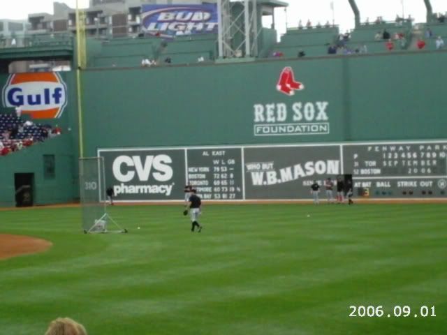
Here's one way to get an idea of what kind of scale you many need for it to be easily visible from 700 feet away.

Here's a shot of the Green Monster at Fenway Park in Boston.
 -

As you can see by the two players standing on the warning track, who are around 6 ft tall, the scoreboard itself is around 12 to 15 feet tall. The "CVS" letters are taller that the ball players.
Again, that shot is from HALF the distance you will be doing that sign from.

I did a little plotting out and came up with this...
 -

6 sheets
24 ft long with 3 foot lettering/line
192 sq ft

I completed a sign that size last fall and, IMHO, it wouldn't work from that far away. Would look smaller than a business card at arms length.

Hope the customer knows what they are asking you to do. At that distance, a 12 foot tall sign MIGHT work, but it would have to be around 32 ft long.
384 sq ft=12 sheets of material.

Hope this sizes it up better... [Wink]
Rapid

--------------------
Ray Rheaume
Rapidfire Design
543 Brushwood Road
North Haverhill, NH 03774
rapidfiredesign@hotmail.com
603-787-6803

I like my paint shaken, not stirred.

Posts: 5648 | From: North Haverhill, New Hampshire | Registered: Apr 2003  |  IP: Logged | Report this post to a Moderator
Si Allen
Resident


Member # 420

Icon 1 posted      Profile for Si Allen   Email Si Allen   Send New Private Message       Edit/Delete Post   Reply With Quote 
Alicia...here's a good reason to take a trip to Las Vegas!

Take your camera and tape measure along and check out the signs along I-15!

Best part...it would be a work related tax write off!


[I Don t Know]

[ June 01, 2007, 08:30 PM: Message edited by: Si Allen ]

--------------------
Si Allen #562
La Mirada, CA. USA

(714) 521-4810

si.allen on Skype

siallen@dslextreme.com

"SignPainters do It with Longer Strokes!"

Never mess with your profile while in a drunken stupor!!!

Brushasaurus on Chat

Posts: 8831 | From: La Mirada, CA, USA | Registered: Nov 1998  |  IP: Logged | Report this post to a Moderator
Donald Miner
Visitor
Member # 6472

Icon 1 posted      Profile for Donald Miner   Email Donald Miner       Edit/Delete Post   Reply With Quote 
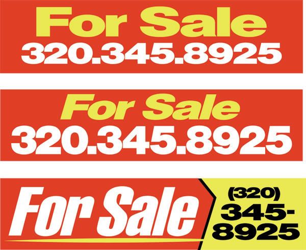
Alicia, Chrome yellow bkg. Black letters. This is a time proven color combo for billboards. It shows up against green grass or white snow. I've been active in this crazy sign business for 47 years. I have had many clients comment on the readability of this combination. Give a test print, I think you will like it. Good Luck! Don

--------------------
Donald Miner
ABCO Wholesale Neon
1168 Red Hill Creek
Dobson, NC

Posts: 842 | From: North Carolina | Registered: Apr 2006  |  IP: Logged | Report this post to a Moderator
Jon Butterworth
Deceased


Member # 227

Icon 1 posted      Profile for Jon Butterworth   Email Jon Butterworth   Send New Private Message       Edit/Delete Post   Reply With Quote 
Ray's example is for a fixed point of viewing. Assuming viewers are travelling towards the sign at 60mph they will cover the distance in less than 20 seconds. In 5 seconds the sign will appear twice the size!

Two words, Block Letters all caps, opened kerning, either white on red or Black on Yellow will register fine the size (2 sheets) you planned on.

--------------------
Bushie^
aka Jon Butterworth

Executive Director
HARDLY NORMAL
SIGN COMPANY

http://www.icr.com.au/~jonsigns

Posts: 4014 | From: Toowoomba, Queensland, Australia | Registered: Nov 1998  |  IP: Logged | Report this post to a Moderator
Michael R. Bendel
Visitor
Member # 5847

Icon 1 posted      Profile for Michael R. Bendel   Author's Homepage   Email Michael R. Bendel       Edit/Delete Post   Reply With Quote 
Do the Ray thing! Absolutely.
Simple, high contrast, VERY large, 17 letter signs, with little or no artistic layout always stands out!


There is a place for LARGE, simple, bold, non-serif letters & it's not limited to For Sale & For Lease.

Target,
Sears,
& Kmart to mention a few. They read pretty easy.

Here's my simple 2 cents...

 -

--------------------
Michael R. Bendel
Bendel Sign Co,. Inc.
Sauk Rapids, MN

Posts: 913 | From: Sauk Rapids, MN | Registered: Jul 2005  |  IP: Logged | Report this post to a Moderator
Alicia B. Jennings
Resident


Member # 1272

Icon 1 posted      Profile for Alicia B. Jennings   Email Alicia B. Jennings   Send New Private Message       Edit/Delete Post   Reply With Quote 
The phone number is going to be on a separate sign. And I already painted the backgtound red. But Im' not sure if I want to go with all caps or upper and lower case. After the sign goes up, I'll post a pic from the road.

--------------------
Signs by Alicia Jennings (Mudflap Girl)
Tacoma, WA
Since 1987
Have Lipstick, will travel.

Posts: 3820 | From: Tacoma, WA. U.S.A. | Registered: Dec 1999  |  IP: Logged | Report this post to a Moderator
Jon Butterworth
Deceased


Member # 227

Icon 1 posted      Profile for Jon Butterworth   Email Jon Butterworth   Send New Private Message       Edit/Delete Post   Reply With Quote 
Sorry Mike,

If you can read and/or remember the phone number on any one of those sign examples at 60mph I will give you a lollipop!

Make that a Cherry Ripe ... I'm taking couple pounds of them to Canada.

[Rolling On The Floor] [Rolling On The Floor]

--------------------
Bushie^
aka Jon Butterworth

Executive Director
HARDLY NORMAL
SIGN COMPANY

http://www.icr.com.au/~jonsigns

Posts: 4014 | From: Toowoomba, Queensland, Australia | Registered: Nov 1998  |  IP: Logged | Report this post to a Moderator
Jon Butterworth
Deceased


Member # 227

Icon 1 posted      Profile for Jon Butterworth   Email Jon Butterworth   Send New Private Message       Edit/Delete Post   Reply With Quote 
Actually Alicia if you cut the phone number off the end off Mike's Last example ... maybe open the kerning a fraction that would be it!

Especially if you cut the ends of the panels on an "arrow shape" like mike's design.

Out of the "square" shape signs catch the eye!

[ June 02, 2007, 10:44 AM: Message edited by: Jon Butterworth ]

--------------------
Bushie^
aka Jon Butterworth

Executive Director
HARDLY NORMAL
SIGN COMPANY

http://www.icr.com.au/~jonsigns

Posts: 4014 | From: Toowoomba, Queensland, Australia | Registered: Nov 1998  |  IP: Logged | Report this post to a Moderator
Bobbie Rochow
Resident


Member # 3341

Icon 1 posted      Profile for Bobbie Rochow   Email Bobbie Rochow   Send New Private Message       Edit/Delete Post   Reply With Quote 
I agree with Jeff, all caps, widen the kerning.

--------------------
The Word in Signs
Bobbie Rochow
Jamestown, PA 16134

724-927-6471

thewordinsigns@alltel.net

Posts: 3485 | From: Jamestown, PA 16134 | Registered: Oct 2002  |  IP: Logged | Report this post to a Moderator
Sandy Baird
Resident


Member # 4773

Icon 1 posted      Profile for Sandy Baird   Author's Homepage   Email Sandy Baird   Send New Private Message       Edit/Delete Post   Reply With Quote 
I think they have done a number of studies especially with highway sinage, and have found the using words in both upper and lower cases,
are easier for people to read.

The eye and brain combination uses the silhouette of the word to help us fill in the blanks.

All caps have a shape of just a rectangle while upper and lower have a distinct shape that the brain recognizes and helps process the information more quickly.

I think some posted a paragraph here once and every word was spelled wrong but the brain was able to decipher it and made reading the misspelled words make sense.

Just thinking out loud (well not really)

monk

--------------------
Sandy "Monk" Baird
Windwalker Sign Studio
Port Colborne, Ontario
L3K 4H9

Posts: 442 | From: Port Colborne, Ontario, Canada | Registered: Jun 2004  |  IP: Logged | Report this post to a Moderator
Jeff Ogden
Resident


Member # 3184

Icon 1 posted      Profile for Jeff Ogden   Email Jeff Ogden   Send New Private Message       Edit/Delete Post   Reply With Quote 
Interesting Sandy...the ultimate readability may be best upper and lower in certain instances. But I think the "punch" for a headline is still best all upper, although I stand willing to be corrected. After all,there is alot of experience on this board.

I always see the secondary copy as upper and lower case, because it gives that info the strongest emphasis, without overpowering the main copy.

--------------------
Jeff Ogden
8727 NE 68 Terr.
Gainesville FL, 32609

Posts: 2138 | From: 8827 NE 68 Terr Gainesville Fl 32609 | Registered: Aug 2002  |  IP: Logged | Report this post to a Moderator
Lee Kembel
Visitor
Member # 7577

Icon 1 posted      Profile for Lee Kembel   Author's Homepage   Email Lee Kembel       Edit/Delete Post   Reply With Quote 
Not to derail the thread, but heres something interesting I just read along the lines of what Sandy is saying. Should be the first article, "FSI Releases Spiekermann’s FF Mt":

http://typographi.com/

I think that sort of illustrates how word recognition isn't so much about clear and legible letters as it is context and shape of entire words.

[ June 02, 2007, 03:28 PM: Message edited by: Lee Kembel ]

--------------------
Lee Kembel
Aberrant Airbrush
Saskatoon, Saskatchewan
Canada

Posts: 99 | From: Saskatoon | Registered: Apr 2007  |  IP: Logged | Report this post to a Moderator
Michael R. Bendel
Visitor
Member # 5847

Icon 1 posted      Profile for Michael R. Bendel   Author's Homepage   Email Michael R. Bendel       Edit/Delete Post   Reply With Quote 
Upper & lower case soften the outer perimeters of a sign Jon & yes widening the spaces between the letters makes it more readable, but alot more unattractable...?

[I Don t Know]

--------------------
Michael R. Bendel
Bendel Sign Co,. Inc.
Sauk Rapids, MN

Posts: 913 | From: Sauk Rapids, MN | Registered: Jul 2005  |  IP: Logged | Report this post to a Moderator
Michael R. Bendel
Visitor
Member # 5847

Icon 1 posted      Profile for Michael R. Bendel   Author's Homepage   Email Michael R. Bendel       Edit/Delete Post   Reply With Quote 
Here is my new submission, based on the previous Readability assumptions....  -

I hope you like this... & can read this...

--------------------
Michael R. Bendel
Bendel Sign Co,. Inc.
Sauk Rapids, MN

Posts: 913 | From: Sauk Rapids, MN | Registered: Jul 2005  |  IP: Logged | Report this post to a Moderator
Kelly Thorson
Resident


Member # 2958

Icon 1 posted      Profile for Kelly Thorson   Author's Homepage   Email Kelly Thorson   Send New Private Message       Edit/Delete Post   Reply With Quote 
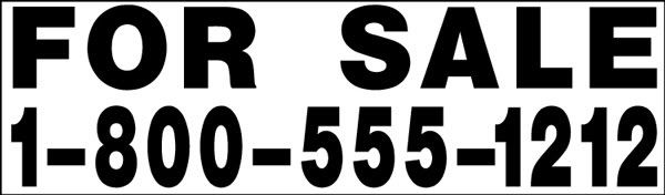
Upper and lower case is definitely more readable when done in a simple type.
Type the words "for sale" out both ways and print it....pin it on a wall and back up until you can only decipher one line....that should convince you. I've used this with clients a number of times...I got my biggest ongoing and most profitable client that way, simply by typing out their system standard (all caps)and my version of upper and lower.
I think there are rules as well as exceptions to every rule, but the visual test does it for me.

--------------------
“Did you ever stop to think, and forget to start again?”
-Winnie the Pooh & A.A. Milne

Kelly Thorson
Kel-T-Grafix
801 Main St.
Holdfast, SK
S0G 2H0
ktg@sasktel.net

Posts: 5496 | From: Penzance, Saskatchewan | Registered: May 2002  |  IP: Logged | Report this post to a Moderator
Curtis hammond
Visitor
Member # 2170

Icon 1 posted      Profile for Curtis hammond   Email Curtis hammond   Send New Private Message       Edit/Delete Post   Reply With Quote 
i wish kelly's pic was facing in..

--------------------
Leaper of Tall buildings.. If you find my posts divisive or otherwise snarky please ignore them. If you do not know how then PM me about it and I will demonstrate.

Posts: 5274 | From: Im a nowhere man | Registered: Jul 2001  |  IP: Logged | Report this post to a Moderator
Jon Butterworth
Deceased


Member # 227

Icon 1 posted      Profile for Jon Butterworth   Email Jon Butterworth   Send New Private Message       Edit/Delete Post   Reply With Quote 
How about that Curt?

 -

She's facing inwards!

Looks like Kelly viewed from "Down Under"

Gimme a couple weeks and she will be hanging up-side down from the rafters and speaking OZ.

[Rolling On The Floor] [Rolling On The Floor] [Rolling On The Floor]

[ June 07, 2007, 04:45 AM: Message edited by: Jon Butterworth ]

--------------------
Bushie^
aka Jon Butterworth

Executive Director
HARDLY NORMAL
SIGN COMPANY

http://www.icr.com.au/~jonsigns

Posts: 4014 | From: Toowoomba, Queensland, Australia | Registered: Nov 1998  |  IP: Logged | Report this post to a Moderator
Todd Gill
Resident


Member # 2569

Icon 1 posted      Profile for Todd Gill   Email Todd Gill   Send New Private Message       Edit/Delete Post   Reply With Quote 
"Unattractable?" Did you really say that? [Rolling On The Floor]

"Readability?" Did you really say that too?" [Razz]

Sorry Mike, couldn't help but poke fun at you for those two Mike-isms. Hehehe.

--------------------
Todd Gill
Outside The Lines
Potterville, MI

Posts: 7792 | From: Potterville, MI | Registered: Dec 2001  |  IP: Logged | Report this post to a Moderator
Michael R. Bendel
Visitor
Member # 5847

Icon 1 posted      Profile for Michael R. Bendel   Author's Homepage   Email Michael R. Bendel       Edit/Delete Post   Reply With Quote 
It seemed to flow better the other nite Todd!
I meant unattractive to the common eye... "unattractable! [Rolling On The Floor]


I agree, bad attempt at rewordizizing. [Rolling On The Floor]

--------------------
Michael R. Bendel
Bendel Sign Co,. Inc.
Sauk Rapids, MN

Posts: 913 | From: Sauk Rapids, MN | Registered: Jul 2005  |  IP: Logged | Report this post to a Moderator
   

Quick Reply
Message:

HTML is not enabled.
UBB Code™ is enabled.

Instant Graemlins


Post New Topic  New Poll  Post A Reply Close Topic   Feature Topic   Move Topic   Delete Topic next oldest topic   next newest topic
 - Printer-friendly view of this topic
Hop To:


Contact Us | Letterville. A Community Of Letterheads & Pinheads!

Powered by Infopop Corporation
UBB.classic™ 6.7.2

Search For Sign Supplies
Category:


Letterhead Suppliers Around the World