posted
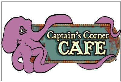
A new customer was referred to me the other day and wants to open a seafood cafe. They seem very interested in theming the inside, so we talked about murals sculptures etc and goin with a capn nemo sort of look with small fish murals scattered about and some copper colored pvc tubing coming out of the walls. heres what I have so far, thoughts or suggestions welcome.
This was a treatment I suggested for around the doors (the doors will be painted copper and the resin rivits applied with epoxy)
heres a detail of my sample, sintra and resin rivits
and heres a quick sample of the octopus that will hang from the soffit in front of the window
the actual octopus will be 8ft long and 1 or 2 tentacles will wrap around underneath
Jon
[ January 29, 2009, 08:35 PM: Message edited by: Jon Peterman ]
-------------------- Jon Peterman 200 Summit Loop Grants Pass, OR -------------------- a.k.a. dc-62 success is in Jesus Christ Posts: 434 | From: grants pass or. usa | Registered: Nov 1998
| IP: Logged |
posted
I might make the sign part of the sign bigger and the octopus part smaller. And because it's me, I like darker backgrounds and lighter colored letters on signs. And becuase I'm a bitsh, I like toned down primary colors for nautical stuff. The painted copper and rivet treatment around the door is looking good. You may be able to make some Hatches for the walls with "Specials" on them.
-------------------- Signs by Alicia Jennings (Mudflap Girl) Tacoma, WA Since 1987 Have Lipstick, will travel. Posts: 3813 | From: Tacoma, WA. U.S.A. | Registered: Dec 1999
| IP: Logged |
posted
colors definatly are not settled yet, still not sure how to handle the octopus yet
-------------------- Jon Peterman 200 Summit Loop Grants Pass, OR -------------------- a.k.a. dc-62 success is in Jesus Christ Posts: 434 | From: grants pass or. usa | Registered: Nov 1998
| IP: Logged |
It looks like you have a great start to a very cool project!!! I look forward to seeing it unfold!
-grampa dan
-------------------- Dan Sawatzky Imagination Corporation Yarrow, British Columbia dan@imaginationcorporation.com http://www.imaginationcorporation.com
Being a grampa is one of the the most wonderful things in the world!!! Posts: 8738 | From: Yarrow, B.C. Canada | Registered: Nov 1998
| IP: Logged |
posted
Jon, I don't want to rain on your parade but... I might suggest a little "friendlier" looking octopus. Something between a realistic and a cartoon. The eyes are the most important, then make it "smile". I would tilt the face into a 3/4 view, so you could see both eyes very clearly. You wouldn't want to scare customers away. Also make the octopus a little smaller with more flowing "arms". After all, it is a SIGN. Please keep us posted on this project.....love the pictures. PS....I need to learn how to post pictures.
[ February 01, 2009, 03:38 PM: Message edited by: John Arnott ]
-------------------- John Arnott El Cajon CA 619 596-9989 signgraphics1@aol.com http://www.signgraphics1.com Posts: 1443 | From: El Cajon CA usa | Registered: Dec 1998
| IP: Logged |
posted
I like the concept, love the rivets/faux effect. But the lack of negative space in the sign copy is killing me. I didn't have time to mess with the fill, so my suggestion is just pasted on. I used pirate-looking free fonts too, trying to be more period-correct I guess. Also took of Mr. Octopus' top eyeball as was suggested. I would make his color more appealing too, maybe a touch more salmon in it. Love....Jill
Posts: 8834 | From: Butler, PA, USA | Registered: Jan 2001
| IP: Logged |
Congrats on the new job, I knew things would turn around for ya It was great seeing you the other evening too!
Now I'm kinda on the fence with Jillbeans on more space. I'd try having the Octopus quite a bit smaller in the upper or lower left with the arms moving out and possibly around a few letters & sign. Give the words more top billing and the Octopus second. The name looks like it's really taking a back seat to the animal by being small but maybe thats the effect you or the client desires. As usual my opinion is just a grain of salt in shaker of life
Your carving looks Awesome! I can't wait to see the final outcome myself.
-------------------- Brian Diver PDQ Signs Everett, Wa
posted
OK then, smaller octopus, friendlier, snakier arms, negative space, and less busy background.
I'll do up a new sketch but they have me on hold for a bit until their equipment is in, and they threw in the idea of a stingray, but the wife really likes the octopus and she's in charge
some inspiration
this was research and dinner last Friday nite
-------------------- Jon Peterman 200 Summit Loop Grants Pass, OR -------------------- a.k.a. dc-62 success is in Jesus Christ Posts: 434 | From: grants pass or. usa | Registered: Nov 1998
| IP: Logged |
posted
. . . uh eww . . . lol . . . I think it's a super fun project too! I love the aged metal-look too. That is awesome.
Please be sure to post pics of the completed project . . .
I'm glad you're making the octopus a little cartoony and not realistic . . . I feel sure that, even tho' people like to eat octopus, if they actually had to stare at a realistic one throughout dinner, they would come to the conclusion that it looks like a giant lugi someone has harked up . . . kind'a like trying to hide 'snot-on-a-cracker' with tobasco sauce . . . my term for a southern staple of oyster, somehow spooned onto a saltine cracker, doused with tobasco sauce and sucked into one's mouth, then the cracker, then a big chug of beer or whiskey, which I suppose is to take one's mind of how much that looks and certainly must feel like a giant lugi in one's mouth . . .
-------------------- Signs Sweet Home Alabama
oneshot on chat
"Look like a girl, act like a lady, think like a man, work like a dog" Posts: 5758 | From: "Sweet Home" Alabama | Registered: Mar 2003
| IP: Logged |
posted
I wonder about some of the things we eat...but I think after seeing the real thing you've got to include some suction cups for added authenticity...I cant beleive you really ate the little guy
posted
actually he was already dead, I bought him (or her) in a package with about eight others, so technically I was playing with my food. I also bought a package of squid to have with them, marinated and grilled for a few minutes, tasty.
-------------------- Jon Peterman 200 Summit Loop Grants Pass, OR -------------------- a.k.a. dc-62 success is in Jesus Christ Posts: 434 | From: grants pass or. usa | Registered: Nov 1998
| IP: Logged |
posted
First off, very great project-I agree with the eye comments, and I really like the rivets and colours...I noticed you have carved the octopus from rigid pink insulation-do you coat it out with anything to portect the foam once it has been painted? I have done a few projects with truck bedliner overtop of a different foam,(then painting it after)and the coating is pretty much bulletproof. It also adds a bit of texture which might not be a bad thing for the octopi if that is a concern, being indoors, it might be overkill...if anyone has any other tips for coating out foam, I would love to hear them...
-------------------- Ken Cade Brokenhead Studio Tyndall, MB R0E 2B0 Posts: 4 | From: Tyndall | Registered: Feb 2009
| IP: Logged |
posted
Now we just don't find critters like that in groups in a bag! Nice gold border, and I think to have a friendly face and some suckers with texture would be a great idea.
-------------------- Deb Fowler
"It's kind of fun to do the impossible - Walt Disney (1901-1966) Posts: 5373 | From: Loves Park, Illinois | Registered: Aug 1999
| IP: Logged |


 You may be able to make some Hatches for the walls with "Specials" on them.


![[Applause]](graemlins/applause.gif) It was great seeing you the other evening too!
It was great seeing you the other evening too! ![[Smile]](smile.gif)
![[Wink]](wink.gif)


![[I Don t Know]](graemlins/dunno.gif)


 Printer-friendly view of this topic