posted
I could use a little advice on this one, I've been looking at this too long and have lost perspective. It's for a 8x12 sign for a rural golf course. The clipart comp will be replaced with a graphic of the actual valley but I plan on using similar colours. I find the plain background a bit bland, and I'm leaning towards something like the first image, but wonder if I should just stick to the plain version, or pull back the contrast more. Is the text readable enough? I'd rather not resort to a golfer, ball or flag, but does it read golf enough?
-------------------- Did you ever stop to think, and forget to start again? -Winnie the Pooh & A.A. Milne
Kelly Thorson Kel-T-Grafix 801 Main St. Holdfast, SK S0G 2H0 ktg@sasktel.net Posts: 5496 | From: Penzance, Saskatchewan | Registered: May 2002
| IP: Logged |
posted
David - Twit! Thanks for your candor Glenn. *edited so Glenn didn't think he was the twit.
[ July 19, 2010, 07:48 PM: Message edited by: Kelly Thorson ]
-------------------- Did you ever stop to think, and forget to start again? -Winnie the Pooh & A.A. Milne
Kelly Thorson Kel-T-Grafix 801 Main St. Holdfast, SK S0G 2H0 ktg@sasktel.net Posts: 5496 | From: Penzance, Saskatchewan | Registered: May 2002
| IP: Logged |
posted
If there's an obvious golf course behind the sign, then I think #1 looks great! (Reminds me of some of Stevo's great panelled-background designs)
-------------------- "Stewey" on chat
"...there are no limits when you aim for perfection..." Jonathan Livingston Seagull Posts: 7014 | From: Highgrove via Toowoomba, Queensland, Australia | Registered: Dec 2002
| IP: Logged |
posted
Looks like you are having the pictorial dictate the layout. The lettering is now working "around" the pictorial, when in fact it should be working with it as a complimentary element.
Stevo
-------------------- Stevo Design Illustration Logos Sign Design Clip Art www.stevo-design.com Posts: 1680 | From: Edmonton Ab Canada EH! | Registered: May 2001
| IP: Logged |
Thanks Stevo, Is there a way to remedy that without shrinking the graphic too much? I did start with the lettering, hence the "valley" like alterations on the letter V. The Golf Course however was squeezed in there later and I admit to having difficulties on where to put it.
-------------------- Did you ever stop to think, and forget to start again? -Winnie the Pooh & A.A. Milne
Kelly Thorson Kel-T-Grafix 801 Main St. Holdfast, SK S0G 2H0 ktg@sasktel.net Posts: 5496 | From: Penzance, Saskatchewan | Registered: May 2002
| IP: Logged |
posted
If the client will go for it, maybe make the Dilke much smaller with the Valleyview predominant, all the way across the sign and lower so that it only covers the bottom of the oval, golf course secondary and the Dilke third, maybe a different type style. The background looks better plain imho. Also, I think the white outline on the shadow makes it harder to read.
[ July 19, 2010, 10:09 PM: Message edited by: Jim Moser ]
-------------------- Life is not about waiting for the storm to pass... It's about learning to dance in the rain ! Jim Moser Design 13342 C Grass Valley Ave. Grass Valley, Ca. 95945 530-273-7615 jwmoser@att.net Posts: 488 | From: Grass Valley, Ca. | Registered: May 2006
| IP: Logged |
posted
Hey Jim, I am inclined to agree with you about the sizing of Dilke to Valleyview and Valleyview placement. Golfers driving to the course would be looking for Valleyview, they already know they are in Dilke! At least they should. I would look at adding letter spacing in these two words as well, they look a little crunched up and not clear as letters. Word spacing in GOLF COURSE might be added, seems to read as one word now. See what it would look like the full width of the bars in the first two panels. Cheers, Bill
-------------------- Bill'n'Annie Davidson Heathcote, NSW, Aus. my Aussie wife, a Toohey's Old, my Holden Ute, Retired from the rat race! Posts: 309 | From: Heathcote, NSW, Australia | Registered: Nov 1998
| IP: Logged |
I'm going to be very honest here, because I think that's what you're looking for - so here goes:
I'd have to disagree with your not wanting to use any golf-related imagery. Golfers L-O-V-E the game... and they identify with the images you're resisting using.
It's a golf-course after all.... if it were me, I'd be using an image that instantly excites the blood of a golf course patron.
The faded bars make me think of a Las Vegas Casino Sign...... the flowers, water and mountains make me think of the Sound of Music, and the one with the subtle green filigrees doesn't say "golf" to me at all.
C'mon Kelly - let's see some balls (and clubs, and fairways) (sorry - lame I know, but couldn't resist hehe)
My 2 pennies :-)
-------------------- Todd Gill Outside The Lines Potterville, MI Posts: 7792 | From: Potterville, MI | Registered: Dec 2001
| IP: Logged |
posted
yurn that oval frame into a driver golf club head.
-------------------- Leaper of Tall buildings.. If you find my posts divisive or otherwise snarky please ignore them. If you do not know how then PM me about it and I will demonstrate. Posts: 5274 | From: Im a nowhere man | Registered: Jul 2001
| IP: Logged |
posted
Thanks for the ideas. Todd the script is Arthur Vanson's Red Sable with modifications on the V and w.
-------------------- Did you ever stop to think, and forget to start again? -Winnie the Pooh & A.A. Milne
Kelly Thorson Kel-T-Grafix 801 Main St. Holdfast, SK S0G 2H0 ktg@sasktel.net Posts: 5496 | From: Penzance, Saskatchewan | Registered: May 2002
| IP: Logged |
posted
I'm having a bit of legibility problems...something easy to try would be to make the outlines of the letters and oval a different color than the letters themselves...all the white kind of runs together for me making it a bit hard to read and somewhat busy...maybe pick up a lite color from the background landscape...I generally like to give some color to my letters but you could play back and forth with color placement...final product might not be better but it's easy to try...oh and like has been mentioned..."GOLFCOURSE" needs more separation
posted
I like #4, I would have cocked the main lettering 45 degrees or so over the oval and center the lettering. Dont care for the bars its a lil too much for me
-------------------- You ever notice how easily accessible people are when they are requiring your services but once they get invoice you can't reach them anymore
posted
Please resist making it look like a driving range sign with golf "stix" and bloody sh!t balls on it. I play golf a couple of times a week here in Oz, and there are not many member courses that have cute little "things" all over their signs. Keep the sophistication in it and you will have a fine sign. I think if the sign has a little uptown look to it, maybe the players will actually repair their divots! Keep up the good work.
-------------------- Bill'n'Annie Davidson Heathcote, NSW, Aus. my Aussie wife, a Toohey's Old, my Holden Ute, Retired from the rat race! Posts: 309 | From: Heathcote, NSW, Australia | Registered: Nov 1998
| IP: Logged |
posted
#3 or 4 works for me wa-a-ay better than the ones with the vertical stripes, and being an avid golfer, you certainly can use some reference to Golf without over doing it.... band I'm sure once you get rid of the clipart and replace it with a more appopiate shot of the course it will come together.. Love the typestyle.
[ July 20, 2010, 07:53 AM: Message edited by: Neil D. Butler ]
-------------------- "Keep Positive"
SIGNS1st. Neil Butler Paradise, NF Posts: 6277 | From: St. John's NF Canada | Registered: Mar 1999
| IP: Logged |
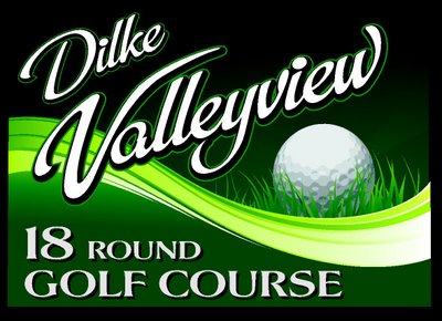
posted
Okay I'll give you guys 1 ball - but that's it! Here is a totally different take on it. I still have to go in and open up the kerning on the script, but I'll do the fine tuning once I have the design nailed down. Looks like I could shrink the text a bit too.
-------------------- Did you ever stop to think, and forget to start again? -Winnie the Pooh & A.A. Milne
Kelly Thorson Kel-T-Grafix 801 Main St. Holdfast, SK S0G 2H0 ktg@sasktel.net Posts: 5496 | From: Penzance, Saskatchewan | Registered: May 2002
| IP: Logged |
posted
Here is a redo of the original as well. I tried to address the comments made, but it doesn't seem quite right to me. Again, I haven't adjusted the kerning on the main script.
-------------------- Did you ever stop to think, and forget to start again? -Winnie the Pooh & A.A. Milne
Kelly Thorson Kel-T-Grafix 801 Main St. Holdfast, SK S0G 2H0 ktg@sasktel.net Posts: 5496 | From: Penzance, Saskatchewan | Registered: May 2002
| IP: Logged |
quote:Originally posted by Sandy Baird: It looks rich and gives me the feeling of a well cared for golf course.
Oh oh.....
-------------------- Did you ever stop to think, and forget to start again? -Winnie the Pooh & A.A. Milne
Kelly Thorson Kel-T-Grafix 801 Main St. Holdfast, SK S0G 2H0 ktg@sasktel.net Posts: 5496 | From: Penzance, Saskatchewan | Registered: May 2002
| IP: Logged |
posted
I think you have the last one right. It Does give the feeling of a well cared for golf course. It would be and 18 HOLE golf course to be correct. But it would only be indicated to be a 9 hole course, if it weren't a full 18. Or, 27 holes if it included a 9 hole "executive" course, a quicky for business people. Good job, well done.
Kerning took care of itself because of the relative size to the overall sign.
-------------------- Bill'n'Annie Davidson Heathcote, NSW, Aus. my Aussie wife, a Toohey's Old, my Holden Ute, Retired from the rat race! Posts: 309 | From: Heathcote, NSW, Australia | Registered: Nov 1998
| IP: Logged |
posted
I like the one with the ball ..... much more dynamic and catches your attention ! .... and I'm not a golfer.
-------------------- Life is not about waiting for the storm to pass... It's about learning to dance in the rain ! Jim Moser Design 13342 C Grass Valley Ave. Grass Valley, Ca. 95945 530-273-7615 jwmoser@att.net Posts: 488 | From: Grass Valley, Ca. | Registered: May 2006
| IP: Logged |
posted
I'm liking both new ones...the letters with a darker pinline are no longer vibrating to my eyes...and with the right composition in the oval...things could get even better...also lovin the ball in the new composition...in the end both would make nice signs
posted
The one with the golf ball is a definite winner when you do as the others have said, change "round" to "hole". The redo with the graphic is much better. The only thing killing it is that stock photo. Where I could lean toward the graphic layout would be if that course has a signature hole. That is a hole that is very unique. Some examples of some local courses near me are; one has a green that is about 6 times the average size. Another course has a par three with a 200 foot vertical drop from the tee to the green. Another has the opposite with a 75 foot rise from tee to green. A photo of a signature hole would work for me.
-------------------- Dave Sherby "Sandman" SherWood Sign & Graphic Design Crystal Falls, MI 49920 906-875-6201 sherwoodsign@sbcglobal.net Posts: 5396 | From: Crystal Falls, MI USA | Registered: Apr 1999
| IP: Logged |
I really like the one with the ball but if your working on the second on try Having a darker Green fading in.. It seems to draw your Eye into the sign more. But Hey what do I know...
Terry - I think this will be a combination of paint and vinyl on Dibond. I'll likely paint the graphics and do the lettering in Vinyl - no digital. If they are willing to go (pay for) the extra mile I'll airbrush it with Auto Air and have it clear coated. In my opinion that gives the most vibrant crisp sign with good longevity.
Bill - I'm not a golfer as you can tell - but the client set me straight...and it is actually only a 9 hole course. But I don't feel bad because someone from their town gave me the information.
Anyhow, I gave a printout of the last two designs to them along with a ballpark estimate and we'll see what they pick, if either.
-------------------- Did you ever stop to think, and forget to start again? -Winnie the Pooh & A.A. Milne
Kelly Thorson Kel-T-Grafix 801 Main St. Holdfast, SK S0G 2H0 ktg@sasktel.net Posts: 5496 | From: Penzance, Saskatchewan | Registered: May 2002
| IP: Logged |


![[Smile]](smile.gif)
![[Wink]](wink.gif)


![[Big Grin]](biggrin.gif) (sorry - lame I know, but couldn't resist hehe)
(sorry - lame I know, but couldn't resist hehe)


![[Rolling On The Floor]](graemlins/rolf.gif)


 Printer-friendly view of this topic