Letterville Bull Board Letterville | Bull Board


Front Page
A Letterhead History
About Us
Become A Resident
Edit Your Database Info
Find A Letterhead

Letterville Merchants
Resident Downloads
Letterville BookShop
Future Live Meets
Past Meets
Step-By-Steps
Past Panel Swaps
Past SOTM
Letterhead Profiles
Business Cards
Become A Merchant

Click on the button
below to chat with other
Letterville users.

http://www.letterville.com/ubb/chaticon.gif

Steve & Barb Shortreed
144 Hill St., E.
Fergus, ON, Canada
N1M 1G9

Phone: 519-787-2892
Fax: 519-787-2673
Email: barb@letterville.com

Copyright ©1995-2008
The Letterhead Website


The Letterville BullBoard Post New Topic  New Poll  Post A Reply
my profile login | search | faq | calendar | im | forum home

  next oldest topic   next newest topic
» The Letterville BullBoard » Letterhead/Pinstriper Talk » Here's what I came up with for a name/logo for Brother-in-law's Window Cleaning biz

 - UBBFriend: Email this page to someone!    
Author Topic: Here's what I came up with for a name/logo for Brother-in-law's Window Cleaning biz
Todd Gill
Resident


Member # 2569

Icon 1 posted      Profile for Todd Gill   Email Todd Gill   Send New Private Message       Edit/Delete Post   Reply With Quote 
Thanks again to everyone for the many, many creative names...for my post requesting names for a Window Washing business my brother-in-law is starting.

The ideas spurred him on to come back with one that I believe was his own - - but inspired by a lot of the feedback he got from you kind folks here.

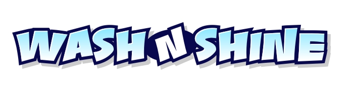
The name? Wash-N-Shine (window cleaning service)

Here's what I came up with for his logo/image for vehicles....which I will be incorporating into biz cards shortly...

 -

I used Dan Sawatsky's "Spaz" font from LH Fonts for the title - seemed appropriate for this business.

Any fine-tuning suggestions would be appreciated... b-in law seems pretty pleased, but nothing has went to print yet.

Thanks again for all your cool name ideas!!

Thanks again.

[ December 25, 2008, 07:49 PM: Message edited by: Todd Gill ]

--------------------
Todd Gill
Outside The Lines
Potterville, MI

Posts: 7792 | From: Potterville, MI | Registered: Dec 2001  |  IP: Logged | Report this post to a Moderator
Kissymatina
Resident


Member # 2028

Icon 1 posted      Profile for Kissymatina   Author's Homepage   Email Kissymatina   Send New Private Message       Edit/Delete Post   Reply With Quote 
Todd, I missed your previous thread, I apologize if this was already discussed. Wash & Shine makes me think of a car wash or auto detailing place. Do windows get shined? Has he thought about anything like "Clear View Window Cleaning Services"? It sells more of the benefit of having your windows cleaned instead of the act of having them cleaned. It's always easier when you sell the benefits of what you're providing, people care about what they get. In this case, people get a clearer view of the scenery out their windows, not just clean windows. Does that make sense?

As for the design, I like the bubbles, the squeegee took me a minute to figure out what it was. I'm thinking maybe some more color, but I don't know what color I'd incorporate that would tie in. The blue subconsciously makes me think of windex, not sure if that was the intent or not, but it works.

--------------------
Chris Welker
Wildfire Signs
Indiana, Pa

Posts: 4254 | From: Indiana, PA | Registered: Mar 2001  |  IP: Logged | Report this post to a Moderator
Stephen Deveau
Visitor
Member # 1305

Icon 1 posted      Profile for Stephen Deveau         Edit/Delete Post   Reply With Quote 
Todd.
That is brilliant.

I like it!
I like it alot!
..good work

Sorry.
Add more bubbles!

[ December 25, 2008, 09:20 PM: Message edited by: Stephen Deveau ]

--------------------
Stephen Deveau
RavenGraphics
Insinx Digital Displays

Letting Your Imagination Run Wild!

Posts: 4327 | From: Lower Sackville, Nova Scotia, Canada | Registered: Jan 2000  |  IP: Logged | Report this post to a Moderator
Anne McDonald
Visitor
Member # 6842

Icon 1 posted      Profile for Anne McDonald   Email Anne McDonald       Edit/Delete Post   Reply With Quote 
I think it's great [Smile]

--------------------
Anne McDonald
17 Karnak Crescent
Russley
Christchurch 8042
New Zealand

"I used to be indecisive, now I'm not so sure"

Posts: 877 | From: Christchurch | Registered: Sep 2006  |  IP: Logged | Report this post to a Moderator
Bruce Bowers
Resident


Member # 892

Icon 1 posted      Profile for Bruce Bowers   Email Bruce Bowers   Send New Private Message       Edit/Delete Post   Reply With Quote 
Love the design. The name isn't working for me, though.

--------------------
Bruce Bowers

DrCAS Custom Lettering and Design
Saint Cloud, Minnesota


"Things work out best for the people who make the best of the way things work out." - Art Linkletter

Posts: 6451 | From: Saint Cloud, Minnesota | Registered: Jun 1999  |  IP: Logged | Report this post to a Moderator
Rusty Bradley
Resident


Member # 6938

Icon 1 posted      Profile for Rusty Bradley   Email Rusty Bradley   Send New Private Message       Edit/Delete Post   Reply With Quote 
I'm wondering if light blue somewhere might give a fresher cleaner look...say if "WASH N SHINE" was a dark blue fade to light blue...or maybe the dark blue is just too black...I like the design but I would prefere tweeking to a brighter color scheme.

--------------------
Rusty Bradley
Bradley Sign Studio
100 Creekview Road
Summertown, Tn. 38483

Posts: 2179 | From: Summertown, Tennessee | Registered: Nov 2006  |  IP: Logged | Report this post to a Moderator
Tony Vickio
Resident


Member # 2265

Icon 1 posted      Profile for Tony Vickio   Author's Homepage   Email Tony Vickio   Send New Private Message       Edit/Delete Post   Reply With Quote 
Very Good!!!

--------------------
Tony Vickio
The World Famous Vickio Signs
3364 Rt.329
Watkins Glen, NY 14891
t30v@vickiosigns.com
607-535-6241
http://www.vickiosigns.com

Posts: 1063 | From: Watkins Glen, New York | Registered: Sep 2001  |  IP: Logged | Report this post to a Moderator
Bob Rochon
Resident


Member # 30

Icon 1 posted      Profile for Bob Rochon   Author's Homepage   Email Bob Rochon   Send New Private Message       Edit/Delete Post   Reply With Quote 
Nice Job Todd!

--------------------
Bob Rochon
Creative Signworks
Millbury, MA
508-865-7330

"Life is Like an Echo, what you put out, comes back to you."

Posts: 5149 | From: Millbury, Mass. U.S. | Registered: Nov 1998  |  IP: Logged | Report this post to a Moderator
Todd Gill
Resident


Member # 2569

Icon 1 posted      Profile for Todd Gill   Email Todd Gill   Send New Private Message       Edit/Delete Post   Reply With Quote 
Hi good people!

Thanks for the comments thus far.

Kissy - I agree with the name; I tried to talk him into something with "Clear" or similar for the name...but he kept going to the internet white pages checking for those names and called me back saying, "There's already a "Clear XXX" in Detroit, or tim-buck-two."

I told him, that as long as it wasn't local and there were a bunch of them around the country that weren't trademarked or franchised, it didn't matter if he had the same name.

But he felt it personally important that it was pretty unique - at least a name that wasn't overly used locally or in Michigan.

So - that's how he ended up with Wash-N-Shine....but you're right; it could be interpreted as a car wash type name. Ah well...

Bradley - I originally had a lighter blue for the name "Wash-N-Shine"... but thought it was a little hard to read, so I darkened the fade to a lt Navy blue to light blue to white fade.

I had another suggestion to have a more "varied" size of bubble trail - - which I think I will do.

Here's what I had originally...do you think it would have been a better color?

 -

Thanks guys!

--------------------
Todd Gill
Outside The Lines
Potterville, MI

Posts: 7792 | From: Potterville, MI | Registered: Dec 2001  |  IP: Logged | Report this post to a Moderator
Ian Stewart-Koster
Resident


Member # 3500

Icon 1 posted      Profile for Ian Stewart-Koster   Author's Homepage   Email Ian Stewart-Koster   Send New Private Message       Edit/Delete Post   Reply With Quote 
Todd, I like where you're heading.
More process blue would be my choice, or reflex/royal blue, rather than navy blue.

I'd reckon there was room for a fake airbrushed 'sparkle' (or starburst) near the end of 'shine'.

I didn't at first figure out the squeegee, but after I did, I liked it. I agree- maybe some more bubbles would help- but I'm not certain.

--------------------
"Stewey" on chat

"...there are no limits when you aim for perfection..." Jonathan Livingston Seagull

Posts: 7014 | From: Highgrove via Toowoomba, Queensland, Australia | Registered: Dec 2002  |  IP: Logged | Report this post to a Moderator
Bob Rochon
Resident


Member # 30

Icon 1 posted      Profile for Bob Rochon   Author's Homepage   Email Bob Rochon   Send New Private Message       Edit/Delete Post   Reply With Quote 
Todd,

you are right the original is too hard to read, I think what Ian and others are saying about the color is, your design is a variation of the same color. Navy blue. If you added some process blue into it, I think it would add more life.

[ December 26, 2008, 08:50 AM: Message edited by: Bob Rochon ]

--------------------
Bob Rochon
Creative Signworks
Millbury, MA
508-865-7330

"Life is Like an Echo, what you put out, comes back to you."

Posts: 5149 | From: Millbury, Mass. U.S. | Registered: Nov 1998  |  IP: Logged | Report this post to a Moderator
Mark Matyjakowski
Visitor
Member # 294

Icon 1 posted      Profile for Mark Matyjakowski   Author's Homepage   Email Mark Matyjakowski   Send New Private Message       Edit/Delete Post   Reply With Quote 
IMO it's still hard to read with the double (actually triple) outline and fade ... especially from a distance ... or small (on business cards)

to illustrate... (dark version, light version, no inline)
 -

IMO it would be much stronger (easier on my aging eyes) if you did light version without the inner outline

--------------------
Compulsive, Neurotic, Anti-social and Paranoid ... but basically Happy

Posts: 2677 | From: Rochester, NY, USA | Registered: Nov 1998  |  IP: Logged | Report this post to a Moderator
Todd Gill
Resident


Member # 2569

Icon 1 posted      Profile for Todd Gill   Email Todd Gill   Send New Private Message       Edit/Delete Post   Reply With Quote 
Any of these variations hit you guys better? Incorporated some of your suggestions. Thanks.


Color changes/different bubbles/different Squeegee/white outline around Wash-n-Shine
 -

Same as above - but with "sparkles" and without white outline around Wash-n-Shine
 -

Same as above but with original squeegee handle/no sparkles/no white outline
 -

[ December 26, 2008, 10:32 AM: Message edited by: Todd Gill ]

--------------------
Todd Gill
Outside The Lines
Potterville, MI

Posts: 7792 | From: Potterville, MI | Registered: Dec 2001  |  IP: Logged | Report this post to a Moderator
Stevo Chartrand
Visitor
Member # 2094

Icon 7 posted      Profile for Stevo Chartrand   Author's Homepage   Email Stevo Chartrand   Send New Private Message       Edit/Delete Post   Reply With Quote 
I prefer the bottom one Todd.
The color of the fade is kinda bugging me though.
How about a sky blue color?

Stevo


 -

--------------------
Stevo Design
Illustration Logos Sign Design Clip Art
www.stevo-design.com

Posts: 1680 | From: Edmonton Ab Canada EH! | Registered: May 2001  |  IP: Logged | Report this post to a Moderator
Todd Gill
Resident


Member # 2569

Icon 1 posted      Profile for Todd Gill   Email Todd Gill   Send New Private Message       Edit/Delete Post   Reply With Quote 
ooooohhhh.... I like that coloration better Stevo... mind if I swipe it?

--------------------
Todd Gill
Outside The Lines
Potterville, MI

Posts: 7792 | From: Potterville, MI | Registered: Dec 2001  |  IP: Logged | Report this post to a Moderator
Alicia B. Jennings
Resident


Member # 1272

Icon 1 posted      Profile for Alicia B. Jennings   Email Alicia B. Jennings   Send New Private Message       Edit/Delete Post   Reply With Quote 
I luv it, I luv it, I luv it.

--------------------
Signs by Alicia Jennings (Mudflap Girl)
Tacoma, WA
Since 1987
Have Lipstick, will travel.

Posts: 3816 | From: Tacoma, WA. U.S.A. | Registered: Dec 1999  |  IP: Logged | Report this post to a Moderator
Stevo Chartrand
Visitor
Member # 2094

Icon 1 posted      Profile for Stevo Chartrand   Author's Homepage   Email Stevo Chartrand   Send New Private Message       Edit/Delete Post   Reply With Quote 
Feel free Todd!

Stevo

--------------------
Stevo Design
Illustration Logos Sign Design Clip Art
www.stevo-design.com

Posts: 1680 | From: Edmonton Ab Canada EH! | Registered: May 2001  |  IP: Logged | Report this post to a Moderator
Donna in BC
Resident


Member # 130

Icon 1 posted      Profile for Donna in BC   Author's Homepage   Email Donna in BC   Send New Private Message       Edit/Delete Post   Reply With Quote 
I'm liking it Todd!

Couple anal ideas... have you tried:

extending the bubbles and squeegie handle outside of the window?

that is a window, right? Applying a window frame of some sort around the box to better simulate a window?

slightly bigger but more randomly placed starbursts? (if you use them)

your secondary info slightly smaller and/or not quite as condensed or heavy? I'm finding that info slightly fights with the main. The main has such a nice hand done friendly bounce to it but the secondary looks very heavy and typed and made as big as it can get.

--------------------
Donna Williams
Funky Junk Interiors
Yarrow, BC Canada
donna@funkyjunkinteriors.net

~ Check out the newest junk at ~ http://funkyjunkinteriors.net/

Posts: 5630 | From: Yarrow, BC Canada | Registered: Nov 1998  |  IP: Logged | Report this post to a Moderator
Stephen Deveau
Visitor
Member # 1305

Icon 1 posted      Profile for Stephen Deveau         Edit/Delete Post   Reply With Quote 
Can I ask why is the oval around the 'N'
Maybe a water drop instead.

[ December 26, 2008, 12:08 PM: Message edited by: Stephen Deveau ]

--------------------
Stephen Deveau
RavenGraphics
Insinx Digital Displays

Letting Your Imagination Run Wild!

Posts: 4327 | From: Lower Sackville, Nova Scotia, Canada | Registered: Jan 2000  |  IP: Logged | Report this post to a Moderator
Kissymatina
Resident


Member # 2028

Icon 1 posted      Profile for Kissymatina   Author's Homepage   Email Kissymatina   Send New Private Message       Edit/Delete Post   Reply With Quote 
The different shades of blue really help. It livens it up and makes the squeegee easier to see.

Personally I don't like the starbursts, but that's just because the old sign guy here uses them on EVERYthing since 1970. [Wink]

--------------------
Chris Welker
Wildfire Signs
Indiana, Pa

Posts: 4254 | From: Indiana, PA | Registered: Mar 2001  |  IP: Logged | Report this post to a Moderator
Todd Gill
Resident


Member # 2569

Icon 1 posted      Profile for Todd Gill   Email Todd Gill   Send New Private Message       Edit/Delete Post   Reply With Quote 
Ok... here we go...incorporated Stevo's (Ian's and Bob's) color change into Wash-N-Shine and the 'wipe' fades, made the subtext a tad smaller, and recolored a few of the bubbles to tie in with the Wash-n-Shine.

I'm thinking it looks much better...

 -

--------------------
Todd Gill
Outside The Lines
Potterville, MI

Posts: 7792 | From: Potterville, MI | Registered: Dec 2001  |  IP: Logged | Report this post to a Moderator
Bob Rochon
Resident


Member # 30

Icon 1 posted      Profile for Bob Rochon   Author's Homepage   Email Bob Rochon   Send New Private Message       Edit/Delete Post   Reply With Quote 
Much Better!!

Now the lettering comes forward and the background...well becomes the background [Smile]

A hell of a lot more interesting to look at than the original.
Nice progression.

--------------------
Bob Rochon
Creative Signworks
Millbury, MA
508-865-7330

"Life is Like an Echo, what you put out, comes back to you."

Posts: 5149 | From: Millbury, Mass. U.S. | Registered: Nov 1998  |  IP: Logged | Report this post to a Moderator
John Deaton
Visitor
Member # 925

Icon 1 posted      Profile for John Deaton   Author's Homepage   Email John Deaton   Send New Private Message       Edit/Delete Post   Reply With Quote 
You might put a few little bubbles inside the letters too Todd.

--------------------
Maker of fine signs and
other creative stuff.
Located at 109 N. Cumberland ave.
Harlan, Ky. 40831
606-837-0242

Posts: 4172 | From: Ages-Brookside, Ky. Up the Holler... | Registered: Jul 1999  |  IP: Logged | Report this post to a Moderator
Joey Madden
Resident


Member # 1192

Icon 1 posted      Profile for Joey Madden   Author's Homepage   Email Joey Madden   Send New Private Message       Edit/Delete Post   Reply With Quote 
If I wanted to go into that particular business my card would say ' I wash windows ' or ' I do windows ' to the point, simple and effective.

The present yuppie style does not seem to do well in this here economy

--------------------
HotLines Joey Madden - pinstriping since 1952
'Perfection, its what I look for and what I live for'


http://members.tripod.com/Inflite
http://www.pinheadlounge.com/hotlinesjoeymadden

Posts: 5962 | From: USA | Registered: Nov 1999  |  IP: Logged | Report this post to a Moderator
Todd Gill
Resident


Member # 2569

Icon 1 posted      Profile for Todd Gill   Email Todd Gill   Send New Private Message       Edit/Delete Post   Reply With Quote 
Thanks for your "second pair of eyes" everyone.

I showed my b-in-law and he liked it. Actually told me to not tweak it anymore LOL...so I guess that settles it.

Have a great weekend good people!

--------------------
Todd Gill
Outside The Lines
Potterville, MI

Posts: 7792 | From: Potterville, MI | Registered: Dec 2001  |  IP: Logged | Report this post to a Moderator
old paint
Visitor
Member # 549

Icon 1 posted      Profile for old paint   Email old paint   Send New Private Message       Edit/Delete Post   Reply With Quote 
SEND STEVO THE CHECK)))))

[ December 29, 2008, 02:09 AM: Message edited by: old paint ]

--------------------
joe pribish-A SIGN MINT
2811 longleaf Dr.
pensacola, fl 32526
850-637-1519
BEWARE THE TRUTH.....YOU MAY NOT LIKE WHAT YOU FIND

Posts: 11582 | From: pensacola, fl. usa | Registered: Nov 1998  |  IP: Logged | Report this post to a Moderator
Neil D. Butler
Resident


Member # 661

Icon 1 posted      Profile for Neil D. Butler   Email Neil D. Butler   Send New Private Message       Edit/Delete Post   Reply With Quote 
I know it's been discussed but he's making a bigmistake, the name just is'nt right.. First thing I thought of is Cars... Great design all the same... but he will lose business with that name.. people will see Wash and Shine and just not read the rest, they will skip over it, and if he's competeing with other ads, he may be in trouble. That's just ny opinion... but the design is great!

--------------------
"Keep Positive"

SIGNS1st.
Neil Butler
Paradise, NF

Posts: 6277 | From: St. John's NF Canada | Registered: Mar 1999  |  IP: Logged | Report this post to a Moderator
   

Quick Reply
Message:

HTML is not enabled.
UBB Code™ is enabled.

Instant Graemlins


Post New Topic  New Poll  Post A Reply Close Topic   Feature Topic   Move Topic   Delete Topic next oldest topic   next newest topic
 - Printer-friendly view of this topic
Hop To:


Contact Us | Letterville. A Community Of Letterheads & Pinheads!

Powered by Infopop Corporation
UBB.classic™ 6.7.2

Search For Sign Supplies
Category:


Letterhead Suppliers Around the World