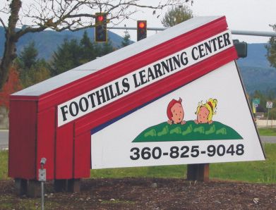
What are they saying in this sign? Every time I drive pass this sign, I can't help but feel bad for the person who had to design this sign.
Posted by Dave Sherby (Member # 698) on :
As Steve Martin once said..."What the hell is that?"
Posted by Alicia B. Jennings (Member # 1272) on :
Oh, I know what da is! What the hell is that?!
Posted by DianeBalch (Member # 1301) on :
it looks like they are birthing kids in a watermelon patch
diane
Posted by James Donahue (Member # 3624) on :
The kids are behind a green hill, with footprints on it; so OBVIOUSLY they're behind a FOOTHILL!! C'MON PEOPLE, you call yourself DESIGNERS?!?!? Posted by Ricardo Davila (Member # 3854) on :
Pleeease, show some mercy.......It doesn't look that terrible.......
This reminds me of an old sign design teacher saying to the class: "Suppose that I give, 10 of you, students, a subject to develop a design for a new sign and, then, lock up those 10 students, each in a different room, and ask each one of them to create a design for the new sign, without consulting with anyone else.....The end result is going to be the same: 10 different designs, about the same subject for that new sign........It is, practically, impossible. for two or more students, to come up with, exactly, the same design."
The same thing is happening here.
Then, again......Opinions are like noses......Everyone has one.
RD
[ November 01, 2014, 11:05 PM: Message edited by: Ricardo Davila ]
Posted by Alicia B. Jennings (Member # 1272) on :
Okay, now I get it. "The Foothills" Hills with feet on them then add the kids somewhat behind them. Gee, I would have never thought of that one.
Posted by Bill Davidson (Member # 531) on :
They are planting kids up to the neck, then tamping the ground down barefoot, porpagating younguns I'd say.
Posted by Mikes Mischeif (Member # 1744) on :
I saw a runway model with the same step pattern on my local news. It will bring tears to your eyes......from laughing.
There's a "designer/artist" kicked back in his reclining desk chair, looking at an enlarged photo of that sign, and thinking to himself, "Man, that sign really says something! I really nailed it this time"
He's waiting for the phone to ring; for the next knucklehead, gullible enough to ask him to design a similar "wonder" for them.....
[ November 06, 2014, 03:47 PM: Message edited by: Dale Feicke ]
Posted by James Donahue (Member # 3624) on :
That or it's customer designed. Probably a group meeting, a brainstorming session; and the sign company had to decide how badly they needed work.
Posted by Dave Grundy (Member # 103) on :
I have looked at that photo for a few days and the more I look at it....The more I think it is a "photo edited" image.
The perspective is wrong, the angles are wrong. Heck, everything is out of whack in that picture.
But Alicia did stir up a few comments. Posted by Dan Beach (Member # 9850) on :
At least its legible.
Posted by Mikes Mischeif (Member # 1744) on :
Uh-Oh. Dave is calling Alicia a Liar! Now whatcha gonna do?
Posted by jack wills (Member # 521) on :
The answer is in the stop lights.............
Posted by Deb Fowler (Member # 1039) on :
The impression I get right away; it seems like an upward hill to learn, thumbs down on the hill that goes up! I see two startled kids that are sinking in some sinkhole, wow. Then I see the logo looking like a big piece of wood beginning to fall. And besides that, those footprints, make them a bit bigger and that would be perfect for Jack and the Beanstalk!
I visualize some smiling kids in a picturesque mountain land with beautiful open space at the valley full of bright colors and lots of animals, teachers and singing. For heaven's sake they could have put them on a small mountaintop and used the Sound of Music theme!
[ November 08, 2014, 10:44 PM: Message edited by: Deb Fowler ]
Posted by Bill Davidson (Member # 531) on :
Jack notices everything.
Posted by Kathy Weeks (Member # 10828) on :
I'm with Alicia - that is a sad sign. Since the sign is substantial, I got the impression that the newby/wouldbe sign maker is a handyman or carpenter of some sort, and bought a vinyl plotter/printer and is trying their hand at sign making. Poor design. I hope the customer did not pay a lot for this sign. It's kind of creepy. Posted by Brad Ferguson (Member # 33) on :
Yes, this is mediocre design at best.
Surely the footprints on the hill were insisted on by the customer. A play on words is difficult to pull off on a sign. Instead of clever, the effect is often juvenile, as in this case.
I never use a visual play on words unless it actually relates to the business. Even then, if it is the least bit complicated, it's usually not a good idea. If it is not INSTANTLY recognizable, it detracts. If viewers have to stop and think to digest the message, it's less effective. My ex-gf, a writer, says, "If your message slows the reading down, or stops it, even momentarily, it's a fail." Some may reason that if this bizarre graphic stops people to look at it, then more will read the sign. Good argument? I'm not sure. Could this be a memorable sign in the community? Becoming a little landmark, perhaps? "(Turn at the sign with the footprints on the mound. You know, the sign with the decapitated kids heads)." Hmm...
At any rate, I believe priorities are skewed in the layout. The visual focal point has become the odd graphic, together with the phone number. Shouldn't the dominant element be the words, "Learning Center?" Or, "Foothills Learning Center?" If the average read time is 1.6 seconds, I would expect some people to pass this sign, stare at the graphic for 1.6 seconds, and never even see or digest the words "Learning Center." I can visualize people driving past and saying, "I wonder what they do there?" The phrase "Learning Center" has had its legibility compromised in several ways: It is all caps. It is placed in a panel that is part of what amounts to a border treatment. It is on an angle, and it has precious little negative space around it. It has been treated as secondary copy. Its black letters may even be sometimes mistaken, at quick glance, for a decorative pattern in the border.
Of course, there IS the stoplight. Traffic backed up at this intersection will have at least 30 seconds, or longer for a long light, to stare at this sign and then decide whether it's safe to trust these people with their kids.
Brad in Kansas City
Posted by Brad Ferguson (Member # 33) on :
This thread reminded me of a daycare sign I had to design last year. The name of the place is really "Krumb Snatchers."

![[I Don t Know]](graemlins/dunno.gif)
![[Applause]](graemlins/applause.gif)
![[Roll Eyes]](rolleyes.gif)