Letterville Bull Board Letterville | Bull Board


Front Page
A Letterhead History
About Us
Become A Resident
Edit Your Database Info
Find A Letterhead

Letterville Merchants
Resident Downloads
Letterville BookShop
Future Live Meets
Past Meets
Step-By-Steps
Past Panel Swaps
Past SOTM
Letterhead Profiles
Business Cards
Become A Merchant

Click on the button
below to chat with other
Letterville users.

http://www.letterville.com/ubb/chaticon.gif

Steve & Barb Shortreed
144 Hill St., E.
Fergus, ON, Canada
N1M 1G9

Phone: 519-787-2892
Fax: 519-787-2673
Email: barb@letterville.com

Copyright ©1995-2008
The Letterhead Website


The Letterville BullBoard Post New Topic  New Poll  Post A Reply
my profile login | search | faq | calendar | im | forum home

  next oldest topic   next newest topic
» The Letterville BullBoard » Letterhead/Pinstriper Talk » 'Nother Farm Sign

 - UBBFriend: Email this page to someone!    
Author Topic: 'Nother Farm Sign
Kelly Thorson
Resident


Member # 2958

Icon 1 posted      Profile for Kelly Thorson   Author's Homepage   Email Kelly Thorson   Send New Private Message       Edit/Delete Post   Reply With Quote 
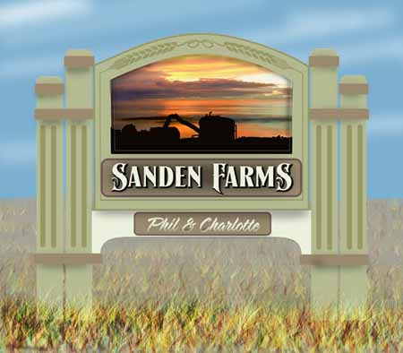
I've been working for a long time on this one, I think I may be closing in it finally.
The client wants a sunset with a combine, it's real easy to slip into cheesy!
Suggestions for improvement are welcome.
 -

--------------------
“Did you ever stop to think, and forget to start again?”
-Winnie the Pooh & A.A. Milne

Kelly Thorson
Kel-T-Grafix
801 Main St.
Holdfast, SK
S0G 2H0
ktg@sasktel.net

Posts: 5496 | From: Penzance, Saskatchewan | Registered: May 2002  |  IP: Logged | Report this post to a Moderator
Dave Sherby
Resident


Member # 698

Icon 1 posted      Profile for Dave Sherby   Email Dave Sherby   Send New Private Message       Edit/Delete Post   Reply With Quote 
Nice. All our farmers around here are broke or ready to retire.

--------------------
Dave Sherby
"Sandman"
SherWood Sign & Graphic Design
Crystal Falls, MI 49920
906-875-6201
sherwoodsign@sbcglobal.net

Posts: 5400 | From: Crystal Falls, MI USA | Registered: Apr 1999  |  IP: Logged | Report this post to a Moderator
PatRaap
Resident


Member # 4290

Icon 1 posted      Profile for PatRaap   Author's Homepage   Email PatRaap   Send New Private Message       Edit/Delete Post   Reply With Quote 
Very Nice Kelly.
Dave I was thinking that same thing! [Smile]

--------------------
Patricia A. Raap
Raap Signs
2615 Arthur
Coopersville, MI 49404
616-677-0158
pat@raapsigns.com

Posts: 579 | From: Coopersville, MI 49404 | Registered: Nov 2003  |  IP: Logged | Report this post to a Moderator
Dan Sawatzky
Resident


Member # 88

Icon 1 posted      Profile for Dan Sawatzky   Author's Homepage   Email Dan Sawatzky   Send New Private Message       Edit/Delete Post   Reply With Quote 
I think you may be carving out a fun niche market there Kelly!

Nice design.

-grampa dan

--------------------
Dan Sawatzky
Imagination Corporation
Yarrow, British Columbia
dan@imaginationcorporation.com
http://www.imaginationcorporation.com

Being a grampa is one of the the most wonderful things in the world!!!

Posts: 8739 | From: Yarrow, B.C. Canada | Registered: Nov 1998  |  IP: Logged | Report this post to a Moderator
Bruce Brickman
Visitor
Member # 8180

Icon 1 posted      Profile for Bruce Brickman   Author's Homepage   Email Bruce Brickman   Send New Private Message       Edit/Delete Post   Reply With Quote 
Kelly, I like this a lot. I notice my eye drawn to the white panel at the bottom probably more than you intended? Anyway, very nice!

[ January 26, 2011, 10:38 AM: Message edited by: Bruce Brickman ]

--------------------
Bruce Brickman
Art & Sign
503-351-4205
www.brucebrickman.com

Posts: 660 | From: Oregon | Registered: Oct 2007  |  IP: Logged | Report this post to a Moderator
Kelly Thorson
Resident


Member # 2958

Icon 1 posted      Profile for Kelly Thorson   Author's Homepage   Email Kelly Thorson   Send New Private Message       Edit/Delete Post   Reply With Quote 
Thanks for your comments.
Bruce, I thought that light area might be too distracting, I didn't notice it until after I posted it. I'm not so sure about the posts in general, they may be a bit too gingerbread-ish.

Dave and Pat, the number of farms in our area has been cut by about 2/3 in the past 20 years. Most of the farms around now are huge. Last year was a bad one due to a very wet spring and excess water all year. Still, a sign is a drop in the bucket when these folks are forking out 100s of 1000s of dollars every season on inputs.....

Dan, I do 4 or 5 farm signs a year, I suppose if I advertised better I could increase that amount, but I'm busy enough. I guess it's time to raise my prices again. [Wink]

--------------------
“Did you ever stop to think, and forget to start again?”
-Winnie the Pooh & A.A. Milne

Kelly Thorson
Kel-T-Grafix
801 Main St.
Holdfast, SK
S0G 2H0
ktg@sasktel.net

Posts: 5496 | From: Penzance, Saskatchewan | Registered: May 2002  |  IP: Logged | Report this post to a Moderator
Ian Stewart-Koster
Resident


Member # 3500

Icon 1 posted      Profile for Ian Stewart-Koster   Author's Homepage   Email Ian Stewart-Koster   Send New Private Message       Edit/Delete Post   Reply With Quote 
Very nice, Kelly!

I think I'd like a bit more bulk to the 7-o'clock position (bottom left) of the first S though-it just needs a bit more bulk there I feel as an initial letter.
Also, for the F, the top left serif could be enlarged & dragged back left into the empty space between the words a bit more than it is. The bottom of the F could be a bit more horizontal, too so it doesn't lead your eye down into the ground so much... For a big F, it looks very narrow.
(sorry to sound critical-just thinking aloud [Wink] )

--------------------
"Stewey" on chat

"...there are no limits when you aim for perfection..." Jonathan Livingston Seagull

Posts: 7014 | From: Highgrove via Toowoomba, Queensland, Australia | Registered: Dec 2002  |  IP: Logged | Report this post to a Moderator
bill riedel
Resident


Member # 607

Icon 1 posted      Profile for bill riedel   Author's Homepage   Email bill riedel   Send New Private Message       Edit/Delete Post   Reply With Quote 
The sunset is beautiful, but if it was lighter, the combine would stand much out better. I agree with you that there are too many posts.
Bill

--------------------
Bill Riedel
Riedel Sign Co., Inc.
15 Warren Street
Little Ferry, N.J. 07643
billsr@riedelsignco.com

Posts: 2953 | From: Little Ferry, New Jersey, USA | Registered: Feb 1999  |  IP: Logged | Report this post to a Moderator
Preston McCall
Visitor
Member # 351

Icon 1 posted      Profile for Preston McCall   Author's Homepage   Email Preston McCall   Send New Private Message       Edit/Delete Post   Reply With Quote 
Maybe one post per side and maybe turn them into grain looking design....corn or wheat? The two posts make it look like a funeral home. Agree with Bill on lightening up the landscape and maybe keep the contrast of the machinery dark? Why the white background on the panel with the names?

--------------------
Preston McCall
112 Rim Road
Santa Fe, New Mexico
87501
text: 5056607370

Posts: 1557 | From: Santa Fe, New Mexico | Registered: Nov 1998  |  IP: Logged | Report this post to a Moderator
Preston McCall
Visitor
Member # 351

Icon 1 posted      Profile for Preston McCall   Author's Homepage   Email Preston McCall   Send New Private Message       Edit/Delete Post   Reply With Quote 
There was a company in central Kansas in the 40s and 50s that did some very illustrative and fanncy cattle ranch signs all over the state. They were out of Wichita. I remember seeing them everywhere, but they were just painted steel or plywood, I recall. The cattle illustrations were very good. They used to advertise in a magazine called "Grass and Grain" published somewhere out here, I guess. You might look into any similar local farm publications and maybe even get an article written about you or advertise there. Direct mail would also probably work. Surely there are farm address directories of your area? Interesting niche market!

--------------------
Preston McCall
112 Rim Road
Santa Fe, New Mexico
87501
text: 5056607370

Posts: 1557 | From: Santa Fe, New Mexico | Registered: Nov 1998  |  IP: Logged | Report this post to a Moderator
Deri Russell
Resident


Member # 119

Icon 1 posted      Profile for Deri Russell   Author's Homepage   Email Deri Russell   Send New Private Message       Edit/Delete Post   Reply With Quote 
So..........is this painted flat? Or 3D sanblasted? Or what are ya making there girl?

It's got a great feel to it however you build it.
Very classy.

--------------------
Deri Russell
Wildwood Signs
Hanover, Ontario

You're just jealous 'cause the little voices only talk to me.

Posts: 1904 | From: Hanover, Ontario, Canada | Registered: Dec 1998  |  IP: Logged | Report this post to a Moderator
Kelly Thorson
Resident


Member # 2958

Icon 1 posted      Profile for Kelly Thorson   Author's Homepage   Email Kelly Thorson   Send New Private Message       Edit/Delete Post   Reply With Quote 
It will likely be cedar. The wheat & border will be routed and the Sanden Farms will be routed letters on an add on panel. I think I'll hog out the pictorial area to make it recessed about 1/2 and then sandblast the sunset area and leave the combine/truck silhouette flat.

--------------------
“Did you ever stop to think, and forget to start again?”
-Winnie the Pooh & A.A. Milne

Kelly Thorson
Kel-T-Grafix
801 Main St.
Holdfast, SK
S0G 2H0
ktg@sasktel.net

Posts: 5496 | From: Penzance, Saskatchewan | Registered: May 2002  |  IP: Logged | Report this post to a Moderator
Deri Russell
Resident


Member # 119

Icon 1 posted      Profile for Deri Russell   Author's Homepage   Email Deri Russell   Send New Private Message       Edit/Delete Post   Reply With Quote 
Sounds Awesome Kell. I like the design the way it is. I think its a winner.

--------------------
Deri Russell
Wildwood Signs
Hanover, Ontario

You're just jealous 'cause the little voices only talk to me.

Posts: 1904 | From: Hanover, Ontario, Canada | Registered: Dec 1998  |  IP: Logged | Report this post to a Moderator
Joy Kjer
Resident


Member # 3026

Icon 1 posted      Profile for Joy Kjer   Author's Homepage   Email Joy Kjer   Send New Private Message       Edit/Delete Post   Reply With Quote 
How about a border around the pictorial? Maybe in the same color as the border around Sanden Farms?

--------------------
Joy Kjer
Art On Display Signs
4001 Randolph St
Lincoln, NE

"My life has a superb cast,
but I can't figure out the plot."

Posts: 445 | From: 4001 Randolph St. Lincoln, NE | Registered: Jun 2002  |  IP: Logged | Report this post to a Moderator
Rusty Bradley
Resident


Member # 6938

Icon 1 posted      Profile for Rusty Bradley   Email Rusty Bradley   Send New Private Message       Edit/Delete Post   Reply With Quote 
the post alone are a beautiful element of the sign...but I'm wondering the same as you...are they too ornate for a farm sign...everyone loves the pictorial...the beautiful blends of color in the sunset will certainly draw attention...I have some problem with the silhouette however...no one else has mentioned it so it might be just me...but I would like to see a more recognizable shape...maybe the dark line in the sunset that cuts behind the silhouette is confusing the shape...they look to be almost the same value...replacing that dark line with one of the other sunset colors not as dark would make those shapes stand out from the sky and be more definable...also I would replace any white in the sky with color as well...another beautiful design.

--------------------
Rusty Bradley
Bradley Sign Studio
100 Creekview Road
Summertown, Tn. 38483

Posts: 2179 | From: Summertown, Tennessee | Registered: Nov 2006  |  IP: Logged | Report this post to a Moderator
Todd Gill
Resident


Member # 2569

Icon 1 posted      Profile for Todd Gill   Email Todd Gill   Send New Private Message       Edit/Delete Post   Reply With Quote 
Hi Kelly -

I like the sunset photograph. And I like how you incorporated a 'wheat' filigree into the sign... and I think the LHF Signmaker's font *could* work.

Here's where you might reconsider:

* Less posts (as suggested above)
* The sign structure itself doesn't say 'farm' to me... I get more of an Insurance Agency, or upscale business feel from it. Can you come up with something less 'City' in favor of something more 'Country?'
* I didn't know the silhouette was a combine until I read it... I thought it was a large digger with the arm extended. Can you work the silhouette so that you see more of a 3/4 view... with the combine taking out a swath of corn? Showing the 'teeth' of the combine so-to-speak?
* I like the LHF Signmaker's font... but the colors of the white w/black seem very harsh laid upon the pastel green. Also wondering if a combo of white (or Cream) and grass green might be more 'farm' color for the entire sign monument.
* I'm picturing a monument that has an arched top, with a rail following the arch about 4 inches off the arch - attached to the arch with 'spokes'.... to bring in a country appeal. And tweaking the balance of the monument get a more 'country' feel.
* Owner's names feel a bit 'jammed in'.... not sure about the script font with the decorative LHF Signmaker's font.

Sorry, lot's of critique here - but with the best of intentions and it's always good to get a look from a fresh set of eyes.

Consider what makes sense and trash the rest.

--------------------
Todd Gill
Outside The Lines
Potterville, MI

Posts: 7792 | From: Potterville, MI | Registered: Dec 2001  |  IP: Logged | Report this post to a Moderator
Todd Gill
Resident


Member # 2569

Icon 1 posted      Profile for Todd Gill   Email Todd Gill   Send New Private Message       Edit/Delete Post   Reply With Quote 
Ah... Rusty posted just a second before me regarding the 'combine'....

--------------------
Todd Gill
Outside The Lines
Potterville, MI

Posts: 7792 | From: Potterville, MI | Registered: Dec 2001  |  IP: Logged | Report this post to a Moderator
Kelly Thorson
Resident


Member # 2958

Icon 1 posted      Profile for Kelly Thorson   Author's Homepage   Email Kelly Thorson   Send New Private Message       Edit/Delete Post   Reply With Quote 
Aftre spending so much time on it, I decided to give my brain a rest and revisited it today.
I'm going to change the white portion of the sign to a darker colour, remove two of the posts, lighten the sunset and remove the dark streak and refine the silouette.
All the colours on the sign are picked up from in the sunset. The white is actually a cream and the black is a dark reddish brown, but I'll try and soften them a bit.
Thanks for all the feedback, whether I use your suggestion or not, there are so many ways to do something and it's good to have fresh eyes.

--------------------
“Did you ever stop to think, and forget to start again?”
-Winnie the Pooh & A.A. Milne

Kelly Thorson
Kel-T-Grafix
801 Main St.
Holdfast, SK
S0G 2H0
ktg@sasktel.net

Posts: 5496 | From: Penzance, Saskatchewan | Registered: May 2002  |  IP: Logged | Report this post to a Moderator
Rusty Bradley
Resident


Member # 6938

Icon 1 posted      Profile for Rusty Bradley   Email Rusty Bradley   Send New Private Message       Edit/Delete Post   Reply With Quote 
Going to look great Kelly...but if you'll just move the combine about 1/16" to the right you'll have it...maybe 1/32" would even do it [Wink]

--------------------
Rusty Bradley
Bradley Sign Studio
100 Creekview Road
Summertown, Tn. 38483

Posts: 2179 | From: Summertown, Tennessee | Registered: Nov 2006  |  IP: Logged | Report this post to a Moderator
Bruce Brickman
Visitor
Member # 8180

Icon 1 posted      Profile for Bruce Brickman   Author's Homepage   Email Bruce Brickman   Send New Private Message       Edit/Delete Post   Reply With Quote 
I think Rusty is off by a hair!

--------------------
Bruce Brickman
Art & Sign
503-351-4205
www.brucebrickman.com

Posts: 660 | From: Oregon | Registered: Oct 2007  |  IP: Logged | Report this post to a Moderator
   

Quick Reply
Message:

HTML is not enabled.
UBB Code™ is enabled.

Instant Graemlins


Post New Topic  New Poll  Post A Reply Close Topic   Feature Topic   Move Topic   Delete Topic next oldest topic   next newest topic
 - Printer-friendly view of this topic
Hop To:


Contact Us | Letterville. A Community Of Letterheads & Pinheads!

Powered by Infopop Corporation
UBB.classic™ 6.7.2

Search For Sign Supplies
Category:


Letterhead Suppliers Around the World