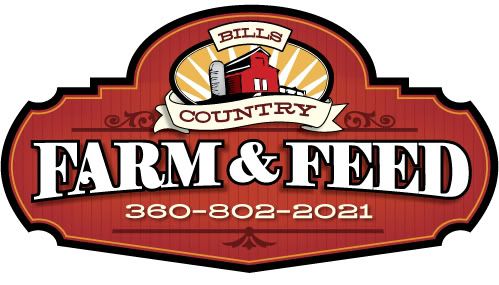
Here is a design I finished yesterday. It was done rather quickly as a freebie.
This was the business card logo that was given to me. I took the barn and silo to use on the sign.
The name has alot of elements to it. It was a challenge to make it work. I think I may have nailed it
The one thing I just noticed it the right scroll bracket seemes to be floating. I will fix it on the sign when it gets made and then post a picture of the finished sign.
Thanks for looking Posted by Ryan Culbertson (Member # 7560) on :
Nice, Charles.
Love to see the sign when your finished
Posted by Darcy Baker (Member # 8262) on :
Very cool. The sunburst behind the logo gives it some warmth.
Posted by Arthur Vanson (Member # 2855) on :
That's great, Charles, but you surprised me; As I gently scrolled down, I was expecting one of your beautiful scripts. Posted by Cam Bortz (Member # 55) on :
Schweet!!
Nice contrast, good line value, and I like that the scrolls don't compete with the copy. I might like to see BILL'S a bit more prominent, but the power of FARM AND FEED leaves no doubt what this business sells.
Posted by Randy Campbell (Member # 2675) on :
Very nice Charles-you really nailed it. Posted by Dave Correll (Member # 100) on :
Bravo Charles!
Posted by jake snow (Member # 5889) on :
That is a good looking sign Charles!
Beside the scroll that you mentioned, You might take a look at your arch on the feed and farm. Your bottom of "eed" looks like it could be dropped just a bit to match up with the other side.
Posted by Pierre Tardif (Member # 3229) on :
Beside being one of the greatest designer, Charles is by far the best lettering artist I know, right in the league of John Stevens and Julian Waters, he simply does'nt want to believe it yet!!

![[Smile]](smile.gif)
![[Applause]](graemlins/applause.gif)