This client wants the following copy for the back windows of his pickup. All in ONE LINE!
OK... he's a buddy & I took this one on as a challenge. Well, It's a tough one in my opinion. Join in please!
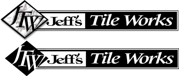
Here is my B&W rendition.
I am trying to avoid the typical "script name on top & bold title beneath" layout.
He understandably also wants it easy to read & needs to be white for the truck window.
Please critique mine & let me know how you'd approach this one..?
Let's just say I'm less than satisfied with what I came up with & know there is a much better approach here...I am stifled!
Thank you!
Just to throw him another less readable option, I am doing an all script version that would look "fast & cool" on the back window to accent his "readable" doors done by a local "Times bold specialist" if you get my drift.
Posted by Michael R. Bendel (Member # 5847) on :
????
Posted by Doug Phillips (Member # 5708) on :
hehehe, how 'bout some "times"
btw, that script should give him a headache!
[ March 23, 2007, 03:36 AM: Message edited by: Doug Phillips ]
Posted by Patrick Whatley (Member # 2008) on :
Michael, have you tried to read that last one? Looks cool, completely illegible.
Posted by jake snow (Member # 5889) on :
Phillips one is nice and clean. Me likey!
Posted by Sam Staffan (Member # 4552) on :
It's rough but just an Idea.
Posted by Michael R. Bendel (Member # 5847) on :
Yea that script shoulda been kept hidden deep in some vault somewhere! Thanks Doug & Sam. Your re-works were great.
I'll keep you posted on the final layout.
Posted by Todd Gill (Member # 2569) on :
Doug - that is a PERFECT logo.
Completely readible, emphasis and imagery working together.....simple, and simply fantastic!! Kudos. Posted by Arthur Vanson (Member # 2855) on :
Another simple one.
Posted by Glenn Taylor (Member # 162) on :
I think Authur hit the nail on the head. Its clean, simple, to the point and attractive at the same time.
Nicely done!
.
Posted by david drane (Member # 507) on :
I like Sam's effort. With a little color added it will make a nice logo.
Posted by Michael R. Bendel (Member # 5847) on :
Arthur! That's the sort of response I was looking for. Great job, thank you for posting!
Doug & Sam nailed it too, but the "punch" & siplicity of Arthur's fits this project to a tee.
Would "frailing" down Jeff's a bit ruin the look?
Thank you all. Posted by Arthur Vanson (Member # 2855) on :
A couple of possibilities?
Posted by Michael R. Bendel (Member # 5847) on :
I like the lower case one with the tiles pulled a tiny bit closer maybe.


![[Wink]](wink.gif)

![[Smile]](smile.gif) Yea that script shoulda been kept hidden deep in some vault somewhere! Thanks Doug & Sam.
Yea that script shoulda been kept hidden deep in some vault somewhere! Thanks Doug & Sam.![[Big Grin]](biggrin.gif)

![[Applause]](graemlins/applause.gif)
