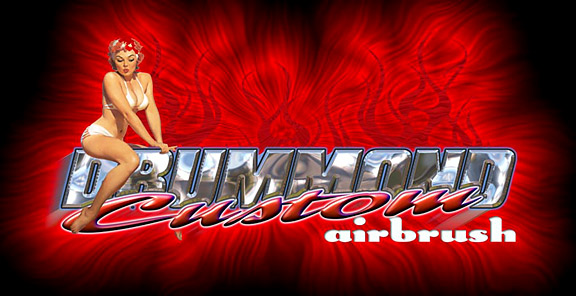
This was done in Photoshop and outputed to the gerber edge.
[ April 10, 2009, 05:07 PM: Message edited by: Barb. Shortreed ]
Posted by Bob Rochon (Member # 30) on :
Eric,
Your pushing the envelope for me! awesome!!!!! Now I'm charged to try to produce stuf even close to that.
Keep em coming.
Oh BTW that picture doesn't do that image even half the justice it deserves, that big one on 4 edgetalk was stunning!
[ January 09, 2003, 10:49 AM: Message edited by: Bob Rochon ]
Posted by eric musser (Member # 3419) on :
Thanks Bob if you ever need help just let know
Posted by Terry Whynott (Member # 1622) on :
Really cool!!
Right click on box>Properties>Copy the url>Paste in Address bar at top
I suspect you can't link out of the forum it is placed in.
Posted by Bob Stephens (Member # 858) on :
Very impressive! Should be a law against that much creative fun. Is that a Vargas chick?
Posted by Kelly Thorson (Member # 2958) on :
WOW!!!!!!!
Posted by Ryan E Young (Member # 2325) on :
You cant beat a sexy pinup girl!!!!!! Awsome
Posted by Bruce Evans (Member # 44) on :
I'd like to see it too, but it appears your signforum link isn't working
Posted by Suelynn Sedor (Member # 442) on :
Wow!
Are we seeing the photoshop image, or is this how it printed out from the edge?
Absolutely impressive!
Suelynn
Posted by Joel Peters (Member # 622) on :
Simply awesome! This certainly helps making the case to get into digital printing. Great job!
Joel Posted by Janette Balogh (Member # 192) on :
Dynamic!
That chrome effect is awesome.
Nettie
Posted by cheryl nordby (Member # 1100) on :
WOW indeed! I looked yesterday and couldn't get your picture to open. I am glad I came back! Really nice work! Posted by Neil D. Butler (Member # 661) on :
COOOOOOOL! Where did the Girl come from?
Posted by Ryan Ursta (Member # 1738) on :
Awesome! How is the effect for Drummond done? Is it a photograph thats distorted and powerclipped into the text? I'd like to know. Killer artwork!
Posted by Robert Carney (Member # 2016) on :
Awesome stuff!!!
How about a step by step on how you put all the elements together. Posted by Amy Brown (Member # 1963) on :
Very cool!
Posted by Mark Matyjakowski (Member # 294) on :
Yeah that's real pretty ... what's it say?
IMHO it looks like a "really cool design" that got over filtered... harsh
How's it look printed? I think it would look cool on a biz card if that red hair stuff weren't so bright.
I know no critique was asked for ... and it kinda pains me to post anything even slightly negative after all those other ... reviews
Posted by Mike Pipes (Member # 1573) on :
Mark Mark Mark... anymore comments like that and you will be bannished to live forever in late night letterville chat. You should stop by for a visit some evening, you just might like it. Posted by Rich Stebbing (Member # 368) on :
That is really HOT! I agree a "step-by-step" would be great, even if it is over my head. About how many "man hours" you got into this project. You mentioned Edge output, and I wondered how is was to be used (sign,vehicle, etc.)?
Posted by eric musser (Member # 3419) on :
Mark, it printed very good the pic on the site does not show very well. i don't know what kinda work your are in to but i've been airbrushing for about nine years so i know what im doing and know what works and it's funny ten or so people knew what it said and you can't read it Oh well it doesn't mater anyway. the whole thing took me all abot five min to do and printed it out(in 20min or so) and the job sold for a G
Posted by Mark Matyjakowski (Member # 294) on :
I didn’t mean anything personal. I can read it ... after a while ... close to the monitor. Maybe I’m just not a big fan of plug-in chrome filters or red and black on red and black.
Five minutes in photoshop? ... then I wasn’t too far off.
Got a G for it, Well then I have to change my answer to, GREAT JOB (seems that’s all you wanted to hear anyway)
One question, Did Drumond at least paint the girl to be pasted in?
Obviosly I'm the minority so probably wrong ... And meant nothing personal by feeling that one design was over filtered.
Posted by Raymond Chapman (Member # 361) on :
I'm just dumb enough to plod into this discussion on design.
I too like the design, but depending on how it will be used determines whether it is readable or not.
In my opinion, it doesn't make a lot of difference how long it took, or how much you got for it, or long you have been doing airbrushing - the bottom line is still, "Can you read it?"
Sitting here in front of the monitor with a little time I can understand the message and think that the design is first rate...if the viewer is close to the design and has some time to sort out the copy and the visual elements.
On the other hand, if the design is on the side of a van and the viewer has three to five seconds to comprehend what is being said, then it may not be as effective as it could be.
I don't think Mark meant any ill will towards you - he was just analytical...just as I am.
And, by the way, I've been doing this for 40 years, but that doesn't mean that I know any more than the next guy.
Posted by Dan Antonelli (Member # 86) on :
I agree with what some of you are saying - depending on the usage, the design works well, or doesnt work as well as it could.
Certainly, distance legibility is sacrificed, but the coolness factor is way high.
It really depends on what the customer want the lettering to accomplish. For print and web usage, I think the design works fine and is kinda trick. For vehicle or signage purposes, it may be a little hard to read.
Eric, keep in mind that no one has as quite much experience as Ray! (I dont think theres many people THAT old )
Haha Ray--
Posted by Rick Chavez (Member # 2146) on :
If I had a buck when someone told me "I've been doing this for------ years" As far as cool, it is very cool, as far as layout, take away the effects and what do you have? I agree with some here, I think a little more thought on your type layout and choice of font would make this a much better peice. Photoshop filters are cool but can be overdone, I don't think your design is too much over the top, but it's about the limit of what can be done and still look good. Thanks for sharing. Rick
Posted by Bruce Evans (Member # 44) on :
I think it's sharp. Would make a great t-shirt design.
Posted by Angel (Member # 3541) on :
Being someone that is not in the sign-biz, but on the sideline, I think that if your customer loves the design, that is most important. However, (again...not in the sign-biz) at first glimpse, I see a nice pin-up girl and the word "airbrush".
Unfortunately the name doesn't stand out as effectively as it could.
It IS a cool design, and apparently the customer was pleased with the outcome.
Posted by Curtis hammond (Member # 2170) on :
i think some of you all need to take the color test i posted earlier today...
i read it right out first try. and i think its great. and i wish i had the talent. If i did i would post an alternate if i had any thing negative to say...
Hey dude, would u be interested in doing a logo for me??? luv the red
Posted by Gavin Chachere (Member # 1443) on :
I'm going to disagree with everyone here,#1 for the sole purpose of disagreeing and #2.....the problem is obvious..if DRUMMOND sat about .0000237" to the left in the design instead of where it is now imagine how much more pleasing it would be to the eye,how much the negative space would be utilized and how the flow of the design would just inhabit your soul when you read it....it wouldn't just stand there and look pretty,it would sing. In fact,to make certain i had the numbers correct and simplify things i used eigenvectors and matrices.It is easy to show that
M = (u1 u2)|k1 0|(u1 u2)^(-1) |0 k2|
where (u1 u2) is the 2x2 matrix P formed by the columns of u1 and u2.
Then M^n = P|k1 0|^n P^(-1) |0 k2|
M^n = P|k1^n 0|P^(-1) |0 k2^n|
say a (2x2) matrix M operates on a two- dimensional column vector v, then that vector is transformed in magnitude or direction or both to the vector v'.
So M.v = v'
Now for the general (2x2) matrix M there are 2 eigenvalues k1 and k2 with associated eigenvectors u1 and u2 with the property that:
M.u1 = k1.u1
M.u2 = k2.u2
So any point on the vector u1 is transformed to k1.u1 when operated upon by M, and similarly any point on u2 will move to k2.u2 after transformation by M. In some problems where M is to transform a complicated figure or we wish to describe the transformation clearly, it is convenient to use u1 and u2 as the base vectors - i.e. give coordinates of all points in terms of u1 and u2 rather than the usual (x,y) coordinates, and the transformation matrix then becomes
|k1 0| |0 k2|
From there,its a simple step to plug in the right numbers and get .0000237" But i do have to ask this.... is this the direction this buisness has now taken??? Have we gotten so damn quicky-sticky in our mentality to the point where we will overlook things like proper spacing just to have it look good? I mean sure it looks cute but is it spaced right? All the chrome in the world won't help sloppy spacing,nor should we expect it to....but i guess now that computers have entered into this buisness the downward spiral can only continue,depressing as that is.
[ January 14, 2003, 04:37 AM: Message edited by: Gavin Chachere ]
Posted by Dana Bowers (Member # 780) on :
I know that someone will eventually post something about 'he didn't ask for criticizm, etc...' but isn't posting stuff here for us to see a chance for some of us to learn something, too? Or is it just a brag post site?
I like it better knowing that I can learn stuff.
Constructive criticizm is something we did alot in our second year of sign design class. We were given some job specs and had to design, layout & paint the sign accordingly. At the end of the week, we all sat in a circle and looked at the sign and discussed why it works... and why it doesn't.
It was a wonderful learning tool. Sometimes seeing it vs describing it makes all the difference.
If this were our classroom, my thoughts would be the same as some posted already.
From the viewpoint of cool effects, this has got it covered. Very awesome looking and shows that the person knows how to use the program. It would be awesome on printed media and something like t-shirts.
From the viewpoint of "sign"... I stood behind Bruce at the monitor and asked him what the name was. I guess if I would have stood there a few more moments I would have figured it out. If you are at a P.O.P. stand, than way cool, since someone can grab a business card and won't need to remember the name to look it up in the phone book.
But I agree with Mr. Chapman - stuck on the side of a van, it's awesome to look at, but to quickly read the name, then go home to look it up would be tough. (Mr. Chapman's work was something we studied in school and I have a GREAT amount of respect for him... no matter how many years he's been doing it!)
How many times do sign makers complain about the designs from 'graphic designers' that work great on paper but aren't as effective on a sign?
Maybe if you told us what you were using it on, it would help us to understand the use better.
Actually... I'd rather just look like her...
[ January 14, 2003, 07:24 AM: Message edited by: Dana Bowers ]
Posted by mike norcross (Member # 3496) on :
Wow Eric what a great job, that certainlly makes me want an edge all by itself. Mike
Posted by mike norcross (Member # 3496) on :
Dana I know for myself i learn from everyone, my grandfather once said, ´´ In every man or woman theie is something i may learn of them and in that i the pupil.* Mike
Posted by Janette Balogh (Member # 192) on :
Dana, I couldn't have stated my thoughts better.
My early art classes in school were also like Dana describes and I view this forum much the same way.
I think that one of the qualities of a "Letterhead type" is that they, more often than not, see room for improvement in things, and mostly in their own stuff. I see way's I'd have done things differently, on that lawyer's sign I have posted. I have some personal dissapointments there, but realize it's still a pretty decent piece of work.
Like Dana also, I have the utmost respect for Ray Chapman. (from the very first issue of SignCraft back in 1980) It may sound odd to some of you, but rather than get my ego bent, I actually feel honoured that someone in Ray's (and other's) league of expertise would even bother to give input on my work. Whether complimentary or constructive. I appreciate people's input, and their time in giving it.
Last year I posted a logo I did for an englishman. Someone here suggested that a brighter colour yellow might look better. Well, damn if he wasn't right about that! I took to the design, and adjusted my colours. Lo and behold, a totally bolder and better design emerged! I couldn't get back on here fast enough to show my discovery, and to thank that guy.
Although I tend to consider the source of any comment, I've found that input from ANYBODY can have merit. For instance, I've recieved change suggestions from customer's that have seemed downright elementary, when I've shown them designs that I've thought were "just right". After the initial disappointment of their reactions, I've found that by implementing their ideas using good design sense, I've often surprised myself with some good results. By opting to view their input as a design challenge, and not a put down of my original work, we both win. I pull something off, and the customer leaves smiling!
Eric, I think your effects on this design are awesome. I'm particularily impressed by the chrome. I did need to work at reading it. As other's have stated, if this is something that will go to print and will be held close to view, than it's not the issue it would be if it would need the immediate impact for a sign. Mark, Ray and Rick all made excellent points, and did so without the intent of putting your work down.
Incidentally, I'm having a difficult time believing that you only spent 5 minutes on that design. hahaaaa ... that's sign painters time scale, right?
Maybe there should be some kind of statement at the top of the portfolio page saying that if you are not open for a design critique, then state that upfront, or refrain from posting any work.
Seeing thru other's eyes could prove valuable to those willing to expand themselves.
Nettie
[ January 14, 2003, 11:11 AM: Message edited by: Janette Balogh ]
Posted by eric musser (Member # 3419) on :
Ok, the pic on the site does not show up clear in person it is very readable. on the sign the letters are over 12" tall. you can read from 30' away no problem. so don't judge off the pic and as far as color it depends on the person
Posted by Doug Allan (Member # 2247) on :
Great work again Eric. I, like Bob, feel challenged to get into photoshop & learn to get WAY more creative to come close to eye candy like this.
I also had some trouble reading "Drummond" but like my logo design book from Dan A. says, "Airbrushing" needs to be the easily read part of the sign, & the company name can afford to be a little more tricked out. (I'm not quoting here, just how I remembered it)
My other 2 questions are: If "Drummond" (& you for that matter) are airbrushers, why is the whole sign done on the Gerber EDGE?
2nd question: Please post a pic of the actual sign. I'm sure it looks great, but no way as clear & vivid as the digital file created from. I think we would all benefit from seeing how well you can get all that awesome design skill to output.
Posted by John Cordova (Member # 220) on :
Very cool! I too would like to see a step-by-step. I don't think it's over done. You were going for the trick look and you've achieved it my friend. There are a ton of signs out there that ARE legible and I wouldn't give them a second glance 'cuz they're ugly. This is beautiful and I was able to read it right off the bat. Maybe next time you can use white helvetica and brushscript to please everyone (hee, hee). It's cool dude and the client liked and paid you well for it, that's all that matters . Rock on!
[ January 14, 2003, 04:51 PM: Message edited by: John Cordova ]
Posted by Dan Antonelli (Member # 86) on :
Wow! Ive been quoted! Cool! I went back the book to see exactly what I did write about it, and thought I'd share an excerpt:
"Lettering effects:
In general, keep your lettering effects to a minimum and youll help keep the legibility of your design intact. Try first to design a logo that does not require any effects. Later, you can add effects if you wish to enhance the design. You need to be careful when designing something that only becomes legible with the addition of an effect. However, when youre designing logos with layers and varying levels, youll sometimes need an effect to help the legibility.
Shades and outlines: Shades and outlines are great tools to enhance a good design. But as stated previously, be careful relying on them to solidify a designs legibility. If the design legibility is suspect prior to the addition of a shade or outline, its not apt to vastly improve when it is added. It may, in fact, detract or distract the viewer if used incorrectly."
Posted by Doug Allan (Member # 2247) on :
partly out of fear of mis-quoting (well no quotes really, but mis-representing) Dan, I took another look at his book. Funny after years since I read it that I had this idea what I thought I learned from it. I ended up scanning through quite a bit of it to see how the same info. would have different impact based on how much further down the road of experience I may be.
I guess a few sentances that hints at what I remembered is this:
"In general, most lettering effects should be relegated to main copy usage only. Your main copy should be the appropriate size to have an effect without hindering it's distance legibility. You want to limit the number of effects used in any one design."
This passage was followed with a chapter on main & sub-copy philosophies. So the term "main copy" as used above could still apply to anything as Dan points out. I guess I adopted one of the philosophies, that being the one where the business name is the main copy & "what they do" is secondary. But in my mind this meant the secondary copy may be the easist to read from a distance. (& therefore I might have considered it the most important)
What I had not retained in my memory is how often Dan stressed exactly what he has repeated above. If the "effects" are used carefully enough not to lose legibility then main copy is the most important & probably the first to be seen.
I guess over the years I've developed my own standard logo-selling schpeel (sp ) I tell people if they see what you do & they need that then they will look at the rest of the logo, but if the whole thing is boring, they may never focus on it anyway. If some trick design effects bring their eye to your sign & all they can read is "Drummond" or some such name, it's over, there looking somewhere else already. If they see "airbrushing" & they think they may want some airbrushing they will want to get the name & remember it.
Plus they will later see the logo on shirts or a business card & without even reading it the graphic uniqueness has them making the tie-in to seeing it around & being impressed by it & wanting to do business with that airbrusher.
Posted by cheryl nordby (Member # 1100) on :
I love it Eric. Every sign serves a different purpose, and with your design it makes you take a double take. Again and again. Just like everybody posts their work for different reasons. Some to get help and others just because they are proud. You should be very proud Eric. It looks great!
Posted by cheryl nordby (Member # 1100) on :
Gavin....forgot to say LOL about you. OH NO!!! Are you getting to be one of these long winded sticky picky Letterheads? you are too funny.
Posted by Steven Vandervate (Member # 3025) on :
Would it be out of line to ask what Brown & Bigelow charges for the use of its images for signage?
Posted by Joel Peters (Member # 622) on :
Wow, talk about an attention getter. Eric, I hope we all can see more of your killer work in the near future.
There was a lot to learn here after 39 responses. Now my brain and my eyes hurt. Lol.
Joel Posted by Randy Campbell (Member # 2675) on :
I agree with Joel;keep them comin!!!!! Posted by John Deaton III (Member # 925) on :
I think one thing you gotta look at too, is there are many different people on the board. We all dont own the same car, nor do we all like the same foods. We are gonna disagree at times on what looks "right" to us. In this instance, I understand what my friends have pointed out, but... when I first looked at it, I read it out loud,and it really jumped out at me. Thats probably what the customer wanted, doing the kind of work that he does, airbrushing. There are always little things we can do to tweak a design here or there, and I do alot of tweaking on mine. Tips that have been pointed out on this post might pop in your head on some other job, and help you out in some way. On this design though, I really do like it. I love the chrome effect, and use it myself from time to time. The coloring is vibrant and the art (girl) adds a nice touch. Really nice job.
Posted by Terry Baird (Member # 3495) on :
WOW!!
Posted by Glenn Taylor (Member # 162) on :
Eric,
How did you manage to get Cheryl to pose?
Posted by Randy Campbell (Member # 2675) on :
Tell the truth; doesn't Cheryl look like the actress thatplayed in that girl??????
Posted by Bruce Bowers (Member # 892) on :
Hey Randy...
You're showing your age, dude! Besides, Cheryl is much prettier...
Have a great one!
Posted by Doug Allan (Member # 2247) on :
Randy, what girl? Marlo? nah, I don't see it...
[ January 27, 2003, 01:53 PM: Message edited by: Doug Allan ]
Posted by KARYN BUSH (Member # 1948) on :
no..she looks like monica on friends!
Posted by Deb Fowler (Member # 1039) on :
Eric, you outdid yourself here. The chrome is unusual, as I was looking to see how it appears bent, how unique, just that I haven't seen any like that. It took me a second to capture the wording but that didn't bother me, as the other qualities satisfied my thirst.
The colors contrasts and textures are really rich and are very well chosen as you already know that. Another treat from the portfolio page, inspiring me again today, thanks. btw, what do you produce in an hour?????( Posted by Victoria Colella (Member # 5833) on :
Hi Eric,
Was any portion of this image produced with an actual airbrush or is the whole thing done inside photoshop?
Curious Vic Valhalla Signworks Posted by Victoria Colella (Member # 5833) on :
Hey Karyn = is your hair really purple or have you been fooling around with photoshop too?
Vic
Posted by William Holohan (Member # 2514) on :
I love the "look" of it. The color, the effects, the girl. But for me is doesn't pass the "squint test" as a sign. As a card...terrific.
Posted by Jon Jantz (Member # 6137) on :
Design looks awesome. I have a friend who can airbrush killer chrome effects and have always been impressed with it. Keep it up...
And Steve, you can contact Brown and Bigelow from this link to see about chick licensing...
Here's the pic from the site Jon links to above: Posted by Ian Stewart-Koster (Member # 3500) on :
Wow, 3 years between contributions!
Here's the pic from the site Jon links to above:
here's the first pic: Posted by Todd Gill (Member # 2569) on :
Effects are always cool....but they can be easily overdone, and quickly contribute to difficulty in legibility where text is concerned.
I'd have to agree with Mark on this one....nice effects if you were isolating the various elements and judging them as individual components...but as shown? Very difficult to read and distinguish the message.
If we're going to get picky;
* The chick needs a dropshadow cast upon the "Drummond" and "Custom"....much like you see her arm casting a dropshadow on her abdommen.
* Drummond - uses a good font to showcase the chrome...however, the letter spacing needs to be opened up and I would have placed a thin, bright white border after the chrome...followed by a somewhat thicker black border, finally followed by a medium perimeter gradient glow of a slightly creamy color. This would make the individual letters "pop" and be more distinguishable both from the background and the neighboring letters.
* Custom - a little lighter on the dark shading on the shadow side of the letters....a little harsh. And definately a different color than red...it is engulfed by the strong red background testure.
* Airbrush is fine.
What chrome filter did you use? Eye Candy or AutoFX? Looks like Eye Candy to me.
Artists have huge ego's in regards to their work...and I'm no exception....but it's good to take your licks and give other's advice a try. Often times, it serves to improve the current design as well as enhance skills.
I like the portfollio section here...but I'd agree that in many cases people don't want constructive criticism, but rather are looking to be showered with compliments - which is natural - don't get me wrong....we all like to be complimented.
It's especially hard to be critical to people you've met or have come to know through conversation here.
I always understood "portfollios" to be open to critical/constructive judgement. If you've ever taken a portfollio to an interview - this is what you can expect; questions on why a design was treated this way or that, or on occassion negative comments.
Not all criticisms are worthy. Some criticisms can come from people who's work you may not admire at all. I think the key is being open to ideas and knowing which ones are valid, which ones aren't, laying ego aside and being willing to implement ideas that can enhance your design and make a person a better designer.
Even widely acknowledged "design - masters" make mistakes here. Nobody is perfect, especially in a somewhat subjective field like this.
Posted by Brent Logan (Member # 6587) on :
Todd, is Eye Candy a plug-in for photoshop?
Posted by Todd Gill (Member # 2569) on :
Brent - yes it is....and if you use Photoshop you'd really appreciate the several filters Eye Candy 4000, Eye Candy 5 Impact, EyeCandy Textures and a few of their other plugins can give you that would make you scratch your head trying to figure out how to create it from scratch.
It's made by a company called Alien Skin
Another great Photoshop Plugin is AutoFX....they have a magnificent set of filters too....for Chrome and all kinds of stuff.
And then there's KPT plugin which I use frequently too....
www.corel.com Posted by Brent Logan (Member # 6587) on :
Thanks for the links Todd. Glad this thread stayed open for so long! The chrome lettering really intrigued me. I thought about trying to make something like it in photoshop the hard way. I've been making a lot of brushed aluminum letters lately using noise filters and motion blurs. Excellent critique by the way...
Posted by Brent Logan (Member # 6587) on :
Just checked out the autofx link. Some of the chrome letters remind me of cartoonist Robert Williams lettering for Zap Comix.
Posted by Deb Fowler (Member # 1039) on :
Hot red flames, cool chrome and a cute artsy fartsy, sexy vargas chick in the middle sizzling! I like the artwork, and agree that taking it a few steps further to separate the lettering from the backgrounds, just a bit (maybe a highlight not to disturb the soft effects) would take it from artwork to a lettering design a bit more legible. (a critique of how "I see it"!) and also an inspiration for me as "you see it!).
Posted by Joey Madden (Member # 1192) on :
Eric, let the people of Letterville help you lower your prices to make less money so you learn how it is to be humble. No one should know more then their heros who have criticized your work while still borrowing ideas from their neighbors Posted by Joey Madden (Member # 1192) on :
If this guy is an airbrush artist why in heck would he want a sign designed by someone else and not airbrushed!!!! Faults advertising!!!!!card looks great, wonder if he could paint that himself?????
Posted by Joey Madden (Member # 1192) on :
Jeff, why must you continually post under my name, people will think I have a split personality Posted by Jerry Steward (Member # 2420) on :
Graphics with an Attitude - there's your warning Mark, not somebody who wants to hear criticism. Eric, if you'd ever seen Mark's work, you might realize he's trying to give you some actual help. Maybe you got a grand, but I hope they don't compare it to Mark's work, or that'll be the last grand you see from them. I hate to see so many amazingly talented folks waste their time trying to help people who don't appreciate it. If you post on the portfolio table, check your ego at the door.
Posted by John Deaton (Member # 925) on :
So, we are jumping on this guy three years after the fact?
![[Big Grin]](biggrin.gif)
![[Cool]](cool.gif)
![[Smile]](smile.gif)
![[Razz]](tongue.gif)
![[Wink]](wink.gif)
![[Eek!]](eek.gif) adds a nice touch. Really nice job.
adds a nice touch. Really nice job.


![[Bash]](graemlins/bash.gif)