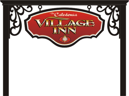
Good morning everyone...the sun's a shinin' and the birds are singin'. My client loves everything about this proposal, except the "The Caledonia". I don't care for it either, but there's not really room for a scroll, dingbat or embellishment to encase the words. Anyone have any ideas?
Posted by Bruce Bowers (Member # 892) on :
Yes, I have several.
Posted by Jillbeans (Member # 1912) on :
Something simple like this maybe? Love....Jill
Posted by Bob Rochon (Member # 30) on :
I think it's because it is stuffed into the top curve of the sign.adjust your panel for the layout, not the layout for the panel.
Posted by Terry Baird (Member # 3495) on :
Yeah, I know Bob, "The Caledonia" was an afterthought by the client. There is another Village Inn in a neighboring town and that has always caused confusion (30 yrs). The panel is exactly 48"x 96" Looks like I'm still sketchin'...
Posted by Bob Rochon (Member # 30) on :
Holy Crap that's a 4x8? what's the structure a car port?
I love the look and feel of it.
Posted by Jerry Berg (Member # 7841) on :
I'm kinda liking Jill's idea there.
Posted by Craig Sjoquist (Member # 4684) on :
likes Jills idea but with the lowercase font
Posted by old paint (Member # 549) on :
wasnt CALDONIA, a john lee hooker song)))))
Posted by Cam Bortz (Member # 55) on :
Caledonia is the name the Romans used for Scotland. Amazing what you can learn from Wikapedia with minimal effort.
My thought would be to arc the word to follow the top arc of the sign.
Posted by Jillbeans (Member # 1912) on :
I knew what Caledonia was already, I think Terry did too cuz he added a thistle. What I would do is flip/rotate the whole panel. It's really better to fit the shape to your text, as Boob suggests. Love....Jill
Posted by Michael Boone (Member # 308) on :
Caledonia is a town..here in central NY
Posted by Ian Stewart-Koster (Member # 3500) on :
I'd drop the picture (thistle?) at the bottom- it 'uses up' too much valuable space. Then lower the two main words 'Village Inn' a bit. Then enlarge Caledonia a little & squeeze 'The' half into the negative space between the C & the L of Caledonia & half protruding out of the space a bit. Then take the A at the end of Caledonia & add a swoosh to it to balance the weight of the C at the start.
Put a thistle back in somewhere if there's room, but I wouldn't be using something constrained in a circle like that, I'd sooner an organic unsymmetrical thistle leaf/pair of leaves & a flowering head on top.
Hope that makes sense!
Posted by Michele Sommers (Member # 8866) on :
Jill's idea looks great, but I'd love to see it follow the arch as Cam suggested, just to see how that would look...
Posted by Terry Baird (Member # 3495) on :
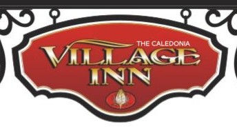
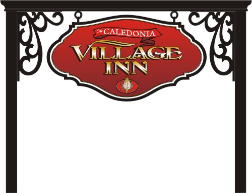
How about this? I tried not to change too much.
Posted by Joel Cuminale (Member # 3148) on :
terry, im diggin the original shapes uniqueness, how about wrapping the tail of the "V" up and around to form an oval to enclose "the caledonia" and end it in a swoosh like on the center bar of the "E" in "village"
Posted by Jillbeans (Member # 1912) on :
I would make the banner a different color than red. Love....Jill
Posted by Cam Bortz (Member # 55) on :
I like the ribbon (but then I always like ribbons on signs). If it HAS to say "The Caledonia" instead of just "Caledonia", do "The" in the same size and font as "Caledonia". As it is, "The" is an unreadable squiggle.
Posted by jack wills (Member # 521) on :
Reduce the size of the logo at the bottom, lower the primary copy a bit. It may even out some of the negative space.
Jack
Posted by Joey Madden (Member # 1192) on :
I liked the original cutout which you should turn upside down to give it more space
[ December 03, 2008, 11:20 PM: Message edited by: Joey Madden ]
Posted by Jon Butterworth (Member # 227) on :
I like Jill's simple solution! KISS!!
Maybe you could make her suggested "Caledonia" a little bigger by dropping the "The"
After all, "Caledona" is only there to set it apart from the other Village Inn.
Posted by Donald Miner (Member # 6472) on :
Jon, you took the words out of my mouth. Sometimes the word 'the' just gets overused in my humble opinion. Don
Posted by Jim Moser (Member # 6526) on :
Loose the ribbon....
Posted by Ray Rheaume (Member # 3794) on :
Lose the flourish on the capital V...it's taking up the space you need to fit Caledonia into.
Posted by Mike Pipes (Member # 1573) on :
Just make sure your purchase order, sell sheet, invoice, or whatever you use, has a clause that releases you from responsibility (and guarantees you get paid) in the case of trademark infringement.
VICORP has a Village Inn restaurant in Caledonia so there could be potential issues with this one.
![[Rolling On The Floor]](graemlins/rolf.gif)
![[Smile]](smile.gif)