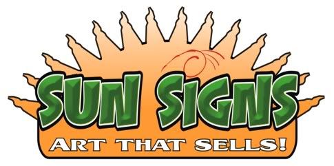
I know there has been a lot of these posts on here lately, but I will add another. Here is my logo, it has went thru many revisions, It is starting to be recognized in my area so I will probably keep using it, however is there anything I could do to give it some more umph.
Sitting cowering in the corner with my helmet on.
Posted by Jill Marie Welsh (Member # 1912) on :
Phone number smaller & tighter to the name, and no need for the black drop shadow...why highlight a phone number? The "S" needs to be bigger, it reads like Sun igns to me. The whole name could be bigger. No black outline around the sun, and maybe nudge that name over and up a bit more. Make the green swooshy thing smaller, and either put a period at the end of your by-line or make that capital "A" the same size as the other caps in the script. Not keen on the brown or the choice of script, but hey that's just me and you did ask. love....Jill edited to add a quick mock-up.
[ June 27, 2006, 10:37 AM: Message edited by: Jill Marie Welsh ]
Posted by Jonathan Androsky (Member # 2806) on :
Jill, you should write a book. For real.
I've not much else to add that Jill hasn't already said. Your idea is good Blake, It just needs tightening up.
I don't mind the brown and teal/green so much. I'd be careful putting a black shadow on the brown though, as both colours are dark and at distance I think you are going to lose readability.
Posted by Todd Gill (Member # 2569) on :
Blake - How about something a little less *perfect circle/simple vector* looking?
When I think of "Sun" I think of fun; a little more bouncy and casual.
Make the Phone number Pop from the logo so it's quickly keyed in on. How about something like this?
Edit: I also took the liberty to shorten your tag line to something more direct-to-the-point and quicker to read.
[ June 27, 2006, 11:12 AM: Message edited by: Todd Gill ]
Posted by Jon Aston (Member # 1725) on :
That ROCKS, Todd.
Posted by Blake Koehn (Member # 5984) on :
I like that Todd. Definately "Outside The Lines" I also like the overall shape,I think it would fit on my vehicle better.
I like Jill's version too. I was playing on the beach sunset look thats where the colors came from. I don't know tho Todd's version got the right side of my brain really workin now.
Posted by Lotti Prokott (Member # 2684) on :
I like what Todd suggested for a tag line, the one you have now is slightly awkward. Theres no real reason for the phone number to sit way to the right. I'd reduce it and position it below the main copy, sort of like Jill's suggestion.
Posted by Jill Marie Welsh (Member # 1912) on :
I also like Todd's....darn show-off. Only thing I'd change on his is to condense that final "s" because it looks too stretched out to me. Or to skootch the sun thing over to the right just a tad. Me? Write a book? I'm flattered but I have about 21 more years to go before I know enuff. I'm just a sign painter. love....jill
Posted by Lotti Prokott (Member # 2684) on :
double post, sorry
[ June 27, 2006, 11:54 AM: Message edited by: Lotti Prokott ]
Posted by Blake Wright (Member # 6584) on :
Todd thats to cool! What program are you running and what do you use to do the bevel letters?
Jill I speak for everyone that you have taken your time to do a logo for, "Thanks" it means more than you think to some of us.
[ June 27, 2006, 12:04 PM: Message edited by: Blake Wright ]
Posted by Blake Koehn (Member # 5984) on :
I really like your font Todd. Where can I find it
Posted by Todd Gill (Member # 2569) on :
Thanks Jon and everyone...
Blake W - * Program - Adobe Illustrator * Fonts - "Menace Base & Menace Convex" (Letterhead Fonts) for *Sun Signs* and "Alarm Block" (letterhead font)for the balance.
Of course, I did my own thing to the fonts - adding outlines,inlines, drops to properly pop the "Menace" font as well as enlarging the two Cap "S" so they were larger....so they helped define the two words as separate.
The "Menace" font comes with it's own bevel...which I think is pretty cool.
Sun was vectored by hand using the Illustrator Pencil tool....then a made a couple of angled rectangles and did a blend from the base yellow of the sun to orange.....then I "clipped" those gradients into the circular "Sun" shape.
Blake K - you're welcome to use any part of that logo - or all of it if it helps....that's what this site is all about, right? Helping others explore new ways of thinking and doing things? Tweak it up and make it your own if you want.
I know I've borrowed more than one idea from things I've seen here....Jill has inspired me as well.
[ June 27, 2006, 12:27 PM: Message edited by: Todd Gill ]
Posted by Todd Gill (Member # 2569) on :
Jill - good call on that last "S."
The two cap "S's" were originally the same as that last "s".....but then I enlarged them vertically to help define the two words as separate from one-another.
I neglected to see that by doing that - it made the unmodified "s" at the end look stretched.....and it totally escaped me....Good eye their gal! Posted by Blake Koehn (Member # 5984) on :
What do you think of this one?
Posted by Jill Marie Welsh (Member # 1912) on :
I dunno...looks like it sez Sun Skins! Maybe un-weld that G. I prefer Todd's placement of the byline, Blake. But it is a lot punchier than how you started out. Unlike most men, you LISTEN to suggestions! hahahaha love.....Jill
Posted by Stevo Chartrand (Member # 2094) on :
Hi Blake. It is better, but it still looks disjointed to me with no flow to it, and find the color choices in your main copy quite hard to read. Try the good 'ol squint test. The color of the sun in the background is fighting with your copy. I think a higher contrasting color choice will solve that to get away from the background and pop out more.
Here's a simple version I whipped up for ya. I'm not sure what kind of look you want so I went with more of a fun image. Keep in mind as well that this should be versatile for all of your other promotional items.
Hope this helps ya.
Stevo
Posted by Blake Koehn (Member # 5984) on :
Another Revision, design fee is going up
Posted by Todd Gill (Member # 2569) on :
Blake - I don't know how to explain it other than you need a design where the elements are integrated better.....there needs to be a sense of the logo being "together" rather than elements that appear to be floating in space.....
Your sun color/fade is tepid looking.....kinda washed out looking. Make that sucker flare up dude!
One suggestion is you need to get away from a simplistic looking round/oval ball....it needs some flare....Nothing wrong with vector art....but give it some Umph!
I gotta admit that I'm not digging the phone number font....it looks very early 80"s to me. Lets go for bold and brassy. Here's another attempt for ya to consider:
Posted by David Wright (Member # 111) on :
Ever since Jill mentioned Sun Skins, that's all I can see. Todd's last is nice, Stevo's works real well to.
Posted by Dusty Campbell (Member # 4601) on :
Blake, bump up the size of your phone number. Your desing is light on the bottom fading away into nothingness. Give it some weight on the bottom. It will make it solid - notice Todd's phone numbers and the difference it makes.
I like Todd's edit of your tag line alot. It makes you think "Hey, this guy's signs are going to help me sell stuff!"
I'd do something about the signs/skins dilema as well. Maybe just alter the shape of the G to be more round on the left side.
Posted by Kelsey Dum (Member # 6101) on :
Very nice Todd!
Here's another quick version. Maybe some more highlights on the sun beams or something.
Posted by Todd Gill (Member # 2569) on :
Yeah, I can see that in that particular font too David.
I'd probably round off the left side of that "g"....that would make the difference.
Actually....here ya go...I tweaked it.
Posted by David Wright (Member # 111) on :
Now I'm seeing "Slin" Signs, it won't stop!
Posted by Blake Wright (Member # 6584) on :
Man, I should have posted my logo here instead of the Portfolio page. Those samples are just too cool! Posted by Todd Gill (Member # 2569) on :
Stop it! You're killin' me! Posted by Blake Koehn (Member # 5984) on :
im workin on the g now I guess todd beat me
Posted by Todd Gill (Member # 2569) on :
What picture?
[ June 27, 2006, 04:51 PM: Message edited by: Todd Gill ]
Posted by Jill Marie Welsh (Member # 1912) on :
Slin Skins....circumcision while u wait? Posted by Tracie Johnson (Member # 6117) on :
Wow Blake! Your ability to accept and use the constructive criticism so positively is ALMOST more impressive than Todd's design skills.
This board is great!
Posted by Mark Neurohr (Member # 2470) on :
This is fun to watch develope! Blake, lookin' good Buddy!
Posted by Glenn Taylor (Member # 162) on :
Blake,
Looking at Todd's latest and Stevo's version, ask yourself what is it about them that is different than the one's you came up with.
A couple things I noticed is that they both reduced the size of the sun and boosted the size/impact of the name "Sun Signs" by increasing the contrast. That to me really makes a difference. Also, the panel that Todd added really helped to separate thought while improving readibility.
.
Posted by Jim Moser (Member # 6526) on :
If I might interject a few thoughts.....Keep in mind that it needs to be readable....sometimes what looks good on the monitor is not readable on a truck door at twenty feet, or on a sign when driving by. All the bevels and outlines are neat, but if they make it hard to read, they need to go. Same thing goes for crowding the letter spacing...hard to read. Color and value contrast are very important too. I like the cool effects as much as anyone, but I have had to learn how to use them so that the end result is still READABLE....I see a lot of artwork that looks great up close, but is indistinguishable when viewed from a distance. I hope this doen't sound too much like I'm preaching, but these are things I have to constantly remind myself when I am designing something. It is real easy to get tunnel vision and loose sight of the overall picture.
Posted by Stevo Chartrand (Member # 2094) on :
Exactly. What's the point if you can't read it? I'm afraid to say Blake, but that font you have going there does not read well at all, and would start out with something that's bolder and reads better. I tend to design in black and white first then start adding color to it. If it works in black and white, then with proper colors it should pop. Careful on your choices though. If the background is yellow stay away from making your letters yellow or anything that is close to that color value. It will just fall right back and you'll lose impact. You want your name to be front and center!
Stevo
[ June 27, 2006, 06:39 PM: Message edited by: Stevo Chartrand ]
Posted by Kelly Thorson (Member # 2958) on :
Well said Jim, a lesson I am still learning and not always in the easiest fashion.
Posted by Todd Gill (Member # 2569) on :
My thoughts run kinda in the middle of the last two posts.
I think that what you're viewing on screen is proportionately like looking at the graphic on a vehicle at 20 feet. I definately think a design shouldn't be overworked, and it must be readable at a glance - but not necessarily at 100 yards.
But I think it's even more important in this business to make an impact as cars are sitting next to you, behind you, or when someone walks by your unit when your at a job site. That's where the biggest "impression factor" kicks in.
An "Epson" font logo might be readable when it's one color at 70 mph.....but nobody is going to say, "Wow...cool design - I gotta give that guy a call."
Yet as Jim points out...you do have to keep a handle on the reins....or a design can get away from you.
You have to know what kind of viewing distance is reasonable.
What we're selling is design and color. Black and white may be needed for a local newspaper ad - but it isn't as critical as in the old days where you'd have to have your stationary printed by an traditional offset printer - using spot colors or black to save $.
These days, your letterhead, business cards, invoices, etc are often printed full color right off your own desktop. Or, you can get full-color high rez cards for next to nothing on line.
If you do have to create a version in black and white, there's nothing saying you have to literally copy every effect in grayscale - which indeed could deep six an otherwise cool color design. You can simplify....and it's still your logo...and it still has "the look." You can remove some of the offending elements/effects that look good in color but don't work in grayscale.
I certainly wouldn't just gob on the effects because "you can." You have to have a decent design and think it through. You need the proper balance.
I'd agree that the last sample of the logo that Blake posted has that font pretty muddy looking. The colors used caused it to lose it's contrast and the *pop* went with it. The font in itself...as tweaked was a good selection though.
Here's what that might look like in black and white - should it ever be necessary.
I think Steve makes a good point about designing in grayscale first....this can help you get things going...and help eliminate the possibility of overworking a design. I work backwards myself. I'm a little dyslexic I think.
[ June 27, 2006, 08:10 PM: Message edited by: Todd Gill ]
Posted by Si Allen (Member # 420) on :
Here's my take on it:
Arrgghhh! Don't know why it got all washed out, colorwise?
Posted by Jim Moser (Member # 6526) on :
Since a lot of us work alone without anyone to bounce ideas off, or critique our work, a thread like this can be of great value to be able to see how others approach design.
We did a panel swap where the object was to create a sign for the person whose name you drew...was a lot of fun and great to see all the different ideas....just like this !
Sometimes designing a logo for yourself can be more difficult than doing one for a customer. I have done several for other people in the business and I know David Butler and several others have done the same.
A lot of times when I get stuck on a project I just dig out some copies of Sign Craft or other reference books....always gives me the inspiration I need.
I am so greatful that we have this forum and the Letterhead family....When I started learning this art almost fifty years ago, you couldn't hardly get anyone to talk to you, much less show you how to do anything....now when one of us has a question, there is always someone with an answer !
[ June 27, 2006, 09:16 PM: Message edited by: Jim Moser ]
Posted by Mark Matyjakowski (Member # 294) on :
Slin Skins hahahaha
That's a neat looking font but obviously troublesome hahaha now it reads... Uppercase, Lowercase, Uppercase, ... Uppercase, Lowercase, Uppercase, Uppercase, Lowercase I do like that last design but There's just something wrong with that
Posted by Ian Stewart-Koster (Member # 3500) on :
I copped it giving an opinion on another thread, so I won't add anything new here- all advice is perfect!
Todd, I'd like to see the 2nd & 3rd birds flipped upwards- they look upside down to me! (GREAT design suggestions though- are you really Todd, or are you Stevo posting under a different name just to give yourself some competition! )
Posted by Todd Gill (Member # 2569) on :
lol....thanks guys...it could use a little tweaking too...and you're right about those birds. I was rushing it between some other stuff...they really are kinda upside down aren't they? I told you I was dyslexic..hehehe.
The more I look at it the more I see areas to tweak.
The "u" needed to be fixed as a few pointed out - I kinda did that in the black/white version.
Squeezed the "s" on the end back to match the other cap "s's" per Jill's keen eye.
Something about the way the sun comes down into the bar bugs me - looks a little funny and needs massaging.
And I rushed out the bar with the tagline - it really started out as half-circle round on the end, but I wanted to lengthen it and for times' sake just stretched it....and that made it kind of funny shaped on the ends.
But all in all....I think the last one has the basic foundation of a decent logo.
Design takes time...and good design takes refinement...
The thing I always tell people (who ask) is to always be your own worst critic. If something bugs you - either refine it till it doesn't. If you cannot be 99% satisfied no mater how much you tweak, then the design isn't a great one and you should start over with a different concept. Never settle.
And even then, I see so many people here that can design me into the dirt - so much talent moving around this place it's humbling.
Hopefully, we've all contributed ideas and design theories which will inspire Blake to hammer out some cool stuff he's satisfied with. He can pick out the things that make sense to him and run with it.
Posted by Jill Marie Welsh (Member # 1912) on :
I think it's neat when a topic sticks in your head. I woke up and got into Corel. Since my first revision is based on Blake's idea, this was what I thought of if it were my idea. I was going for a more celestial feel. I also like old-timey things so I used older alphabets. I am not keen on bevels and fades, as I've stated to death. Mine sorta pales in comparison, but hey it was fun! You might also have to watch for people wanting their palms read if you went too celestial! Stevo is right, if it works in black and white it works in color as well. This has been a fun little exercise. Blake has been great to work with. Too bad more clients don't listen. love....Jill
Posted by Blake Koehn (Member # 5984) on :
I like your logo Jill, however do a google search for sun signs. you will find every palm reader and zodiac in the book. That is a big problem I have with the name, but I am not changeing it. But with the whole world thinking that kind of stuff. I feel like I need to go with something more like what we have been doing in this post. That is the problem I have had with all the versions of Todd's logo, Something about adding those spikes or rays or what ever they are to the sun makes me think of a palm reader.
I am working on another version now, I will post it after awhile. It is kind of what I like about all these ideas. I will probably need help so more critisim will be welcome.
Later
Posted by Arthur Vanson (Member # 2855) on :
Some great suggestions and alternative ideas.
Here something I did a while ago, with a simple sun and similar wording to your original.
Posted by Jon Jantz (Member # 6137) on :
Should I wear sunglasses to look at that Arthur? Nice....
Posted by Stephen Deveau (Member # 1305) on :
I like to add a comment...
Kick myself out the door if you don't like it.
Your Slogan "Art that Sells" It renders up the idea that you are selling paintings and not image designs for business.
Being it the Sign Industry would you not want to use the frase..
"Graphics that Sells" or "Designs that Sells"
Posted by Blake Koehn (Member # 5984) on :
I don't know, I am kind of stuck.
Here is what I got.
And here is a link to the corel file if somebody wants to play with it. My logo in Corel 9.0
Todd I would like to have those birds, do you think you could email them to me? Thanks
I like the idea of the texture, but not the texture I am using . Does anybody have suggestions. No Barry, I don't have money for yours right now.
later
Posted by captain ken (Member # 742) on :
Everybody is having so much fun with this one.... I just gotta toss my hat in the ring... the major problem here is the font on the main line, lets try something very legiable, it also assures that the design will remain timeless and not go out of style, even though i used all Miami Vice colors....
[ June 28, 2006, 10:52 AM: Message edited by: captain ken ]
Posted by Jill Marie Welsh (Member # 1912) on :
Posted by Kelsey Dum (Member # 6101) on :
Good one , Jill!!! hahahahaha Posted by Mark Neurohr (Member # 2470) on :
Jill, outfriggenstanding!! Very cool!
Blake, I take it your not wearing a helmet anymore.
Welcome to Letterville!
Posted by Glenn Racoma (Member # 1846) on :
Good ideas coming in for sure. But personally, I'm drawn to Stevo's concept or the captain's on your logo. Why? Because I feel that a logo should not be competing in it's elements and it would help, I think, to know that a logo should communicate immediately minus the fluff that we somtimes pour into it.
It was said that the most effective communicative logo internationally was the Nike swoosh logo. Having no word or lettering, yet it identifies clearly of it's product.
Being the sign designer that I am, I've found this particular area or arena of design among the sign industry to be of most challenge. Because of who we are (sign people), we are so incline to creating a sign, per say, than a symbol or icon. Most successful designs (logos) are simple, having only the 'bare essential elements' to communicate rather than simply hanging a sign.
And please folks, don't misunderstand me. Your designs are great and I do appreciate your input but just thought I bring the awareness of an area to logo designing that we (maybe just me) may consider when designing a logo rather than just producing another great sign.
Just my 2 cents for what it's worth,
Glenn
[ June 28, 2006, 01:41 PM: Message edited by: Glenn Racoma ]
Posted by Jill Marie Welsh (Member # 1912) on :
Here is the minimalistic K.I.S.S. logo: Nah, it's just a sign layout. love....jill
Posted by John Deaton (Member # 925) on :
Todd, your design is awesome! You need to post more stuff. Damn fine work, not to say that the others arent great too, yours just grabbed me, so to speak, Posted by Jim Moser (Member # 6526) on :
I have some great reference books on logos called "The Big Book of Logos" by David E. Carter. There are three different volumes. He also did one called "The big book of 5000 fonts". Great source of ideas.....
Posted by Todd Gill (Member # 2569) on :
Geez John,
Coming from a talent like you....I'm blushing about three shades of red....thanks! Now if I could only do characatures (if I can't spell it, it's no wonder I can't do it) as fine as yours - not to mention all your stuff...I'd be up in the clouds.
Posted by Blake Koehn (Member # 5984) on :
Here is my latest rendition. IMHO it is starting to come together. I lost some of the clutter and made it more legible.
Posted by John Deaton (Member # 925) on :
I got to thinking about this post, and thought about using a sun graphic in the name. I know that Sun is spelled with a "U" but thought it would work, cause it is a "Sun". Anyway, its a cool name for your biz, and one to have some fun with as the replies above have shown. Posted by david drane (Member # 507) on :
That is awesome John. Amazing how cartoons can work in a serious logo. I love your designs!!
Posted by Glenn Racoma (Member # 1846) on :
Looking cool Blake....
Better composition and that center glow tends to highlight the name, yet not having to battle with it's background. Maybe I might want to cut down on the size of that bottom orange panel. Other than that, it's looking good!
Great job! It's amazing what a little critique can induce if only we have the proper perspective in recieving it as being helpfully constructive. It seems to always (for me) propel the evolution process for the better.
It's probably the most needed thing we all can use at times.
I can almost imagine what it would look like on a black vehicle!
Very nice outcome for sure!
[ June 29, 2006, 04:10 AM: Message edited by: Glenn Racoma ]
Posted by Todd Gill (Member # 2569) on :
John - now that's cool!
Easy to read and smartly designed! Nice composition....and I agree that the "sun" cartoon in the center of the "sun" words - although an "0" in shape instead of a "u" - doesn't bother me a bit!
The visual of the sun cartoon makes you easily read it as "sun." Nice job as always!!
Great anchor with the red swoosh holding the tagline too. Posted by captain ken (Member # 742) on :
great cartoon John, but to me it does read 'Son Signs' it might be better as an independent element or how about dotting the "i" Blake, your version has come along way, but for some reason your stuck on that letterstyle which is tough to read, and the offset on the 2 words really creates an interruption in the flow of the design....
Sun . Signs
[ June 29, 2006, 08:19 AM: Message edited by: captain ken ]
Posted by Blake Koehn (Member # 5984) on :
I straightened up the line of main copy and reduced the size of the panel.
I do like the font Ken, it is the best one I can find out of my font selection. If you have another suggestion let me know.
Posted by Todd Gill (Member # 2569) on :
Blake - looking much better on this last attempt...
Couple suggestions:
1.) Move "Sun and Signs" closer together. You have way too much spacing between them. 2.) "Squeeze" the yellow sun image....you've got it too wide and distorted...colors are good though. 3.) Replace the green outline on "Sun and Signs" with yellow - - that will make it "pop." Right now it gets too dark and muddy on the bottom half of the letters without a bright contrasting outline to help define the letters. 4.) Make the orange bar ends perfectly round instead of a distorted/chopped end. 5.) Birds look great. 6.) Change the "i" and "g" to what I showed you in my last rendition - that will get rid of the "skins" look and make it completely legible.
Posted by Bill Jarvis (Member # 1754) on :
What a terrific post. Blake it's great to see how far your logo has come with the help of all this experience. I probably been done after Jill's first re-vamp, then Todd's then Steve's, then Ken's,Arthur's, then John's. Really great stuff I can see all of them popping off a tee shirt or the side of a truck. Any one of them I would be happy to have as my logo. What's really great about this post is that you've stuck to your guns here and even though You could have ran with any of the logo suggestions, you are incorporating suggestions while still keeping the logo your own.
As for all the Letterheads that have helped here...It's awesome to see the selfless talent . It's awesome to see the all the help for a new letterhead without getting offended that he may stick to his guns a little. KUDOS
This stuff make me really happy to be a member here. I can't believe its only $50 per year. I got $50 in education in this post alone.
Thanks Letterheads Bill
Posted by Jonathan Androsky (Member # 2806) on :
These are the best sorts of posts!
I was thinking about this yesterday but didn't have time to fool with it, so now I'm late I liked the idea of having a common "S" to both words. It doesn't read the best, but what the heck, I'll throw it out there anyway.
Without the rays
Black and White?
Thoughts?
(Edited to fix a wonky black outline)
[ June 29, 2006, 01:20 PM: Message edited by: Jonathan Androsky ]
Posted by Todd Gill (Member # 2569) on :
Jon - I am usually not keen on logos that have words that share a common letter -they can be hard to decipher - as in Blakes first post....but you pulled that off very nicely.
I like that! Posted by Doug Allan (Member # 2247) on :
great post once again!
Blake, I had the good fortune of starting a similar post here almost 5 years ago. My logo was already something I was proud of & I felt it had some recognition around here, but it needed improvement.
I did what you did & I kept revising my own design & posting it, which resulted it constantly more feedback & more observation of what worked for different folks, what didn't work... & why.
In the end I was extremely happy with the outcome, I felt a great deal of personal satisfaction from my own initial concept & my involvement in the evolution.... but I also knew it became light years ahead of what I could have done alone. Besides using it on business cards or a website... the real reward that took 4 years to make time for was when I got the new look up on the front of the building in 3 dimensions.
So, back to your logo. Yes, it is coming along nicely... each stage is an improvement, & design can sometimes be a long process when we are learning to break out of old habits & embrace new ideas... but don't stop yet, keep it up, & I know how pleased you will be when it comes together so well that you (and everyone) will know it's done.
Todd's list of modifications to your last one is great. I'll add one reply to your request for a suggestion regarding the font. It can be made to work as is... but don't be afraid to buy a few new fonts. When you consider the value of the time you've spent on this already & the fact that it will serve you (& support you) for years... 6 letterhead fonts for $150 is not out of line.
My only other opinion is the orange/lime combo on the bottom is a little garrish for sub copy. Maybe some use of blue could work... like a sun setting over water.
Posted by Blake Koehn (Member # 5984) on :
I am excited about this logo. It is really going over the top. I cannot wait to start using it. All you letterheads that have taken the time to help me please accept my most sincerest thank you. Its like Bill Jarvis said, I have gotten a whole lot more than $50 out of this post alone.
Todd, Jill, Doug, John, and all the rest thank you very much.
Here is the latest, what else does it need.
I am not sure but I think I almost like the orange subpanel better even if it is scary.
later
Posted by Jonathan Androsky (Member # 2806) on :
Todd, Thanks!
Blake, Almost there!
I think you can still pull "Sun" and "Signs" a little closer together.
The ends on the tag-line panel are bugging me. I think you need to either make the ends a perfect half circle (that's what I'd do), or re draw the panel with proper ¼ radius corners. Those radii that have been stretched out drive me nuttsy!
We all ought to go back and look where Blake started. He's come a long way and taken in criticism without getting all bent out of shape, and used it to help him to improve. This is a very good thing. Kudos Blake Posted by Kelsey Dum (Member # 6101) on :
Lookin' good Blake,
My only suggestion is to not use too many colors...at least on this logo it is looking a little odd. Do three different versions: 1 black and white; 1 one color; and 1 with two or more colors. These three versions can be applied to just about any media you want to use your logo on.
In the b/w version I would suggest the "Art That Sells!" to be white and the panel behind black. When you choose the color make sure the "Art That Sells!" to be lighter than the panel behind it.
Just my 2cents for what it's worth...the rest looks GREAT!
Posted by Blake Koehn (Member # 5984) on :
Tighter main copy Rounded ends on sub panel Posted by Blake Koehn (Member # 5984) on :
Does anybody have a good vector paintbrush graphic? I thought maybe I would try underlining the tag line with a paintbrush or do you think that would be too much.
Posted by Todd Gill (Member # 2569) on :
Tastey! Now you're getting it. That layout works.
I do have issues with some colors, as Doug pointed out...something about that light/bright blue and the chartreuse green.
Thinking the burgundy(?) should be a saturated red....other than that....you've about got the car parked in the garage my boy.
Edit: Oh, and put a little of that red fade in the dot of the "i".....it looks very stark white.
[ June 29, 2006, 03:13 PM: Message edited by: Todd Gill ]
Posted by Glenn Taylor (Member # 162) on :
The only other thing that bothers me is the "Art That Sells" being in U/L case. It just seems to me it would be better if it were in all caps, especially if you are going to be using Eras Ultra.
The way the "G" desends into the "l" makes it read like "Art That Seils".
.
Posted by Kelsey Dum (Member # 6101) on :
Not that this is a great logo or anything, but the colors are simple. I don't use any vinyl, but I'm assuming the more colors the more $ it costs. Also I might suggest having two separate versions: 1 with just the logo, and 1 with the logo and tagline. Normally you wouldn't ALWAYS want the tagline there, but maybe you do in this case. I think the yellow here makes the lettering kind of glow.
Anyways, I'm just more or less having fun with this post than trying to revise your logo for you. Thanks...
Posted by Doug Allan (Member # 2247) on :
I decided to have some fun with it too, because I wasn't sure about the burgandy bottom half of the main copy & the sub-copy panel colors also seemed to be worth a few more tweaks as well. (I had the same thought as Glenn on the "Seils" but didn't mess with that.
I also threw a larger panel around it with the thought of your own signs on the horizon... many more tweaks in mind if it were mine... but here's what I had time to play with:
[ June 29, 2006, 04:50 PM: Message edited by: Doug Allan ]
Posted by Ray Rheaume (Member # 3794) on :
Posted by Joey Madden (Member # 1192) on :
Blake, i like yours but i'd lose the ( ! )
Posted by Arthur Vanson (Member # 2855) on :
And another.
Posted by Jill Marie Welsh (Member # 1912) on :
That's it. Arthur, I am uninstalling Corel and going into the corner to weep into a box of broken Crayolas. Jonathan, you make me sick too. love....Jill PS Blake, step away from the keyboard. You're almost done if you fix that by-line to all caps, and switch the color of the panel to black with yeller letters.
Posted by Blake Koehn (Member # 5984) on :
I changed the font to "Mike's Block" and stylized the dot on the "i".
Jill I am still blinded by trying your suggestion on the tag line, although I do like it in all caps.
Posted by Corey Wine (Member # 1640) on :
Hey there,
I just wanted to ask Jill what font the word "damage" is in your post with the wrinkly old woman...I dig it. Please let me know, eh?
Posted by Blake Koehn (Member # 5984) on :
Posted by Ian Stewart-Koster (Member # 3500) on :
Arthur, I really like that! It's a great example of the "set your boundaries, and then break them" maxim I try to use- wonderful work!
(Blake, I'm not keen on that font for the slogan, personally, but I think I'd like to see the first S stretched down to make it bigger, and overlap the panel a bit more. I feel the focus needs to be on the name, rather than on the white spot in the sunwhich I keep looking at. Also, since the sun is behind the slogan panel, I feel it needs to be dark- as if in shadow- like an orangey brown. The text can be light, maybe yellowish, as if the panel has letters routed through it, showing the sun. Green & blue doesn't work for me there- no harmony with anything really to tie to, IMHO)
Posted by Jonathan Androsky (Member # 2806) on :
Blake: Yeah man, park it. Seriously, put it away and don't look at it for a day or two. Whenever I do that, I always find something that needs tweaking that I missed the first time around.
There are still some color issues I think, I don't know about that blue panel. Aside from that, I think it's gotten pretty solid.
Jilly: Awww, ya done made me blush.
Arthur: That's delightful! I love that classic written look that your work has.
Corey: I'm pretty sure that "DAMAGE" is Arthur's "Wade Grotesque" (sorry for the hijack Jill) My suggestion? Buy it, use it, love it! Arthur's fonts are very high on my list of favorites.
(One day I will learn to spell )
[ June 30, 2006, 10:50 AM: Message edited by: Jonathan Androsky ]
Posted by George Perkins (Member # 156) on :
Looking better but it still has some major problems with contrast. You are working with a light background...the white and the yellow of the sun and you've got your main copy fading into/out of white. Then to compound it, the shadows are black. A dark shadow on a light background will always present readability issues at a distance. Try black letters or really dark blue with a fade to slightly lighter blue. Drop the yellow pinline and have the shadow a dark yellow/orange. The blue and lime green doesn't relate to the sun and the gulls....maybe a teal and light peach.
OK, I've got a question, how are you guys/gals reworking what is posted. I know showing it would be a lot easier than trying to discribe it. I'm working with Corel 8.
[ June 30, 2006, 10:21 AM: Message edited by: George Perkins ]
Posted by Blake Koehn (Member # 5984) on :
![[Rolling On The Floor]](graemlins/rolf.gif)

![[Cool]](cool.gif) What program are you running and what do you use to do the bevel letters?
What program are you running and what do you use to do the bevel letters?![[Applause]](graemlins/applause.gif)
![[Wink]](wink.gif)
![[Big Grin]](biggrin.gif)

![[Smile]](smile.gif)


![[Bash]](graemlins/bash.gif)


![[Embarrassed]](redface.gif)
![[Mad]](mad.gif) )
)