The
technique I used for an illustration in a recent logo. The logo
was posted in the portfolio section.
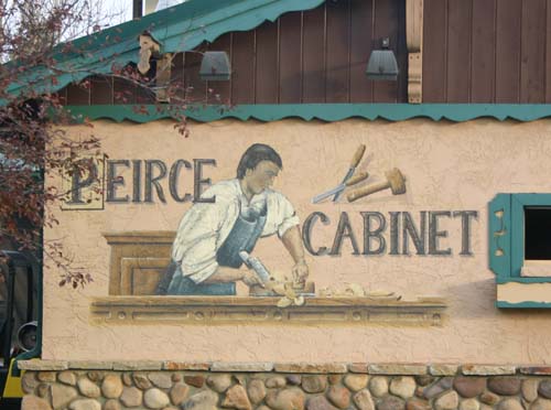
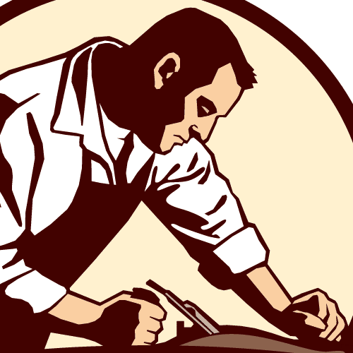
The customer has several scenes painted on their building, and
my boss's wife gave me the idea of incorporating a similar look
in the logo. The illustration is loosely based on this:
Once I put together the initial sketch, which I can't find, I
knew I would need some reference material for the illustration.
I avoid clipart whenever possible and wanted to make my own.
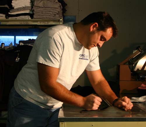
This is one of the first photos I took, just to get a feel for
the pose:
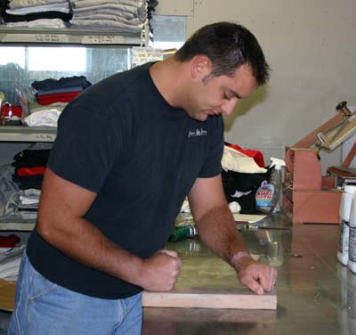
I had a co-worker pose for me and I used my digital camera to
get the image. There are a number of things that make this image
nearly worthless for my application.
1. The lighting is diffused and boring - mostly coming from the
front. It's difficult to show dimension with straight-on light.
2. The clothing doesn't have much personality, especially when I
wanted to have the look of the mural.
3. The pose is awkward and not very dynamic. Not having an
actual plane made things difficult.
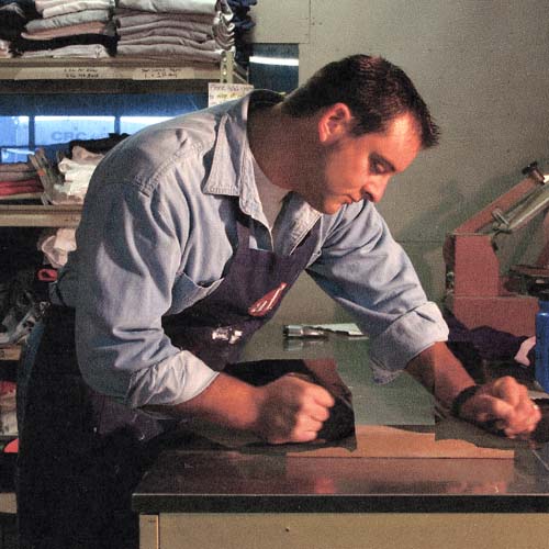
I asked my friend to bring a collared shirt the next day, and
with the addition of a shop apron I ended up with this:
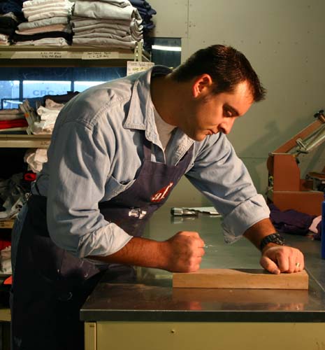
I coached my friend on the pose, and also pointed a halogen
spotlight to give more interesting light. The photo is much more
useful. I still hadn't found a plane so I was stuck with the
wood block. Yuck.
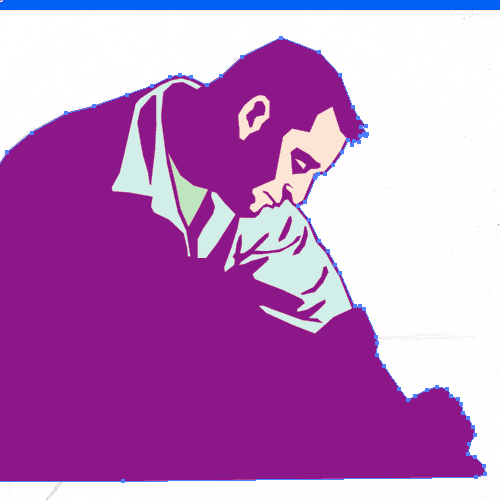
I used Photoshop's Threshold feature to break the image down
into black and white patches:
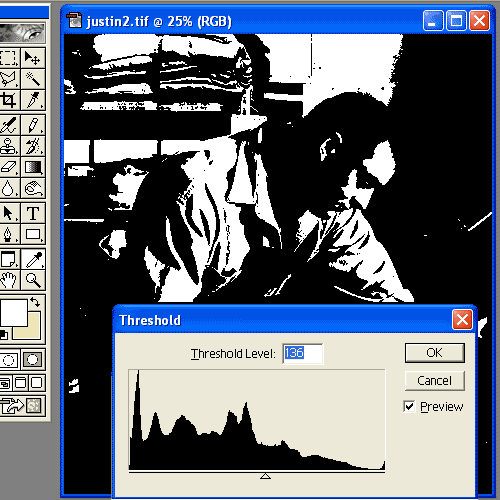
The slider changes the ratio of black and white. I printed out
the result to help me later in the rendering.
I dug an old jack plane of mine out of storage, and shot a new
photo. I was really just interested in the hands at this point:
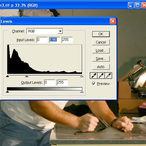
The plane wasn't ideal in the first place, and you can barely
see it in the photo. I had to make adjustments with the midtone
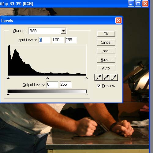
using Levels in Photoshop.
This first image shows the midtone slider at its original
position:
This image shows an improvement by moving the midtone slider to
the left. It isn't the kind of plane I wanted to use, but at
least I can see the way the hands grip it.
I made a composite image in Photoshop, where the forearms and
hands of the newer photograph are superimposed onto the older
one:
I shouldn't have needed this step, but stuff happens.
Once I was
satisfied with the photo, I traced out the main outline and the
breakdown of the light and shadow areas:
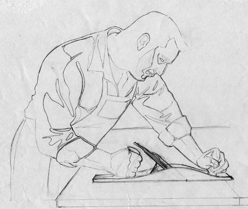
I also faked a larger plane. It looks more like a Stanley #7,
but hoped to tweak it more later. With hindsight, I should have
tried much harder to borrow the type of plane I wanted - a
wooden smoothing plane.
After this I scanned the sketch into Photoshop:
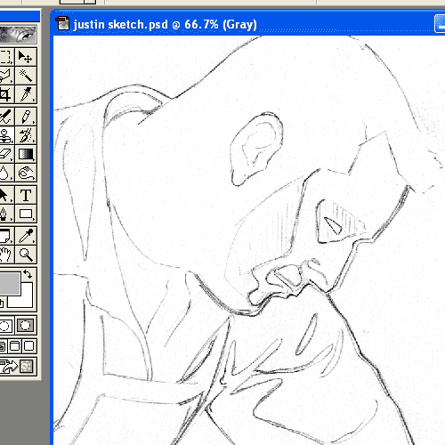
The lines of the sketch needed to be thick enough to see, but
they don't need to be black. In illustrator
it's easier to trace a sketch of the lines are gray instead of
black. I switched to the pencil tool in Photoshop, chose a
medium gray for a color, with Screen as the attribute. With a
wide brush I began lightening the lines in my sketch:
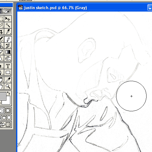
I clicked and held the mouse button as I moved it around for the
entire process of lightening. If I do it in multiple steps, I
end up with some areas too light.
Once the sketch is lightened, I bring it into Illustrator:
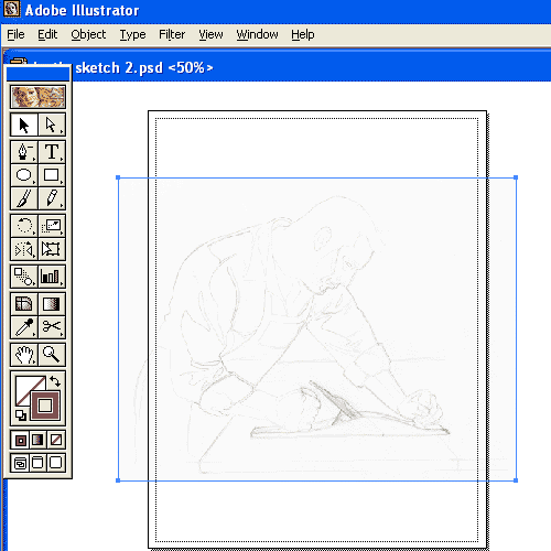
I will often increase the size of the sketch by 400% or so, to
allow for finer adjustments.
The
rendering begins:
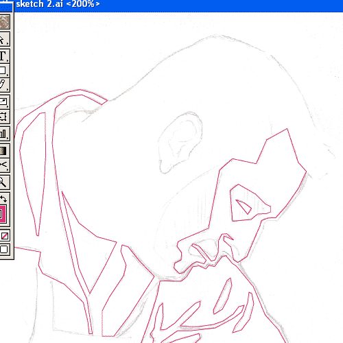
I am not using any curves here. I want a blocky look so I just
use the pen tool and click, click, click.
Some areas of my sketch didn't account for an outline, which
becomes more apparent here:
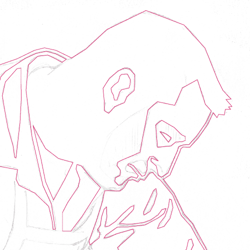
The dimension of the illustration is created with shapes of
color that lay over the background color:
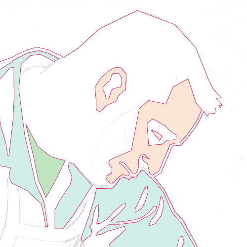
It's not a bad idea to complete the background early...
...so it can be colored periodically to show the form:
Eventually the main outline of the background color expanded,
and I ended up defining the edges of the arms and face with
large cream-colored shapes:
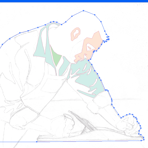
I continued to refine the image by simplifying the shapes. I
used the point removal tool to accomplish this. Remember the
high contrast print I made? It helps in the simplification. I
just kept removing any points that didn't seem necessary -
especially in the face. I also moved points around until I was
satisfied with the expression on the face. I did introduce some
curves in the sleeve once the shape was simplified. If it had
more time to tweak it, I would add more curves. You may also
notice that the outlines
of the face and shirt ended up much thicker than I started with.
This allows them to show up better at small sizes, and I also
like the bolder look.
Well, that's about it. It's not a perfect process, and there are
always things I would do differently. But, this is the basic
approach I take.
|