This is a step-by-step on creating faux-marble signs which are very popular with my
clients as wedding and housewarming gifts, and for children to hang on bedroom walls. I
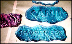
make a bunch at one time, as they are labor-intensive, and the name can be added at any
later date, so it's nice to have blanks in stock for those rush jobs we all know and love
so well! 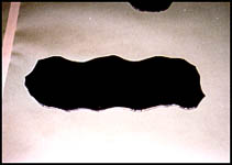
Step 1....I prefer to use white foam board for these signs, but since they must be painted black anyway, any color will do.
Cut the blanks to the desired size and shape, making sure to use a sharp blade in whatever knife you choose. After cutting, lightly dust off the rough edges and sharp corners using whatever fine-to-medium sandpaper that happens to be lying around.
Now the blanks must be painted black, and I use spray enamel because it dries fairly
fast, and allows me to paint the edges with relative ease.
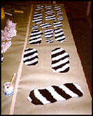
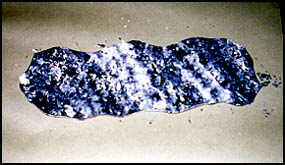
Step 2....Working on a black blank, I have laid a thin (1:1) mixture of white lettering enamel in diagonal bands. I use disposable foam brushes, because I'm lazy, but whatever works for you...
The width of this band will, of course, depend on the size of the blank, and I have
found that regardless of size, 3 to 5 bands will suffice.
Step 3.....I have mixed a batch of black to the same consistency as the white, and laid
a band of black within each white band, the black covering roughly the middle half of the
white.
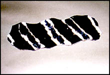
Step 4....This is where I don a pair of disposable latex examination gloves, as the process gets kind of messy.
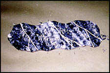
Ball up a piece of newspaper or a page out of last year's telephone book -- anything
that is moderately absorbent -- and dab the paint along the edges where white meets black
background and the latest black band meets the white, turning the paper wad frequently to
avoid repetitive patterns. After practice, you'll know when to get a fresh wad of paper,
and when to stop dabbing for the desired effect.
Step 5....This is a good time to mix your glaze, which gives you your final color, and really brings out the illusion of stone. It also gives your blanks a bit of time to dry, which is important before we add the veins.
I use Super Gloss Tinting Clear (One Shot 4006) as a base for the glaze, and I've found that blue-green, with a bit of process blue mixed in makes a nice base color for the effect I want when I add the lettering. Whatever color you choose, for this project, I've found that lighter colors work best.
Mix your color in with the clear a bit at a time to avoid making it too dark. Did I mention that you should also prepare a test blank so you can try out your glaze? Thin this glaze as you would normally thin a base coat -- it will dry a bit faster if it's thinned at least a little.
Set this mixture aside and proceed to the next step.
Step 6....You still have some of your original white mixture, and this is what you will use for the veins, which simulate quartz. I like to use a feather for this procedure, but a fine liner will do the job if you can keep it loose.
Dip the feather or brush in the white mixture and drag it on a piece of newspaper to get rid of the excess. You don't want a big white blob on the edge of your sign where you first touch down with the feather. If this should happen, however, stop right away, and take your wad of newspaper and dab the blob until it is assimilated into the rest of the pattern. The client will never suspect a thing!
Lightly drag the feather on a diagonal, in roughly the same angle as the initial bands
of white and black. These veins will go from edge to edge, and you will also want to add
what I call tributary veins, veins that branch off the main vein. Don't overdo it. This is
another process that you will perfect through practice.
Step 7....This whole mess has to dry before you apply the glaze, or you'll wind up with a horrible mess! So this step has you sipping on a nice cold soda while you chat with some pals on the internet :)
Depending on how many of these signs you already have committed, you might consider
keeping a couple in the unglazed state. That way, if a client wants one done in a
different color, it's just a matter of applying the appropriate glaze. The messy part is
already done.
Step 8....Now you can apply the glaze to your test blank to check for desired effect. If it is not dark enough, add more color. If it is too dark, add more clear. (Sorry if I'm being too obvious, but I had to learn the hard way -- I didn't use a test blank.) Again, I use the disposable foam brushes for the smaller signs, and disposable foam rollers for the big stuff. Brush gently to avoid disturbing the underlying pattern.
Once this is dry, you have a finished blank, awaiting your client's order.
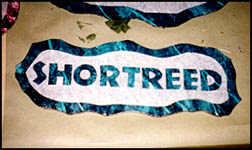
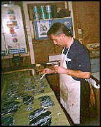
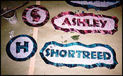
Step 9....Lettering these blanks is the really cool part, because it creates an effect that will make people come up and touch the sign to see if the letters are really carved in stone, and I know how much we all get off on that kind of attention!
The lettering can be done freehand, or you can use a mask. I've found application tape to work quite well, as I don't have a vinyl cutter. When you letter the blank, keep in mind that later on, we will add a beveled edge of 3/8 to 1/2 inch, depending on the size of the sign, so don't allow the lettering to crowd the edges. Also, if you mask the blank and cut the lettering on the sign, be very very careful when you weed, because the face of the foam board is just a thin veneer which will come off if you cut too deep, and boy, will that ever tick you off! Ask me!
The effect you see here was created using clear enamel tinted with black. I always consider my light source as coming from the upper left, so to give an incised look, the shadow must be cast into the letter, rather than by the letter. Therefore, shade the left sides and the tops. If you desire, you can tint the entire letter, then darken your tint and do the left and top. This will depend a lot on how dark your background is.
After your tint starts to tack up, you can optionally highlight the right sides and bottoms of the letters with a mixture of clear and white to show light reflecting off those sides of the letters. Make sure you add just enough white to lighten the background color. I put too much in one time, and it looked pretty funky.
When all of your tints are tacked up, carefully remove the mask, if you used one.
Step 10....Now on to the beveled edge. I've gotten pretty good at doing these freehand, but when I first tried it, I was doing geometric-shaped signs and felt like I had to mask the bevels. If that is your case, go ahead, I won't tell, but make sure you use a good quality tape. I prefer Scotch transparent tape.
Of course, you can perform this step while you have your brush wet for the lettering, as long as you remember to have the edges of the sign uncovered before you begin lettering.
Keeping in mind the perceived light source as top left, we have to reverse our thinking
for the bevels. The lower and right sides will be darkened, as they are beveled away from
the light source. Conversely, the upper and left sides will get the clear/white mixture
because they're tilted toward the light source.
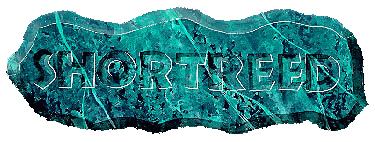
Step 11....The final step -- you never thought I'd ever get here, did you? -- is a very simple one, but one that makes a lot of difference in the final effect.
Using pure white and a 0 liner or tole brush, in other words, a very fine brush, outline the letters on the right and lower sides to create a reflection from those surfaces.
Oh, one last thing. I attach hangers on the backs of the signs I give as gifts, because somebody else will get it in the wrong place or will drive a nail through the sign -- and who ever saw a hunk of rock hung on the wall with a nail? Just poke a pushpin lightly into the back of the sign until you find the balance point, then affix a ring-type picture hanger with a touch of hot glue. Voila!
I hope you get as much satisfaction and profit out of these signs as I do. Of course, don't limit yourself to this kind of lettering. Gold leaf looks stunning on a dark green marbleized background.
Karl M. Holz is a talented signmaker and Letterhead from Haslett, Michigan. Those of you on IRC Letterhead Chat all know him as Kalvin. Everyone is invited to e-mail Karl at yeehaw@voyager.net