|
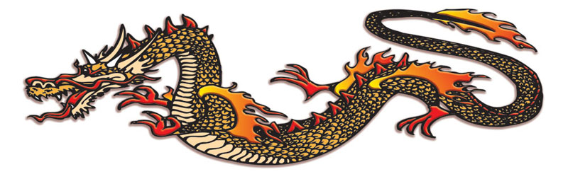
To re-cap... A repeat
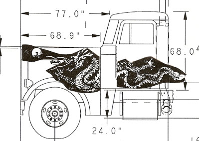
client of mine wanted to have me do an expensive graphics application on a brand
new Peterbilt truck they had ordered. They showed me a simple mock-up of what
they had in mind & wanted me to take it from there. Here is what the client gave
me to show me her idea:
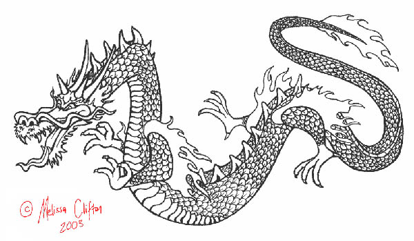
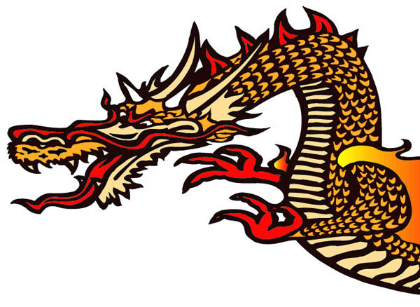
I went on-line to search out images for inspiration & after looking at dozens of
images that weren't big enough, detailed enough, or similar enough... I finally
found a really similar dragon in my Google image search results. After I went to
the original site I also found a fairly large line art image for the same
drawing. While my original intention was to just find a source of inspiration, I
was so pleased with the style & the fact that it was line art, I wrote Melissa &
told her what I was working on. I asked if she would consider selling me
one-time usage rights for recreating a dragon from her work.
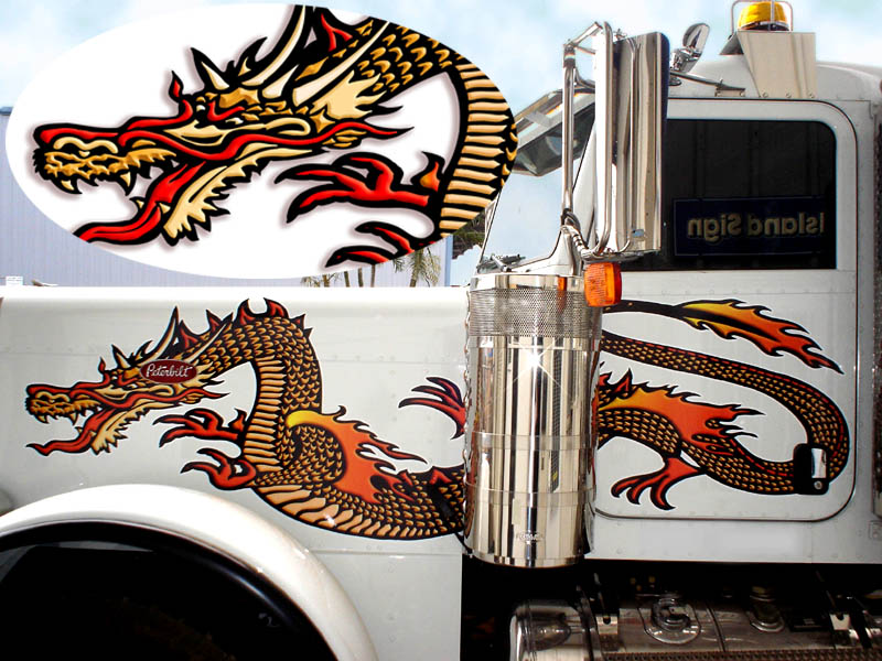
She told me to just use it freely for no charge. Here is the drawing I found:
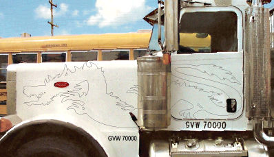
As a first step, I did a quick vectorization in streamline. Then I superimposed
that onto photos of the truck. I had to stretch, rotate & shear the artwork to
fill the space, I was prepared to do some surgical modifications to the
design... but I was able to distort it enough to fit without it looking weird,
so that made it easier. Here is what I decided on for the layout:
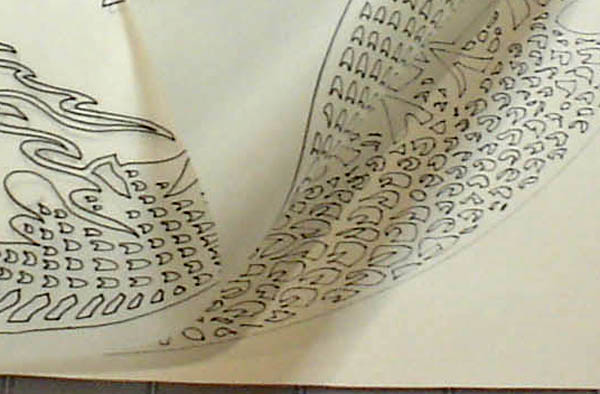
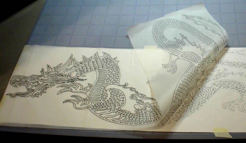
Then I put a pen & paper in my plotter & after enlarging the file to about 30",
I ran the penplot. The reason I made it larger was because I intended to trace
every line in the drawing, making some improvements as I went to correct the
irregularities from Streamline. Then I rolled out some tracing paper (you can
buy 12" rolls from a drafting supply store) & redrew the entire drawing. Here is
a close-up where you can see how I made improvements to the scale shapes &
alignment as I went: (edited to add that I mean "improvements" over the poor
vectorization results... NOT an improvement of the original artists work)
Here is the whole tracing:
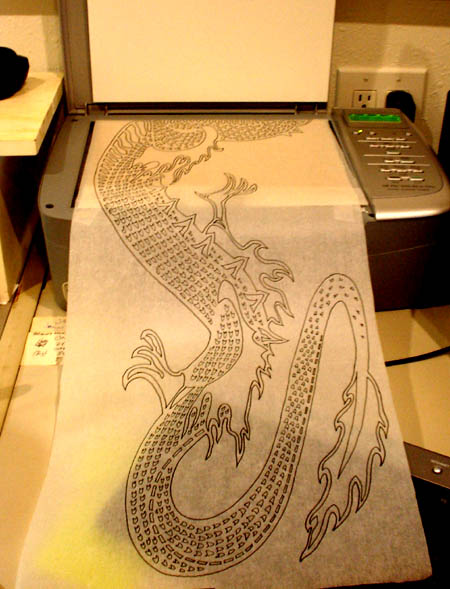
I trimmed the tracing paper down to 11" & fit it into my scanner. It took 4
scans to get the whole design, & then some photoshop work to join them. From
there, I ran it through streamline again, but this time, I spent more time
tweaking the settings, plus it was a much cleaner image & it was much larger. I
ended up with a good vector file to work with.
As I began filling shapes with color, I would find a few contours where my pen
didn't close the shape completely, so I had to fix these few areas with a little
node editing. I tried a few color schemes & kept the black outlines of each
shape from my scanning on some schemes, but I ended up liking black as a
background color between all the scales, flames, fins, & eyes etc, so I changed
the double-line vectors of my pen tracing into a single line. On all the scales,
I kept the outside line since it looked better & kept the black background to a
minimum.
Here is the final color scheme before adding 3D bevels to various elements:
To add some 3D effects, I selected each color, then using the "select same fill"
command, I selected all of that color, grouped it & hit copy. Then I went to the
layers menu & hit paste in front. I made sure it registered perfectly, then went
back & deleted it from the base layer. I repeated this step for 3 more layers,
so on top of the base layer of black, I had ivory on one, red on another, gold
on a third & the gradient red/yellow color of the flames on the 4th layer. I
exported this as a photoshop file, & using the layer styles, I just added a
little bevel/emboss effect to each layer, changing the highlight & shadow color
in each to more properly relate to the main color in each layer.
Here is the whole file after adding 3D bevels :
I'll post the last 2 images in a second page... I seemed to have reached the
limit for one page.
Once the 3D version was
completed, I sent an email of a photo mock-up. The client signed off on this
first submission:
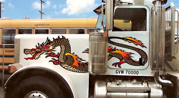
and here again is a photo of the finished truck: (with an inset close-up)
I even flipped the pic
(& the cut & flipped the Peterbilt logo) for a portfolio pic)
the plotted image, as
can be seen in the lower sheet on the tracing pic, was a very crude version,
based on a small, and a low res. original.
While the eye can easily see Melissa's detailed scale drawing style... my
scanner & vectorizing software messed it up a lot.
I was happy to redraw it all, so I would inject a little bit of my own TLC into
the final outcome... then, that much larger, much clearer image scanned &
vectorized rather nicely by comparison.
I'm sure there are other ways... but this is what seemed best at the time.
$1000 for design
$1500 to print, cut, laminate & install
Doug
Allan of Island Sign's in Kahului, HI |
