|
Here is a step by step
on how to fatten up a thick and thin font without totally destroying the
integrity of it.
The following graphic shows University Roman BT in normal and various thickened
modes.
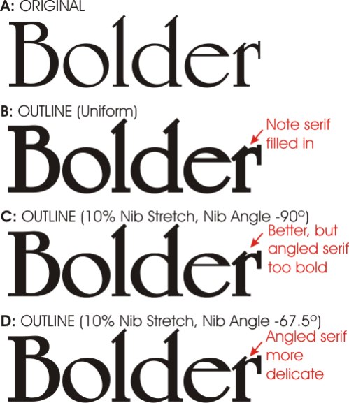
Aesthetic fonts have a precise relationship between the vertical and horizontal
strokes. Just fattening it up all the way around changes the proportions between
those strokes and kills the beauty of it.
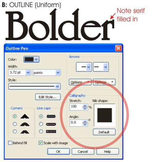
The following shows the Corel outline tool dialog box with an equidistant
outline, the least appealing option:
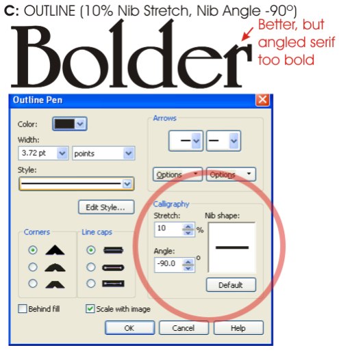
The following shows the Corel outline tool dialog box with a distorted outline,
which adds more to the vertical strokes than the horizontal, thus keeping more
in line with the natural shape of the letters:
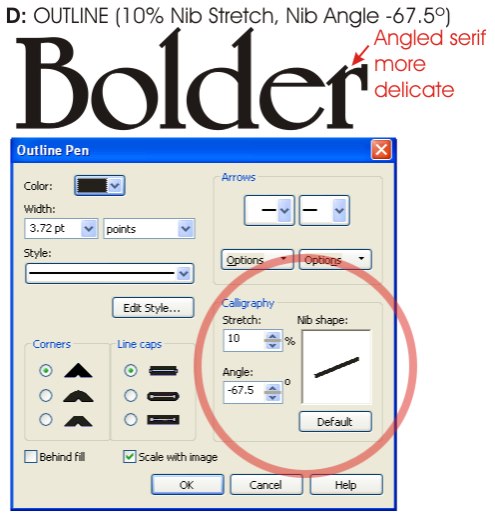
The following shows the Corel outline tool dialog box with a distorted and
angled outline, thus keeping the angled top serifs more delicate. Note that
angling the outline adds a little more heft to the horizontal strokes, although
we still have pretty good definition between the vertical and horizontal:
You can also use similar techniques to add thick and thin strokes to curved
swooshes and lines you may create.
This doesn't tell how to do it in Flexi but you can convert the outline to
curves in Corel and import it into Flexi (that's what I do). I don't know enough
about Illustrator to know if this technique will work with Illustrator.
|
