 |
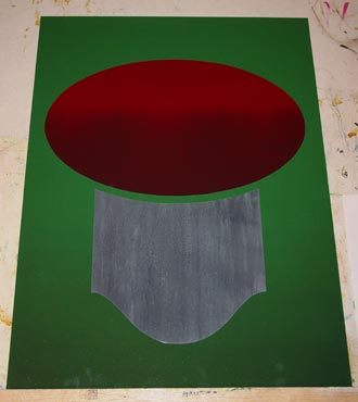
Since we had so long to complete this project, I started out by drawing the lettering I had in mind on paper about a hundred times whenever I had a few spare minutes. I'm a big believer in giving your brain the most time possible to come up with a solution to a problem. Ever had an answer to something you weren't even thinking about just pop into your head? That's your brain subconsciously working on something that you told it to. I scanned one of the drawings into my computer and worked up the final design, completely stressing over ridiculous details like a good Letterhead should. I didn't necessarily have to use a computer for this, but I really like to because it lets me change every little detail easily, and it was going to make my life a lot easier in a few of the steps I had planned. I started by wet sanding a panel with 1500 grit sandpaper and did a slight roller blend green to dark green background. After it was dry I masked it and projected the oval and bottom panel, adding another roller blend to the burgundy oval. I wanted to do the bottom panel all at once with a barn-board type of texture to it, but wouldn't you know it... after I was happy with the texture and was just finishing it off by spattering it with a little thinned down paint and a toothbrush... BAM! The biggest, ugliest streak of thinned down paint possible - and I swear it was the last "flick" I was going to do before I called it done. |
| I had been using
Smith's Cream as a carrier for most of my blending, so I couldn't just
pick up the spots and pretend it didn't happen. I blended everything
back together, loosing most of the detail I had achieved and decided to
come back when it was dry. I thought it would probably look a little
richer anyway with a nice deep undercoat and then I could glaze it with
Smith's Cream with a little light grey mixed to achieve the texture I was
after.
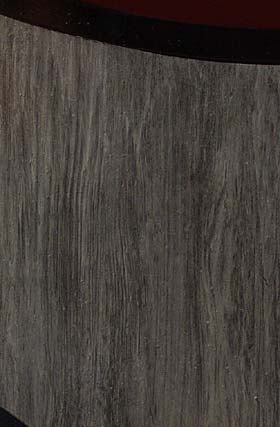
I took a 3" flat landscape brush and coated the area with the above mentioned Smith's Cream and light grey, but discovered that I didn't really need quite so much light grey in it. It wasn't transparent enough to let my base show through. So I thought I'd just scoop it off and try it again with a little less paint in the mix, but a funny thing happened. I was holding the landscape brush at an extreme angle pointed back at me, pulling back, just trying to remove the glaze. The hairs at the back of the brush bent back on themselves as I pulled toward myself - and the random hairs creating a fairly decent wood grain pattern. A little soft back blending, and zip, zip, zip, I was done. |
 |
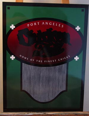 |
Here I've brushed in
the black outlines around the panels and added the border. After
that was dry, I applied a paint mask and rolled on a coat of black for the
outline and drop shadow behind the main lettering. Those white
registration marks that I left on the panel were part of the paint mask,
and I left them on for quite a few other steps I had in
mind. Since, those marks were left on, I could easily line up my arched white vinyl copy without any measuring - which I'm always a fan of. I try to do this as much as possible - let a computer do the work instead of me.
|
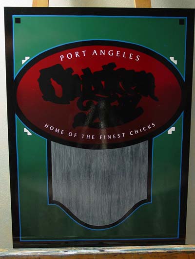
| Here you can see I
had to cut away part of those registration marks to apply my wobbly
pinstriping skills.
I don't know if it was the lighting, or the camera operator, but my camera wasn't picking up the right colours for the blue outline and green background. There isn't as much contrast between the two as is shown in most of these pictures. I colour corrected the first image at the start of this step by step the best I could to represent the colours as they actually are. |
 |
 |
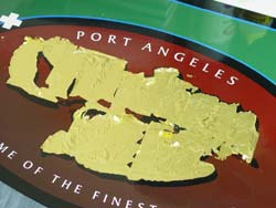
Ok, let's pretend I
did things in the right order, and I applied my egg white and water
mixture to the background to prevent the gold from sticking.
Using the registration marks, I've applied another paint mask here to roll on a thin coat of gold size. I used LeFranc's 12 hour slow size. You can also see I've put premask over the white vinyl lettering so I wouldn't have problems pulling up the thin strokes when I lifted the mask. |
| Remember, I did
things in the right order. I didn't try to paint in the egg white
mixture after I had applied the size - that would just be insane.
Ok, maybe I did. Stop laughing. I guess it serves me right for
not practicing this until a year after I was taught how to do it. I
realized rather quickly that my plan couldn't possibly be the right way of
doing things very shortly after attempting it, so I ended up with
some gold sticking to the background, which of course isn't much fun to
clean off. This is 23k patent gold leaf.
Also of note: the little copy that reads "Co."... I forgot about that until I stuck the edge of my hand into the exposed size. Since things were already going so smoothly, I decided to resize and gild it later. |
 |