|

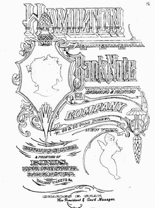
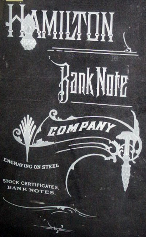
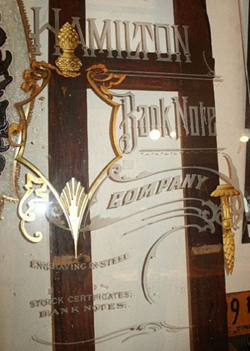
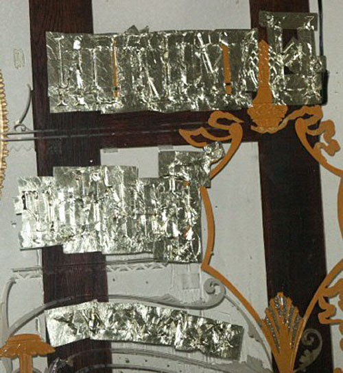
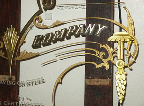
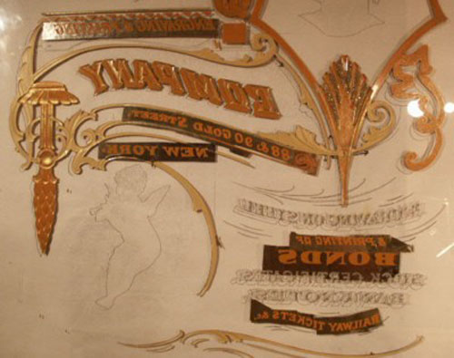
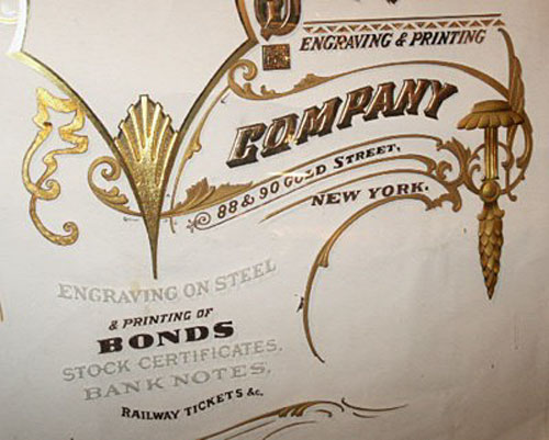
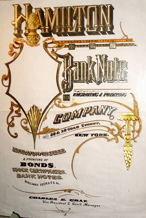
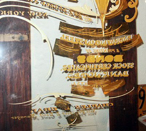
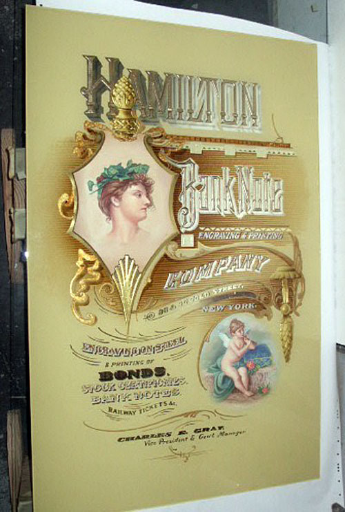
I saw this wonderful image as I was looking through my Letterheads
magazines. It was rather small, but I was able to get a larger version.
Looks to me like it would make a very nice reverse glass sign.
(11-2-05) Defining Design Elements - The first thing that caught my
eye with this one was the fancy borders and ornaments. They definitely call
to be depth carved into the glass. Then, after depth carving, they would
have to be gilded in some manner in order for the depth carving to show up.
Bronze powder would also work, but isn't quite as reflective as a water gild
would be. I would lean toward water gilding. Different portions would most
likely be gilded in different types of gold leaf. Some of the lettering
could also be depth carved. I am not a screen printer, so I probably look at
this a bit differently than someone approaching it from that angle. All that
scrollwork is quite elaborate, so I think not elaborating on the lettering
would be in order. However, a glue chipped letter center with a fading glaze
might look pretty darn nice some where. But it will be the gilded depth
carved scrollwork that I will use to set the tone of the piece. The next
step will be to convert the art into a line drawing and determine the
finished size. Hmm...computer...pencil....computer...pencil....
I think I'll do it with my pencil...that sounds funner. While I create the
pencil drawing, I will be defining the techniques I want to employ. As I
define the techniques that I'm going to employ, I will define the correct
order of execution.
Initial Composition Ideas - My initial vision for this piece is
mostly gold tone inscriptions and scrollwork against a light beige/tan
mottled background.
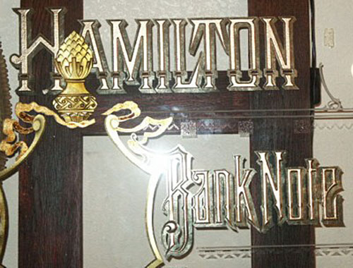
Hamilton-
Depth carved letters finished in a dark brown mica or bronze powder with a
16K burnished primary drop shadow, palladium leaf burnished secondary shade,
with MOP ornaments in the letters.
Bank Note- Also depth carved, finished in blended mica powder with
the same gilded drop shadows.
Company- Again, depth carved with a 22K moon gold water gild, painted
drop shadow, and palladium secondary shade.
Scroll work & ornaments- Depth carved, tinted, and water gilded Rouge
gold.
Misc. secondary text- Various water gilded leaf, perhaps acid etched
centers on "Bonds" with a colored glaze fade.
Pictorials- Probably hand painted oil paintings (not done in reverse
on the glass).
Background- Mottled beige/tan colors. I am also considering
replicating the stripes in the background, probably with an asphaltum glaze.
This is another piece to be done on extra-clear glass. Might I suggest
always using extra-clear glass.
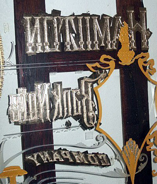
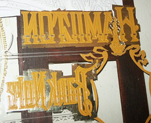
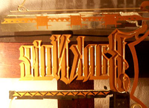
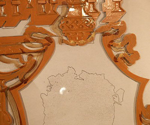
Image Converted to Line Drawing-
I made an enlargement of the original and traced the image
into a line drawing (done in pencil). I have figured this piece to be
approx. 29" x 44". I took the line drawing over to Kinko's and procured half
a dozen enlargements in reverse to use as my pattern for the various
techniques. I will be ordering a piece of extra-clear glass with the first
step being acid etching, followed by the large amount of sand carving.
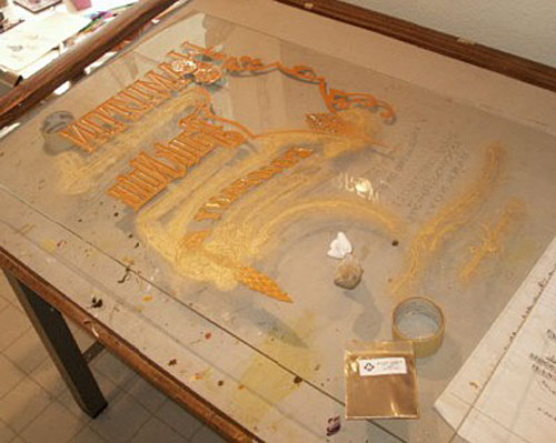
Step 1 - Textured Acid Etching
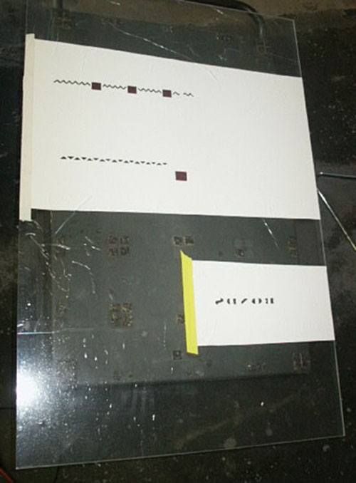
After cleaning the glass and applying the vinyl for the resist, I registered
and spray mounted one of the reverse copies of the line art to it. I then
proceeded to hand cut and weed out the areas that I wanted to etch. I added
a computer cut ornament into the open squares. They were cut out of some red
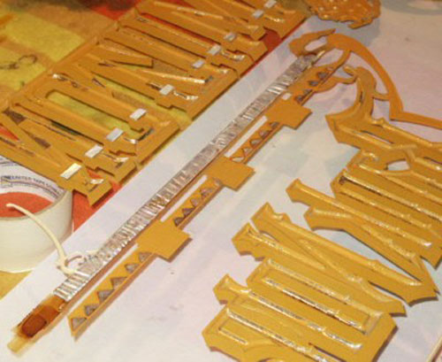
vinyl and are a bit hard to see in the photo.

I applied the acid/mica paste over the weeded areas and left the mixture on
the glass for 30 minutes.

This is the resulting stippled etch texture in the glass. I have found that
sifting the dust out of the mica, and using a fresh acid mixture, yields the
sharpest, most pronounced texture.
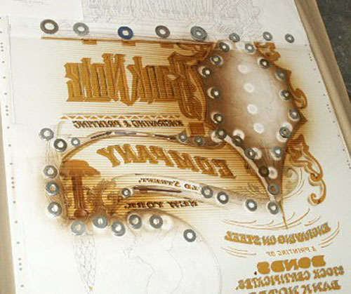
Step 2 – Sand carving
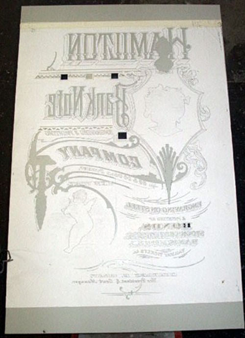
I re-masked the glass with 15mil heavy duty Venture Tape sandblast mask.
(Venture Tape product) I cut a few
windows in it to expose the acid etching. I then registered the previously
used copy to the acid etched images. When registered, I spray mounted the
paper copy onto the sandblast mask. (Krylon has put out a repositionable
spray mount product, which is half the price of 3M’s product, & it works
well too.) I then preceded to hand cut all the areas that are to be depth
carved. With so many different overlapping elements, I am going to make a
"road map" of what gets peeled 1st, 2nd, 3rd, etc. There will also be areas
where the masking will need to be put back in. I peel the paper copy off as
I cut to ensure everything is cut.
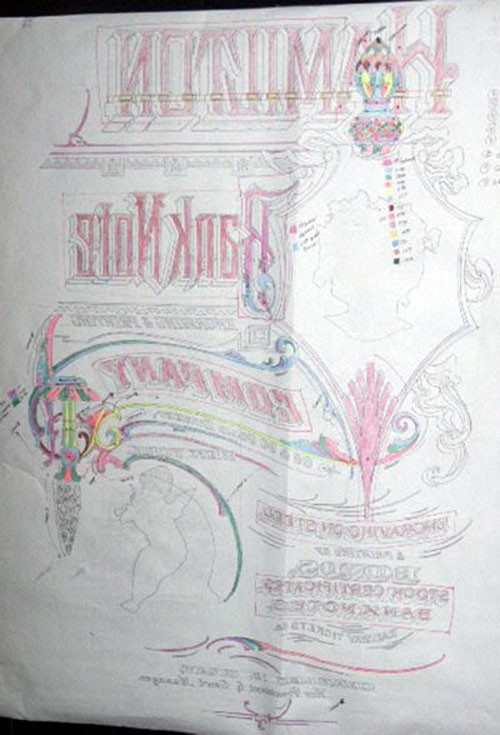
I created this color-coded "road map" so I could keep track of what I was
doing. There are at least a hundred steps involved. The large primary copy
was sandblasted with a large (1/2") nozzle. This keeps the depth carving
nice and uniform. Next, a good portion of the scrollwork was sandblasted
with a medium nozzle (1/4"). It was done with a "progressive peel" method,
which yields a varying depth to different elements with a soft edge
transition between them. Where the scrolls overlap, the mask was put back
in, in order to keep a sharp edge between the elements. The finer detail
work was done with a fine tip (1/16"). These elements were done with both
the "mask replacement" & the "progressive peel" methods.
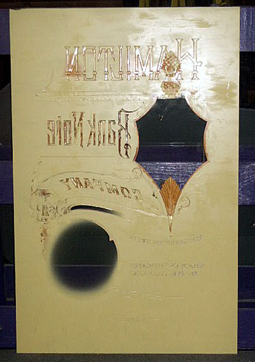
The finished sand carving came out quite tight. There are just a few places
I need to touch up.
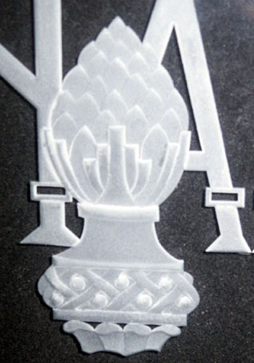
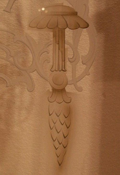
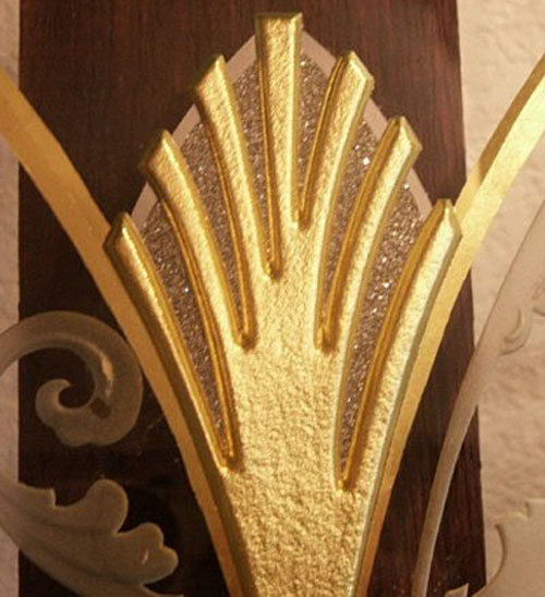
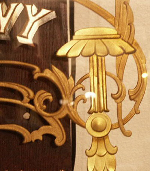
Here is a detail of the upper cone element. The overall height of this
element is 5 3/4".
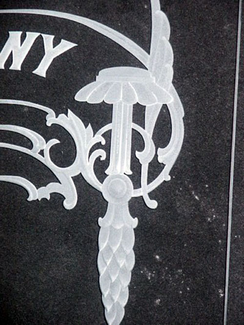
Here is a detail of the lower depth carved element.
This concludes all of the glass surface alteration techniques that I am
employing in this piece. The glass surface alteration techniques are always
done first.
Step 3 - Ribbon and Pictorial Frame
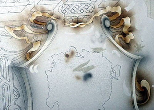
I masked over the area to do the ribbon and pictorial frame and
re-registered and spray mounted one of the Xerox copies down to it. I then
hand cut out the areas to be treated. I airbrushed a transparent glaze of
Asphaltum and Clear Fibroseal to shade the ribbon and used Black Fibroseal
(mixed into Clear Fibroseal) to create the glaze for the pictorial frame.

I surface gilded the backside areas of the ribbon with green variegated
leaf, and then using embossing varnish (1/3 Quick Rubbing Varnish, 1/3 Damar
Varnish, & 1/3 Resin Gel), I tooled in a swirl design into the front areas
of the ribbon.

I then proceeded to water gild the ribbon in Rouge Gold. Water gilding over
embossed varnish is much like gilding over glue chipping as it takes a
couple water gilds, and then needs to be finished with a surface gild. It's
difficult to get the gold to fully go down into the embossed design. After
water gilding, I surface gilded it with pulverized red variegated copper
leaf. The red copper leaf ends up showing through in the embossed design
adding a touch of contrast with the Rouge Gold background. A very fine
bright line was left around the ribbon. The pictorial frame was then water
gilded in 23K gold over the airbrushed varnish. When backing up, a bright
line was left o the interior side of the frame. The end effect is a mirrored
gold outline with a simulated bevel created from the airbrushed tinted
varnish.
Step 4 - Gilding Sand carved Ornaments
Firstly, I sealed the sand carved ornaments with 2 coats of Frog Juice (an
optically clear synthetic overcoat). This will enable me to water gild over
the sand carving. Next, I opted to try a new technique and airbrush a
transparent glaze into the sand carved areas to create a shadow effect. I
used transparent gold screen ink and a dot of black Fibroseal in Frog Juice
for the glaze. I hacked up some pieces of vinyl and pieced together some
masking over the adjoining sand carved areas that I didn't want the glaze to
go into. (It was alright for the glaze to be on the smooth glass because it
can easily be scraped off.) This is the glaze as viewed from the front of
the glass.
I then water gilded the ornaments with 23K gold. Like most "non-flat" gilds,
it took 2 water gilds, then a surface gild. It was then backed up with Fine
Gold ochre backing paint.
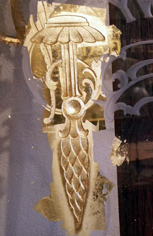
Here is the R/H ornament after gilding. You can see how the airbrush shading
has added an additional effect to the element.
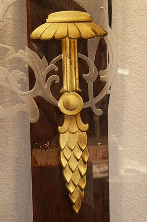
Here's the upper ornament, as viewed from the front of the glass, after the
excess gold has been removed. A small piece of razor blade is used to scrape
off the excess gold and backing paint. It scrapes off clean at the edge of
the sand carving.
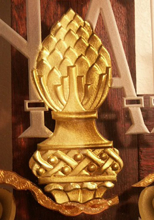
This is the ornament at the bottom of the pictorial frame. After gilding and
cleaning, I water gilded a stripe of palladium leaf, then filled the centers
with silver glass glitter.
And here's the overall view. Now it's on to gilding the main copy. The sand
carved elements are sealed one at a time, then gilded. This way if any stray
gold gets into an unwanted area of the sand carving, it can be easily
removed. As I look at this piece as it comes along, I will be deviating from
some of my initial finishing ideas.
Step 5 - Rendering Main Copy
On this next step of rendering the main copy, I again sealed the sand carved
characters with 2 coats of Frog Juice. After the Frog Juice was dry, I water
gilded it twice with 22K Moon Gold. After the second gild, I could still see
a few cracks, so I did a surface gild over it, and to be on the safe side, I
backed it up with metallic One-Shot mixed to match the gold color. After the
One-Shot was dry, I backed that up with Fine Gold back up.
+
After all that was dry, I cleaned off the excess gold, and, using a razor
blade, scraped off the remaining gold to the sand carved edge.
Here's a close-up. (The shade on the letter is just cast against the wall
behind the piece.)
As seen in the original lithograph, the main copy has split shade on it. The
first shade also contains an outline around the rest of the letter. This
first shade and outline has been water gilded with 16K pale gold. (The
second shade will be water gilded in Palladium leaf.)
The 16K gild is backed up with Fine Gold Ochre back up. Two different size
quills were used, one to paint the outline, and another to paint the wider
drop shade.

The line work is "over run" at the ends and then trimmed back to leave a
sharp corner.

This shows the "over run" ends after they have been trimmed back.

And, here it is from the front.
Here it is from the front. The blemishes in the drop shade are really just
reflections from around my studio.

Next, a secondary drop shadow was added in palladium leaf with much the same
process, water gilded, backed-up, trimmed, and excess removed. This same
drop shadow was also added to "Bank Note" and "Company" text.
Step 6 - Finishing Sand carved Scrollwork
First, the sand carved areas to be finished were sealed with a coat of Frog
Juice. Next, I applied water based Wunda Size to the same areas. Using the
Wunda Size, I can then back up the gild with any solvent based product and
be ensured that the gild won't be compromised. After the size had set, I
applied Sepp Leaf's Custom Gold (MN002) mica powder. I like to use a trick
Rick Glawson taught me of putting the mica powder in a baby's sock as a
pounce bag (it's in the picture) and pouncing the mica powder over the size.
After a good application, the powder is dusted around with a dusting brush
and the excess removed.
I then backed-up the entire area with the mica powder mixed into Window Spar
varnish. After doing so, I noticed it still wasn't 100% opaque, so I backed
it up again with Decor ochre mixed with a touch of white One-Shot. After the
paint was dry, I scraped off the excess at the edge of the sand carving with
a razor blade.
Here's a close-up.
Step 7 - Additional Ornamentation
I water gilded over the acid etching with 18K lemon gold. Again, I over ran
my back painting and went back and trimmed it to a sharp corner.
Here, in the strip between the two sand carved lines, I painted in a
graduated glaze of vertical stripes. I then sealed over the glaze with some
tinted shellac.
I adhered Mother of Pearl pieces into the open rectangle ornaments of the
word Hamilton. I also adhered individual
triangles of Dark Tahitian shell in the strip next to the acid etching. It
could have been done in one strip, but it's easier to get any air bubbles
out with the smaller pieces. I then adhered a strip of Rippled Abalone shell
over the tinted shellac area. All these areas of shell will be surface
gilded with aluminum leaf so they can be painted over without losing their
luster.

Here it is from the front. The abalone strip won't appear so bright when the
finished piece is under normal lighting conditions. Also, the glazed stripes
didn't come out quite as pronounced as I would have liked, but I figured it
wasn't worth reworking. Mainly because a portion of the abalone is adhered
over the ribbon, and removing it could pull it up, then I'd really be going
backwards. ...But I learned something.
Step
8 - Rendering Secondary Copy
I water gilded 18K gold and Palladium leaf, then back painted the copy. I
took my original layout drawing and scanned the various texts. I then ran
the Corel Trace function on the bitmap image, giving me a vector file. After
a bit of tweaking of the file, I output it to my plotter on pounce mode to
create some fairly tight pounce patterns, which were used to transfer the
copy onto the water gilded leaf. Back painting small letters like these via
a pounce pattern is one of the more difficult, yet rewarding, procedures.
"...Though I reckon screen printing would be easier." Again, when cleaning
off the excess gold, the letters are trimmed to clean them up.
A view from the front.

The sand carved text was finished in mica powder, the same process as
described in doing the mica powders in the scroll work. The word "Bonds" has
acid etched centers and was gilded with 22K moon gold.

A brown drop shadow was added to the water gilded text and a cream color
drop shadow were added to other portions of the text. The portions of the
text with the cream color drop shadow will get a secondary water gilded
shadow. The cream color shade should drop out when the background is
painted, just leaving a gap between the letter and the gilded shade, as seen
on the original lithograph. I figured it would be easier to paint in this
gap than to try to back paint the secondary shade while leaving the gap.

This is how it ended up looking...
...and here is the overall from the front.
Step 9 - Flourishes and Shade
The flourishes around the lower copy were water gilded with 23K gold leaf. I
also noticed I forgot to do the secondary drop shadow on the word Bonds, so
I picked that up at the same time.
The next step was to CLEAN & INSPECT the glass. To me, this is one of the
most important steps and cannot be over emphasized. Nothing can ruin a nice
gilded sign more than by having debris appear in your background, or having
some gold going outside of it's desired area. I start by cleaning the front,
and then proceed to clean the back, continually inspecting it from the
front. I spent about an hour cleaning it. I will now wear gloves when
handling it.
After the glass was thoroughly clean, I painted in the shades that appear on
the original art. These were done with varnish tinted with asphaltum.
Step
10 - Painting the Background

Okay, here's a good one, kind of pushing' the envelope a bit. I cut out, on
my vinyl cutter, a block of .10 lines with .10 spaces in-between. I then
mounted this cut vinyl to a wood frame and peeled the carrier sheet off. I
then pounced the adhesive side of the vinyl to get rid of any stickiness. I
laid this mask down onto the glass, then masked off the areas that weren't
going to have any of these lines, with paper cut out of my layout drawing,
registered and weighted down with washers. Nothing was stuck down to the
glass, only weighted. I then airbrushed the fading stripe pattern onto the
glass with tinted shellac.
I lifted the paper masks and the line stencil, then repositioned the paper
masks and airbrushed the same tinted shellac into the required areas for a
shade. This was all a bit experimental, but it worked out pretty darn nice.
I proceeded to mix up a background color with Japan paints and apply it with
a brush over the background. I used my airbrush to create a fade around the
area of the lower pictorial. There is also one more window left clear for
another abalone strip that fades into the background.
Here it is from the front. I commissioned the paintings from some folks I've
done business with before over in the Ukraine. They did a fairly nice job
from what I provided them to work from. I may tone them down a bit. But it's
real close to sending this off to the framer! Once back from the framer, I
hope to get a professional photo of it and I'll post it here.
I added an airbrushed black glaze around the pictorial border. It has added
a needed contrast. Now I'll call it done!
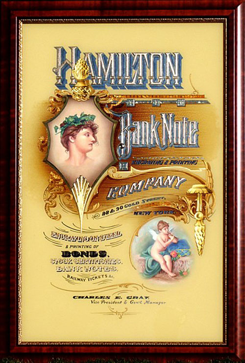
Here it is in its finished frame!
God bless Rick Glawson for his enthusiastic rediscovery and sharing of this
craft, without him, I wouldn't have been able to share this with you.
And now when you rediscover or invent a new technique, you can share it with
me!
Larry
White
http://www.walljewelry.com
e-mail Larry
|